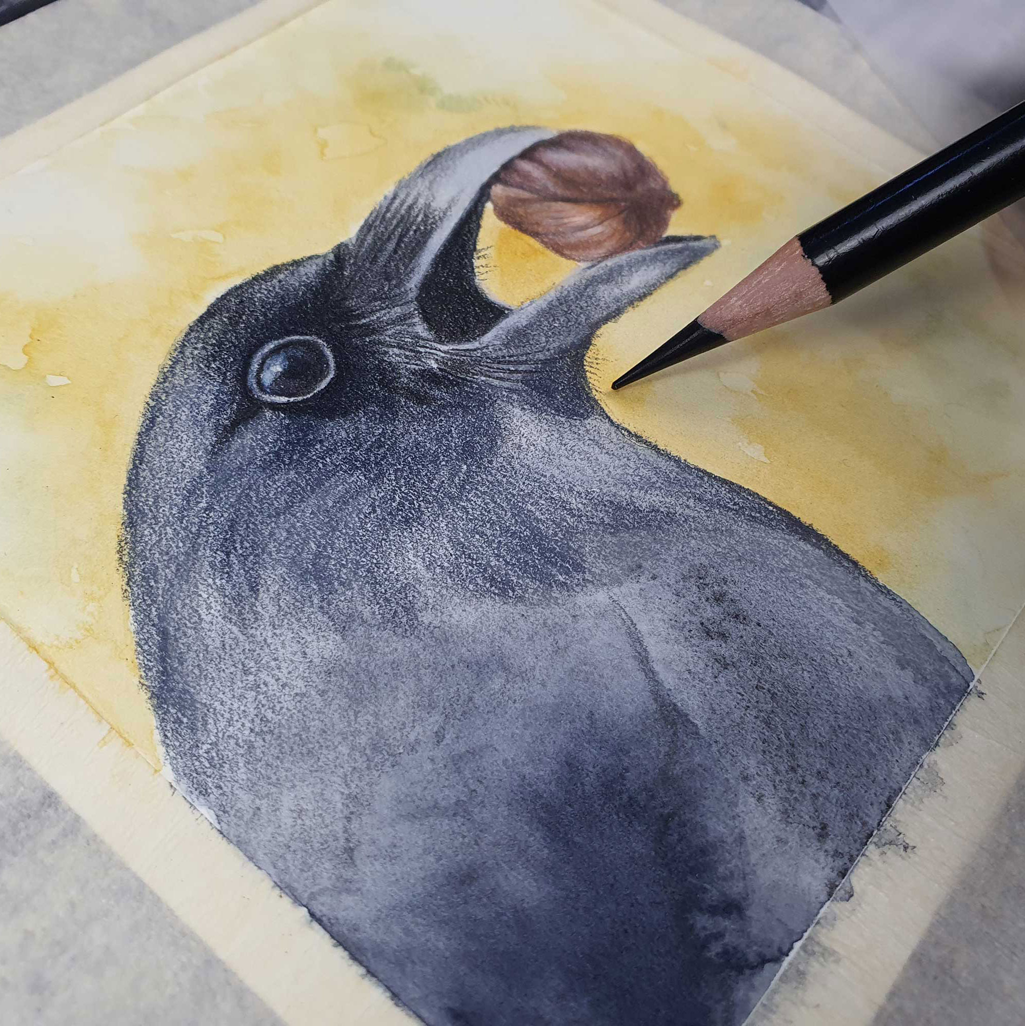
I have listed the supplies I used here, but I want to note that it is not these specific supplies that create magic - that, dear one, comes from you! The exact colours are not important, what is important is you enjoying creating, being absorbed in the process, and blooming where you grow right now. The supplies you have on hand will be absolutely perfect, I promise! You may also want to change up the colour palette - I am drawn (all puns intended) to a muted, natural palette, but natural palettes can also be vibrant, and where I have a soft sepia background, a warm burnt orange may speak to you more! Listen to your intuition, to your heart, and create with open abandonment and joy! As artists, I know that we can’t help but want ALL of the art supplies, but sometimes the money-tree in the backyard is not being forth-coming. I will provide you with the brands I am using, and the general colour palette, but will not list each specific colour - there are a couple of reasons for that; the first that I don’t want you to feel you have to go out and buy these specific supplies (as noted above!) and two that there are very similar colours in other brands - you may well have those on hand already. In the videos I will probably announce each colour as I use them, but please use this as a guide only.
If you are new to watercolour and/or coloured pencil and would like to try it for these projects, buy a starter set, or a few individual colours, and see how you like them. As I mention below, I love Daniel Smith and A.Gallo watercolours, but Winsor and Newton, Peerless and Arteza also make great supplies. I recommend Faber-Castell Polychromos coloured pencils as a perfect all-rounder, they are artist grade, and work beautifully on all surfaces. You can try a starter set of 24 relatively inexpensively.
Specific supplies used for each project are listed in the lesson information, but broadly speaking, all of these projects can be adjusted to use your favourite medium or what you might have on hand.
Mediums Used:
Substrates:
All of the reference photos for this class are taken from the royalty free image website Pixabay. Here is a link to more photos if you would like to explore further:
Drawing is a powerful tool to develop visualization, coordination, analysis, concentration, presence, connection and joy. I believe the only thing drawing requires from you is some curiosity and some willingness to have a go. You do not need to have a background in drawing theory for this class (or for any creative spark!) only curiosity and a wanting to know more about form, structure, light and shading.
We are all at different points on our skill learning journeys, and it is really ok! Where you are now is exactly where you are meant to be at this moment, and if you continue to show up and practice, you will keep moving forward. Please don’t be overwhelmed by the reference - it is a guide meant to support your imagination and observation, but should not be a barrier to your creativity.
If the thought of trying to draw directly to your page is intimidating, even when the subject is broken down into shapes, know that there are other ways of approaching the reference. Let me talk to you about two alternatives, the grid method, and tracing.
1. THE GRID METHOD
There is absolutely nothing wrong with using the grid method to guide your drawings. You can still use the same ‘shapes’ method, but with further guidance from a grid. Most smart phones and tablets will bring up a grid when you are in the ‘edit photo’ option, and hold your finger on the image. You can then take a screen shot with the grid laid over. Alternatively you can print the reference and draw a grid on top. Then draw a grid with the same amount of squares in the same ratio (they do not necessarily have to be the same size, but need to be the same ratio - that is, if the reference has 9 squares each 2cm wide and 3 cm long, as long as you draw a grid with the same ration, eg 4cm wide and 6cm long, your transfer will work!). Don’t press too hard when drawing the grid on your page, it should be light enough to erase easily and not create deep grooves in the page.
2. IT'S OK TO TRACE!
The other thing you can do is trace! It is perfectly ok, whatever tools empower you to move along in your journey is fantastic! Print out your reference to the size you would like it to fit on your page, grab yourself some carbon paper (or rub a soft lead pencil like a 6B) over the back, and gently trace the image to your surface. Your lines should not be deep and dark, don’t press too hard, but you should be able to see your basic outline, and you can go from there!
““The work is in the doing” was something a yoga teacher I had once said, and it really struck a chord. This quote is true of any passion you have that you want to be more proficient in. It is ok to feel a little frightened or overwhelmed, or even doubtful of yourself. Acknowledge those feelings, but don’t let them write the story - feel them, thank them, then honour yourself by taking the energy those thoughts use to put into your work. By showing up, by doing the work, you honour yourself and the creative divine, you are developing your skills and finding your path. Every little thing you create can only make the world a better place.”