Dear creative friends,
Welcome to Issue No. 76 of the Studioworks Journal! As always, I’m so grateful you’re here with me, and I’m excited to share this issue with you.
This month, I wanted us to explore the idea of simplifying—how less can truly be more. Lately, life has been full of change and transition as I settle into our new home in Portugal. In the midst of it all, I’ve found myself drawn to paring things down in my art, working only in blue, allowing the simplicity of a single color to bring me clarity and focus.
As artists, we often feel the pull to add more—more detail, more color, more layers. But what happens when we step back and let our work breathe? How can we say more with less, allowing the essence of our creativity to shine through? Let’s explore this together.
xo,

As we eclipsed our way through the vernal equinox, a time of balance and renewal, and began the ascent into longer days and shorter nights, our bodies and minds have had to shed the detritus of a long winter. For some of us, the Ides of March were, in fact, doom-laden and sinister. For others, the blood moon coincided with copious flow, literal and metaphorical. Fortunately, for those of us here contemplating the dawning of a new season, we haven’t been left to utter the fateful and final words, “et tu, brute.”
´´´Spring urges us to clean house. What in your life and artistic process could benefit from simplifying? Across millennia, artists, poets, creatives, and makers of all stripes have wisely heeded the call of the wild and spent portions of their time in peaceful settings to reorient and center on what truly matters, paring away the rest. And, at times, of course, running with the wolves. Let’s take a closer look at historical examples from a culture that mastered the art of finding glory in restriction—creating beauty through thoughtful economy.
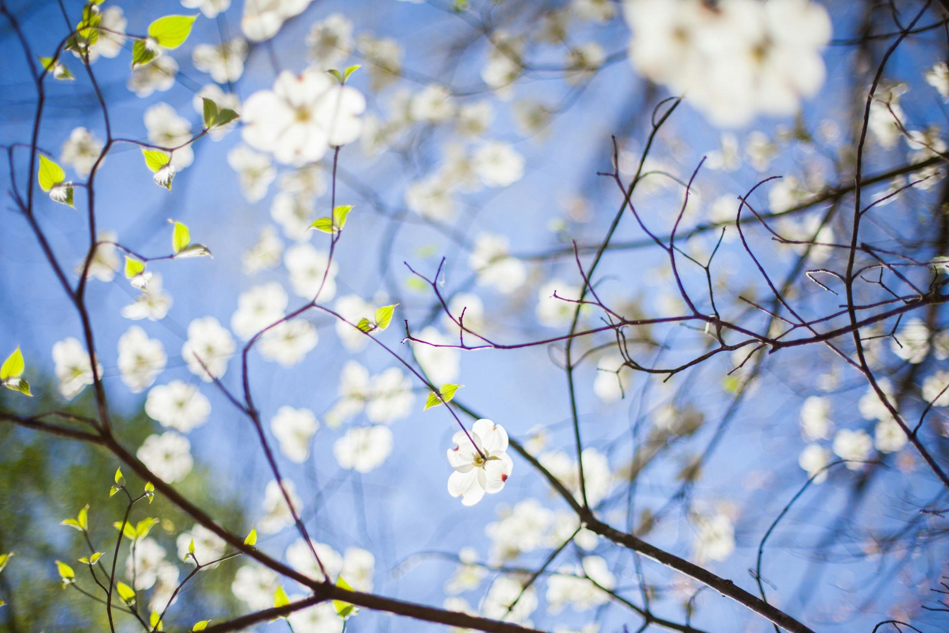
The world is vast, and history is now more available to the layperson than ever- If you know where to look and have the will to do so. In an era where global tension and emotional fatigue are palpable, a small step back into a broader perspective reveals a familiar pattern—division often gives way to curiosity, and conflict to transformation
This may not feel encouraging as our lives endure the spin cycle, but it should be. It’s a reminder that change occurs continuously and urges us to employ patience. A telling example of the desire to wall off from the dangers of external forces of the world was the isolationist foreign policy Sakoku- meaning chained country- in Japan.
During this era, also known as the Edo and Meiji periods, which endured from 1603 to 1868, the Japanese shogunate kept the Archipelago of Japan isolated from the rest of the world. The reasons were many, but a salient one was the desire to keep Japan's culture and traditions pure and free from Western influences of colonialism.
This separation maddened Westerners who wanted access to Japan's rich trove of physical and cultural resources. As soon as the ban was lifted, the artistic fervor of Japonisme took flight, but that is another story. (See Studioworks Issue #46 for Japonisme) For our purposes, let’s narrow our focus to some of the beautifully preserved cultural aspects of Japan that Sakoku fostered.
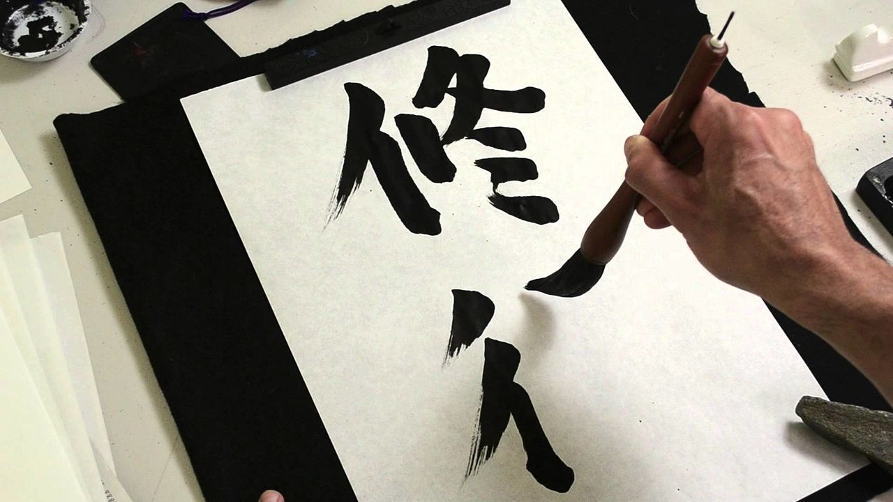
The crafts of Sumi-e and Zen Calligraphy poignantly represent Japan's historical values. They both emphasize the economy of brushstrokes, negative space, and the beauty of imperfection (wabi-sabi). In Sumi-e, all shades and gradients from black to white are delivered with simplicity and sensibility, bringing life into the work and making it a “living” thing.
Zen calligraphy, for its part, is thought by Zen Buddhists to be a method for reaching enlightenment or sanmai. The term Hitsuzendō, meaning “the way of Zen through brush,” refers to a Japanese school of calligraphy that emphasizes balanced proportions and aesthetically pleasing results. The goal here is to represent the vitality and experience of the eternal.
There are countless great works within the Japanese Oeuvre (Sumi-e, Zen Calligraphy & beyond!), but a few that undoubtedly stand as testimonies to the power of limits in the artistic process are the following:
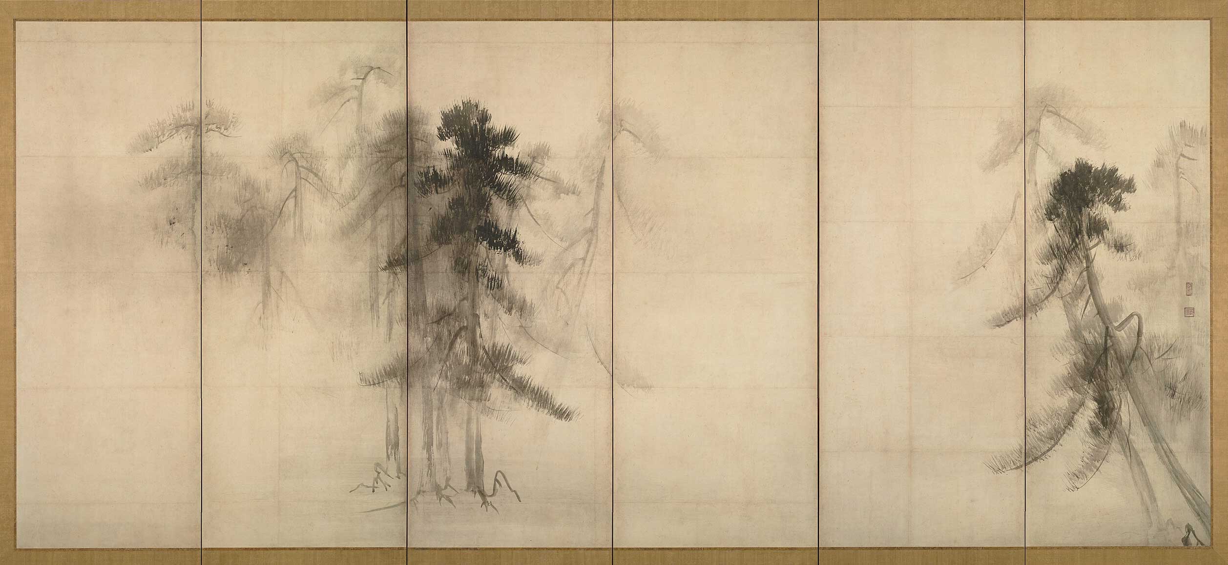
Hasegawa Tohaku- Pine trees
Hasegawa Tohaku was a Kano artist of the 16th century. He was the only artist of his era to paint screens in ink on a feathery dusting of powdered gold. This piece depicts pine trees in the mist and forms a fine example of the Zen Buddhist concept of ma.
Kawanabe Kyosai-Tiger
Kawanabe Kyosai, one of the most renowned artists of the Edo period, was heavily influenced by Tohaku's works. His piece reflects the Kano school technique, rooted in powerful, well-balanced brushstrokes, demonstrating the enduring influence of historical art on contemporary artists.

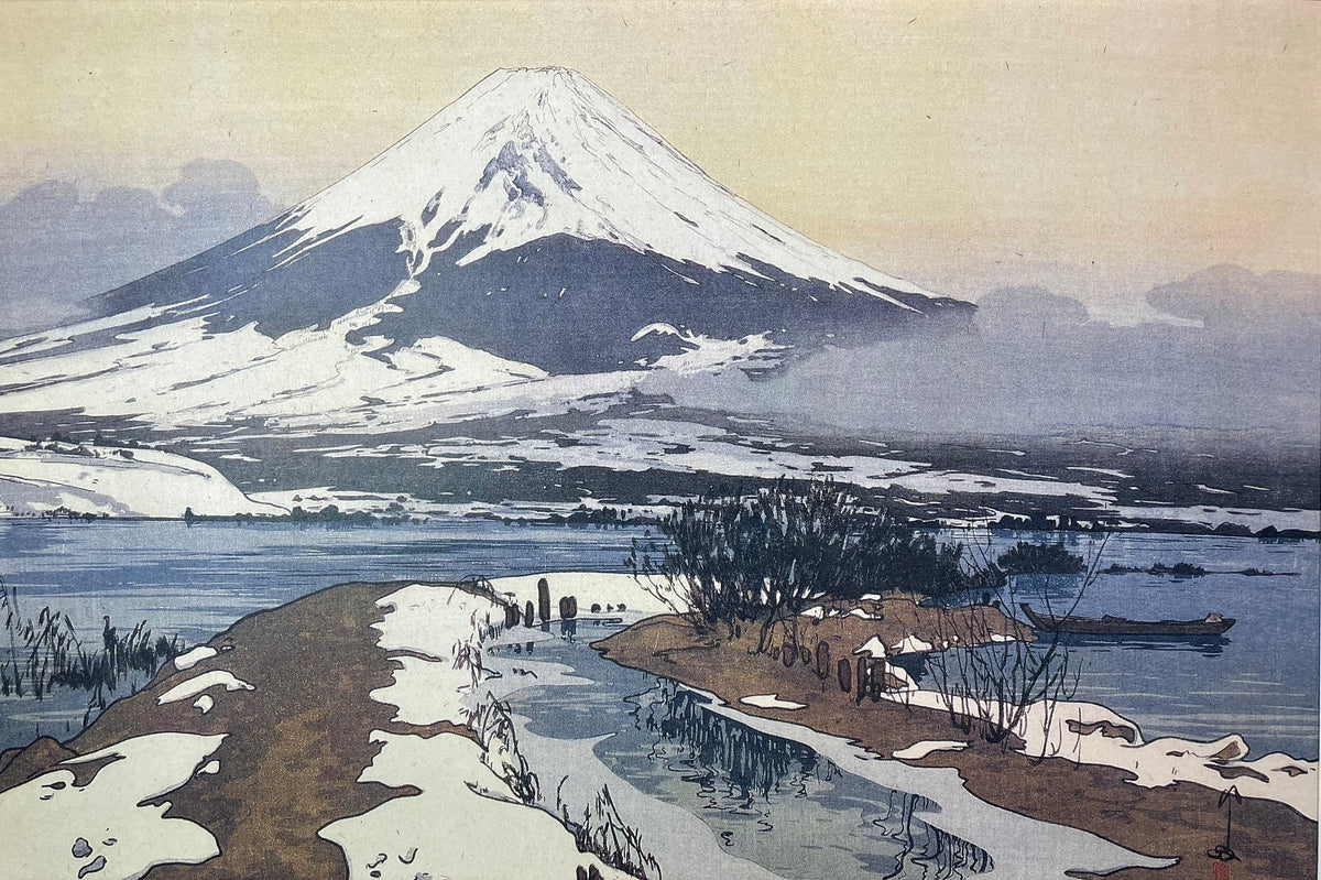
Hiroshi Yoshida-Fuji From Kawaguchi Lake
Hiroshi Yoshida was a leading figure in the Shin-Hanga movement, which came after Japan opened up to the world. He designed, printed, and carved woodblocks for his work. This piece, crafted in 1926, stands as one of the most enduringly recognizable paintings by the premiere landscape artist of his time.
The idea of restricting the palette, tools, and parameters of our art in order to expand our talents and refresh our process can feel contradictory. However, as the Japanese era of relative isolation from the rest of the world demonstrates, honing in on specific values and using the least of things to express the greatest of concepts (enlightenment, anyone?) can create something pure and beautiful that will inspire other artists for generations to come.
By exploring the impacts of Japan’s relative isolation from the rest of the world, we were able to unpack some of the benefits of single-pointed focus on one’s own cultural mores and artistic processes. The reflective space created by stepping back from external noise can distill something essential, what it means to be Japanese, for example. Yet, it also demonstrates how simplifying further beyond national identity can breathe life into our work without overindulgence and excess.
Just as the approach of spring has us craving lighter, brighter foods, leaving behind the heavy, comforting meals of winter, we can also begin to shed the excess in our creative work, clearing away what might be clouding our true expression. This is an invitation to explore how simple, practical choices—when made with intention—can give rise to unexpected beauty and creative clarity.
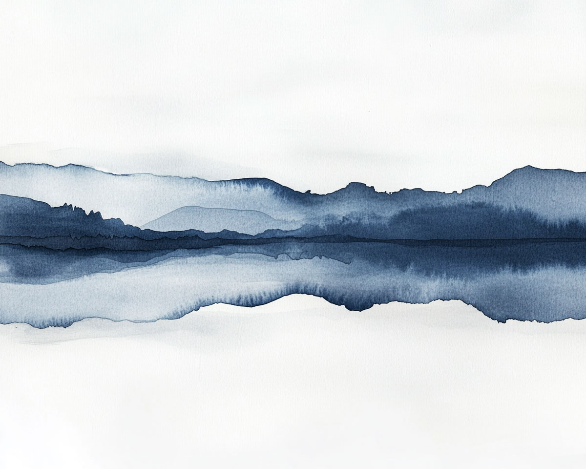
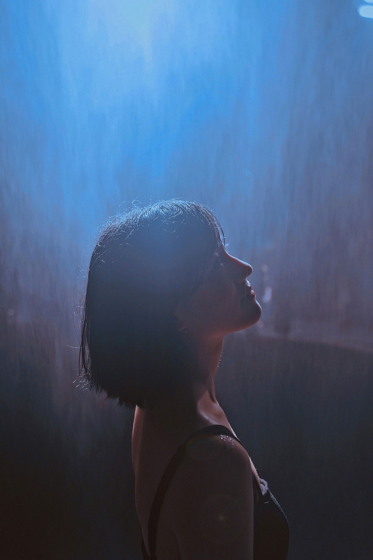
Let’s begin with a thought experiment. Find a completely relaxed position that suits your body’s needs. Once you are situated in a way that doesn’t require concentration or energy to sustain, close your eyes and begin to breathe slowly, focusing on the area around your heart. Some people find that visualizing the color green (representing the heart chakra) helps them deepen their relaxation.
As your sense of peacefulness extends through your body, concentrate energy on sending loving acceptance to the creator in you. Hold that place that brings imagination into the physical domain lightly like a newly hatched bird. When you’re ready, ask that vulnerable, gorgeous maker of art that resides in you what it most craves to bring to life. Take your time, and don’t force this.
When you’re ready, open your eyes and jot down the first words that come to mind. Perhaps sketch a few images that feel burned into your retinas from the exercise. If you take adequate time and foster a nurturing space, you will find the answer to what your work is in service to.
Whether your inner compass nudges you toward painting in a single hue—blue? green? maybe a moody purple —or sends you halfway across the world to rediscover who you are without your familiar landmarks, or even leads you into the quiet of the woods to test what life feels like off-grid and unplugged... the throughline is the same: travel light. Use what’s at hand. Don’t let excess weigh you down or delay your start.
Gather what you need—just the essentials—and begin. Maybe it’s ten minutes. Maybe it turns into ten hours. Either way, show up. Think of it like a daily appointment with your creative self. Not optional. Not “when you feel like it.” You wouldn’t skip a class you’re paying for, right? Give your practice that same respect.
This isn’t about grand gestures or perfect conditions. It’s about building a quiet, steady momentum. Choosing simplicity on purpose. Making space to do the work—without drama, without clutter, and without the usual excuses. That’s where the shift happens. That’s how you get closer.
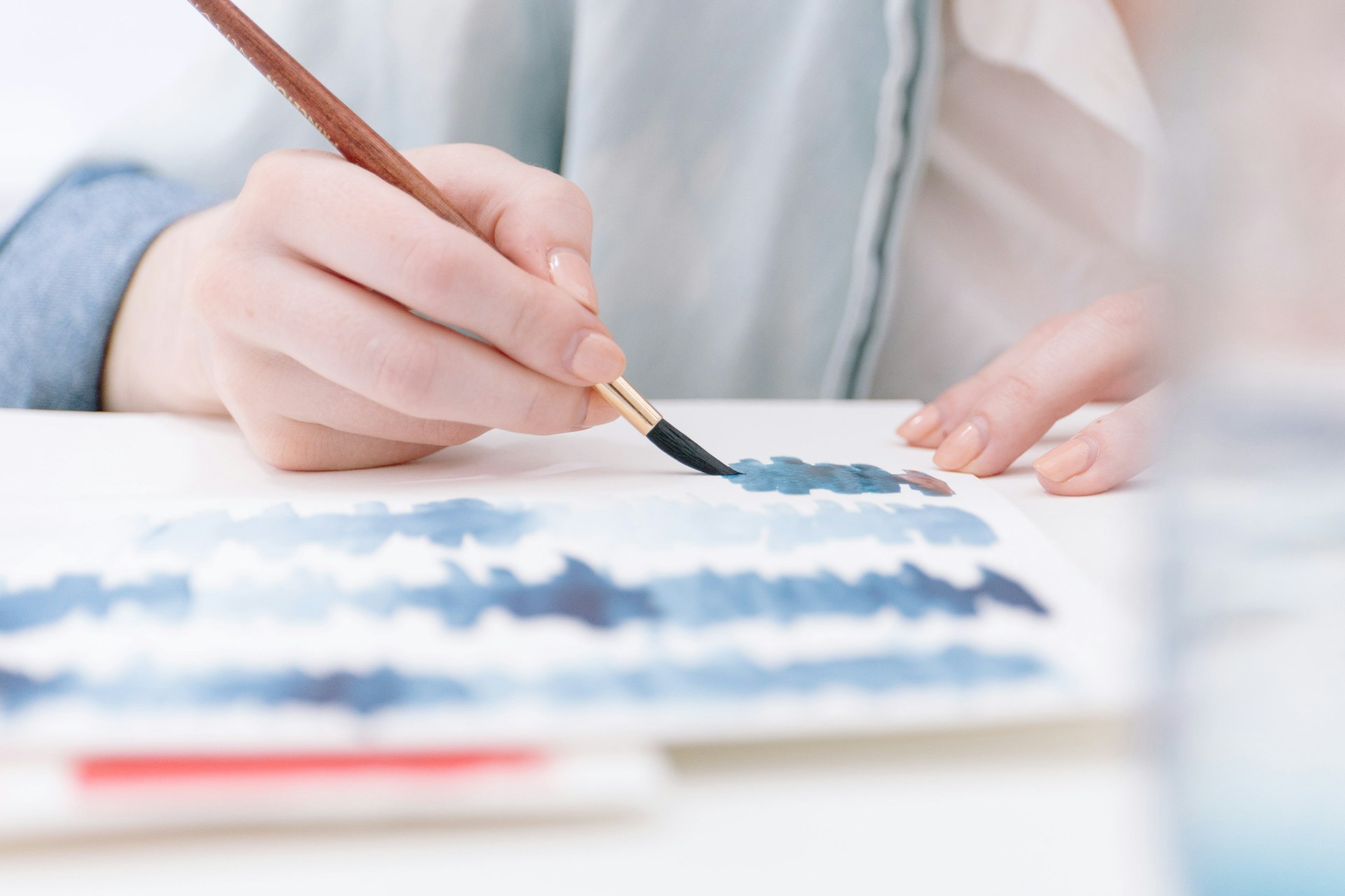
There are moments in life ripe for taking big bites out of everything, throwing spaghetti at the wall of our chosen artistic media, and seeing what sticks. However, there are also moments like the current transition from winter to spring where dimming the lights, canceling the noise, and finding the beauty in a fluidly applied single sweep of an ink brush is what the doctor ordered. What is true for you in your current state?
Be free enough to be truly curious and listen carefully enough to allow the softly spoken inner wisdom to be heard. By embracing minimalism in this moment of seasonal change, we prepare ourselves for the rigor of a world bursting back into life. By simplifying our practice and honing in on breathing the creative flame to life with minimal embellishment, we find that not only are the simple and practical beautiful, but virtually everything is. Enjoy the visual feast, but remember to chew deliberately!
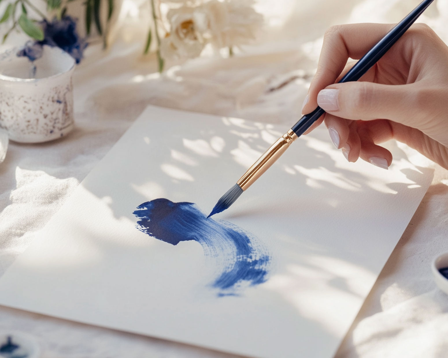
According to the Oxford English Dictionary, the word essential is defined as:
1. Absolutely necessary; extremely important.
2. Fundamental or central to the nature of something.
I’ve been thinking a lot about what is truly essential—both in my art and in my life. Moving overseas has been a whirlwind of change, a beautiful yet overwhelming shift that has forced me to reassess what I hold onto and what I let go of. When everything around me feels new and uncertain, I find myself craving simplicity—not just in my daily life, but in my creative practice as well.
In this season of transition, I’ve made a conscious decision to pare things down. I’ve started working only in blue—a single color, a single focus—allowing it to guide me. There is something freeing about embracing limitation, about trusting that within fewer choices, there is actually more clarity, more depth, more meaning. And that’s where the word essential comes in.
Essential and Essence: Returning to the Core
(let’s geek out about this word for a minute.)
The word essential comes from the Latin essentia, meaning "being" or "what something is made of." It shares a root with the word essence, which speaks to the true nature of a thing—its most fundamental state. These words remind me that when we strip away the excess, we are left with something pure, raw, and honest.
As artists, we are often taught to build, to layer, to add complexity. But sometimes, the real power comes from simplifying—from removing what is unnecessary so that what remains is the truest form of expression. In my own work, I am learning to ask myself:
What is truly essential in this piece?
What can I remove without losing its essence?
How can I say more with less?
This shift in perspective is changing not just how I create, but how I see. It’s teaching me that when we strip away what is non-essential, we make room for clarity, intention, and depth—whether in a painting, in a home, or in the way we move through the world.
So, what happens when you limit your palette? When you focus on just one material, one subject, one mark? Can you find freedom in restriction? Can you uncover the essence of your creativity by letting go of what is not essential?
What is essential to you?
Let’s tap into our creative intuition and do some self-reflective work inspired by our theme. Below you will see our month’s Oracle/Tarot card spread. But fear not, if you are not one drawn to using oracle or tarot cards, no worries, just use the accompanying reflective questions as writing prompts for your journals!
Here’s a three-card oracle card spread designed to tap into your creative intuition and our themes. This spread and its journaling prompts encourage reflection on the artist’s inner wisdom, the magic of inspiration, and the journey of trusting intuition in the creative process.
This card represents the heart of your artistry—the key themes, ideas, or emotions that are calling to you. It may highlight what truly matters in your work and where your focus should be.
This card reveals what is non-essential—what is weighing you down, distracting you, or keeping you stuck. It may be self-doubt, overcomplication, or an attachment to unnecessary details.
This card offers guidance on how to move forward with ease, allowing your creativity to unfold naturally. It might suggest a shift in process, a mindset change, or a new way of working that brings you back to your artistic essence.
The Core: What elements of my art feel the most natural and fulfilling? If I had to define my artistic essence in three words, what would they be?
The Shedding: Where do I tend to overcomplicate my creative process? What distractions, fears, or habits am I ready to let go of?
The Flow: How can I create with more trust and ease? If I simplified my process, palette, or materials, what might emerge?
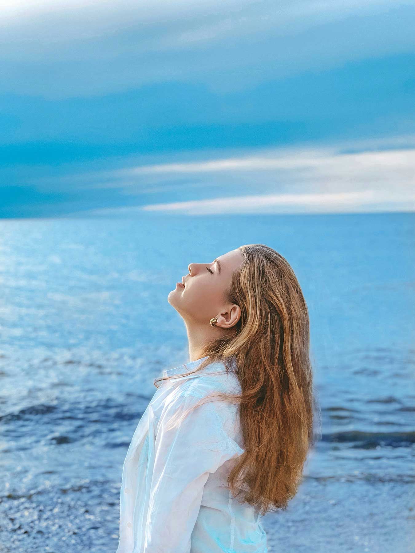
Treat yourself to this wonderful and powerful meditation from one of my favorite meditation creators - Rachel Hillary
Here’s a little more information from Rachel…
This meditation I have created is designed to rock you gently into the beauty of your own inner knowing, wisdom, and power. It contains singing also from me, which are almost like portals of activation which I hope lead you somewhere beautiful. The whole piece will activate your sacred being. All you have to do is relax, listen to my guidance, and join me in harmonizing.
I hope you enjoy, sending you love.
lots of love,
Rachel
Each month we will have a positive affirmation. I recommend you print out this affirmation and put it in your sketchbook or somewhere in your studio. Recite the affirmation out loud each time you show up to create. Saying words aloud is powerful and can begin to re-write some of our own limiting beliefs or calm our fears. Try it now…
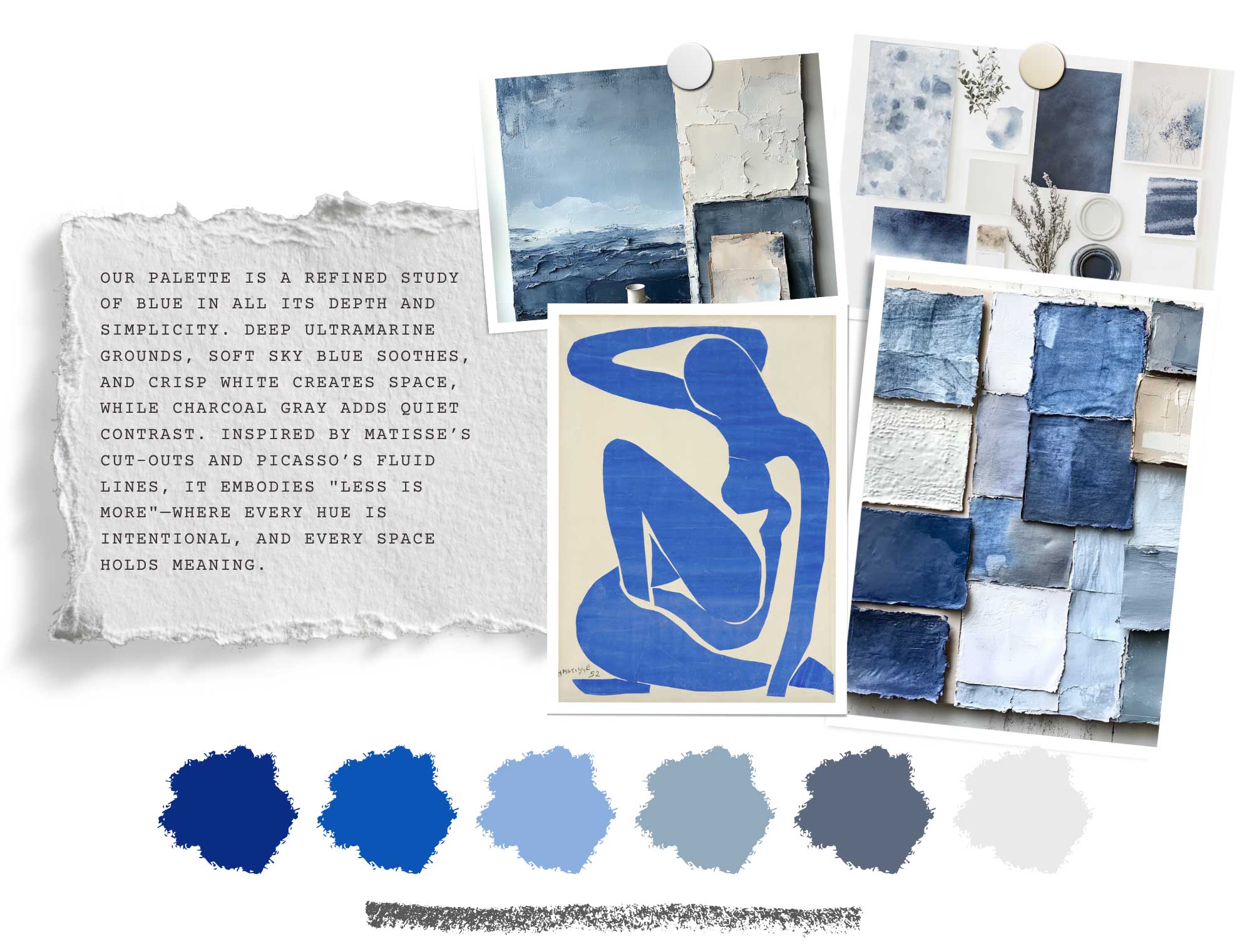
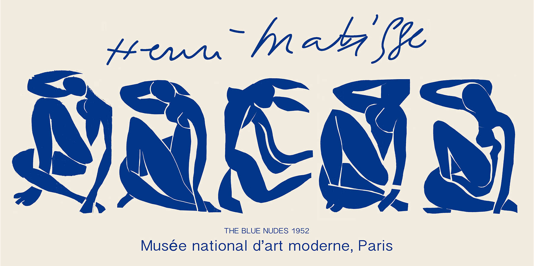
This month, I’m bringing Henri Matisse and Pablo Picasso into the pages of Studioworks Journal once again. (We first studied Picasso in Issue #10 and Matisee in Issue #18). While both artists created vast and diverse bodies of work, we’re honing in on two of their most strikingly simple yet profoundly expressive techniques—Matisse’s paper cut-outs and Picasso’s one-line drawings. Rooted in fluidity, restraint, and essence, these works embody the spirit of this issue’s theme: "Less is More."
Both artists understood that true expression doesn’t require excess—it lives in the essential, in the fluidity of a single line or the depth of a singular hue. Matisse’s Blue Nudes and paper cut-outs strip form down to its most vital shapes, while Picasso’s one-line drawings capture entire figures in a single, unbroken motion—proving that restraint can be the key to revelation.
This palette draws from that same spirit—deep ultramarine, soft sky blues, and crisp white, punctuated by the inky fluidity of charcoal and indigo linework. It reflects both bold simplicity and quiet depth, inviting us to trust that within limitation, there is endless possibility. Just as Matisse carved space with scissors and Picasso let his hand move without hesitation, this issue is an exploration of paring down to the essential—allowing clarity, movement, and meaning to emerge.
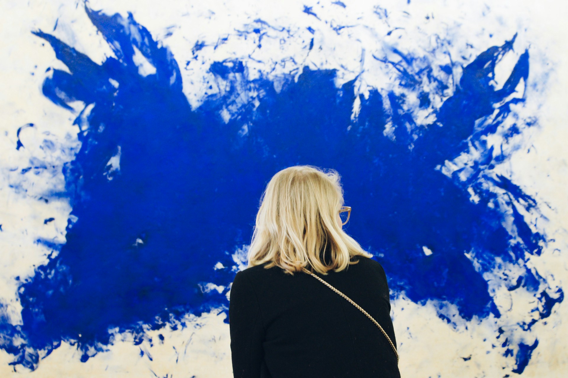
There’s something about blue. It’s the color of vastness, of depth, of something greater than ourselves. It’s the ocean stretching beyond the horizon, the endless sky shifting with the light. It’s the color we look to when we need space, when we need to breathe.
Lately, I’ve found myself drawn to it more and more. Maybe it’s because life feels so full of change, and blue offers a kind of stillness. Maybe it’s because, in its infinite shades, it holds both serenity and intensity, quiet and power. Or maybe it’s because blue, at its core, is a paradox—it can be soft or bold, melancholic or expansive, grounding or transcendent.
Artists have always understood this. Yves Klein, obsessed with the depth of ultramarine, once said, “Blue has no dimensions. It is beyond dimensions.” And isn’t that the truth? Blue can be infinite or intimate. It’s the color of shadow and light, of longing and clarity. It doesn’t ask to be noticed, but once you see it, you can’t look away.
In art, blue carries weight. During his Blue Period, Picasso turned to deep, muted blues to express sorrow, loneliness, and the raw edges of the human experience. In contrast, Matisse used brilliant blues in his cut-outs to radiate energy, joy, and movement. Kandinsky saw blue as spiritual, a color that pulled us inward, away from the material world and toward something ethereal.
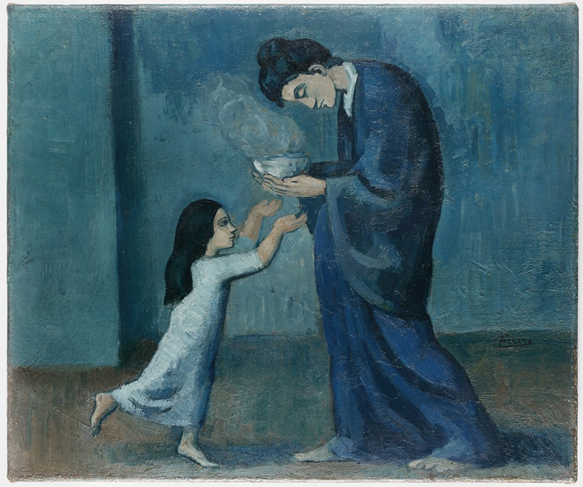
The Soup
By Pablo Picasso, 1902
And then, of course, there’s the science of it. Blue is known to slow the heart rate, calm the nervous system, and create a sense of openness. It’s why we’re instinctively drawn to the sea when we need to clear our minds. It’s why a blue sky can make us feel like anything is possible.
For me, working only in blue has been an act of simplification, a way to filter out the noise and let emotion lead. Without the distraction of too many colors, there’s space to explore form, value, and movement in a different way. Blue is structure and freedom, a single hue that contains multitudes.
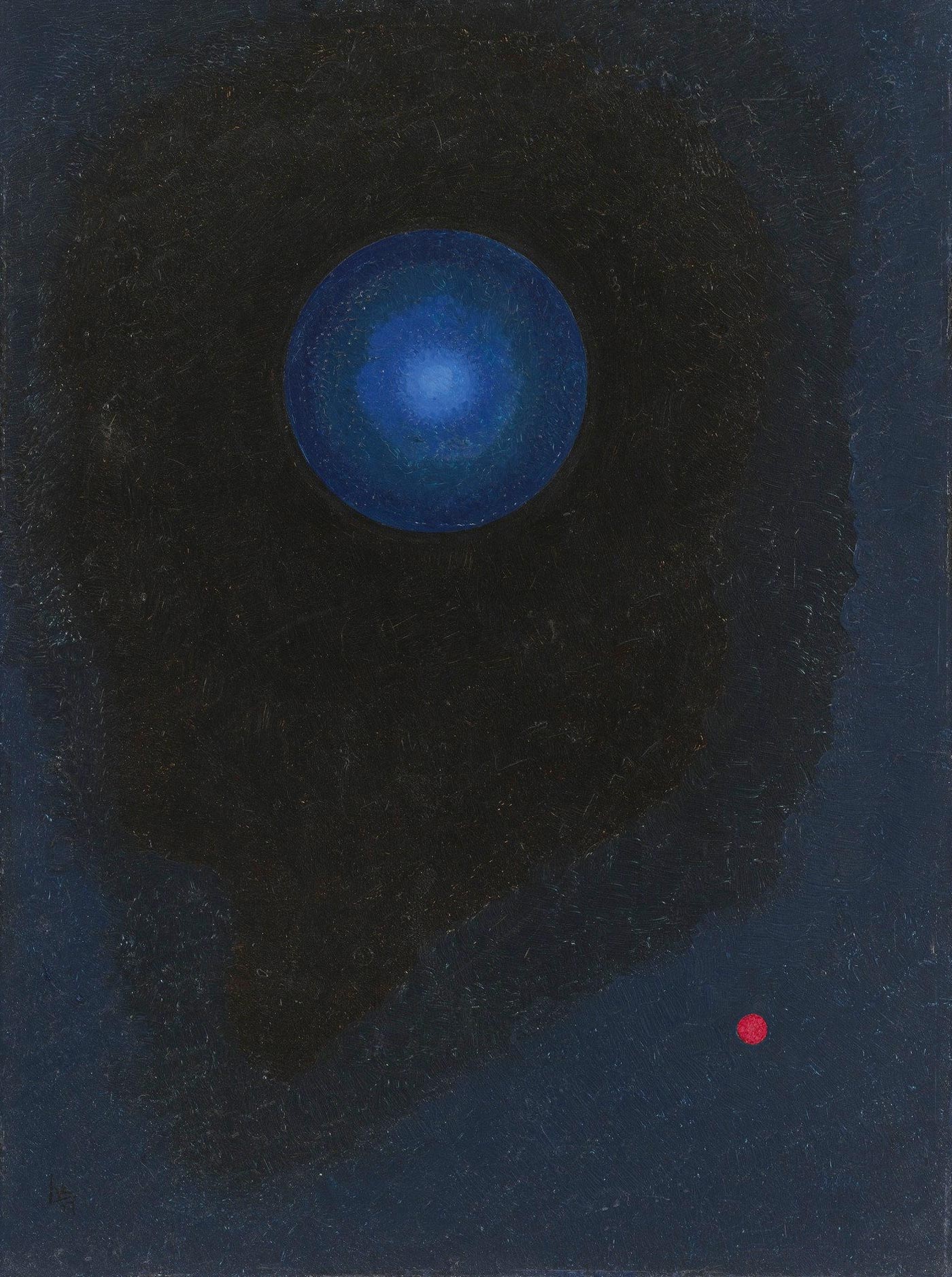
Blue
By Wassily Kandinsky, 1927
So why blue? Because it’s both an anchor and an escape. Because it’s everywhere and yet never the same. Because in a world that often feels overwhelming, blue reminds us to slow down, breathe, and just be.
And maybe, for now, that’s enough.
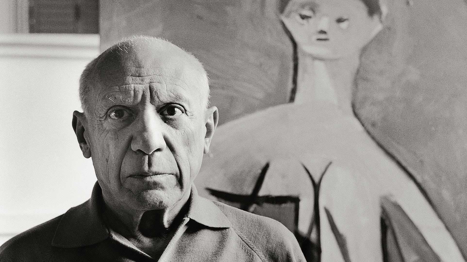
Some of the most powerful works of art are not those filled with detail but those that strip away the unnecessary, revealing a purity of form and expression. Henri Matisse and Pablo Picasso, two titans of modern art, both arrived at a place in their creative journeys where they pursued extreme simplicity—Matisse through his paper cut-outs and Picasso through his one-line drawings. These works, created in the later stages of their lives, were not the result of a lack of ability but rather a mastery of restraint, a deep understanding that the essence of an artwork could be conveyed in a single gesture or shape.
But what led them to this way of working? And how did the world respond?
Pablo Picasso, known for constantly reinventing his style, had spent decades mastering realism, Cubism, and abstraction. By the time he reached his later years, he had nothing left to prove—his artistic language had become so refined that he could convey a figure, an animal, or an emotion in just one continuous line.
This approach was not simply a stylistic choice—it was a culmination of a lifetime of artistic exploration. His one-line drawings, often created in the 1940s and beyond, were about capturing the purest essence of a subject with no hesitation, no revision. Each piece was a performance of sorts, a fluid, instinctual movement that required absolute confidence. Picasso himself described drawing as being like "writing pictures," emphasizing its immediacy and connection to intuition.
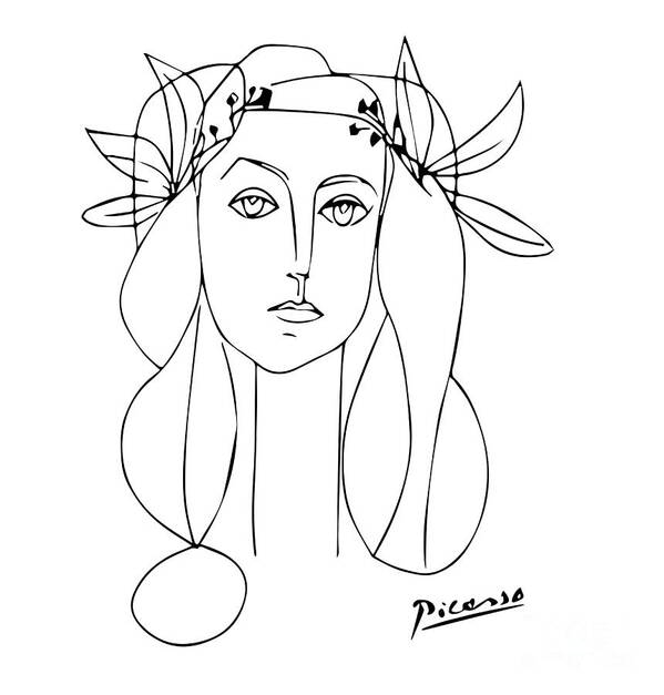
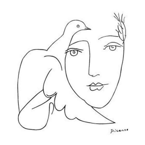
Picasso’s fascination with the power of a single line can be traced back to multiple influences:
By reducing his drawings to their simplest form, Picasso was not just distilling decades of skill into a single gesture—he was challenging the idea that complexity equates to importance.
Picasso’s one-line drawings were initially met with mixed reactions. Some critics saw them as a playful departure from his earlier, more intricate works, while others recognized them as an ultimate testament to his genius. Today, they are revered for their effortless elegance, proving that sometimes, the simplest mark can hold the most meaning.
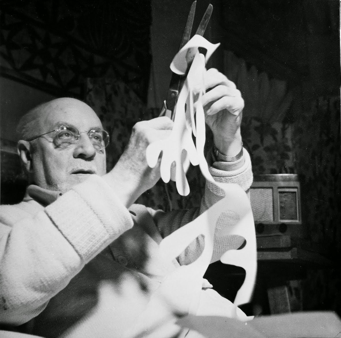
In the final decade of his life, Henri Matisse found himself unable to paint in the way he once had. Illness and surgery had left him wheelchair-bound, his body weakened but his creative spirit still burning. Rather than see this as a limitation, Matisse reinvented his process, creating what he called "drawing with scissors."
His paper cut-outs, created primarily between 1943 and 1954, were made by cutting organic, fluid shapes from painted paper and arranging them into dynamic compositions. These works were bold, modern, and unapologetically simple, yet they carried the same vitality and joy that had always defined Matisse’s art.
Why Did Matisse Turn to Cut-Outs?
Matisse once said, "An artist should never be a prisoner of himself, prisoner of a style, prisoner of a reputation." His cut-outs were proof of his own evolution—a radical new way of creating that extended the boundaries of what art could be.
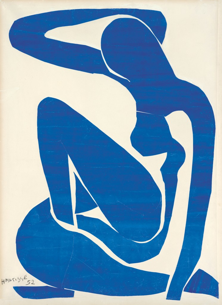
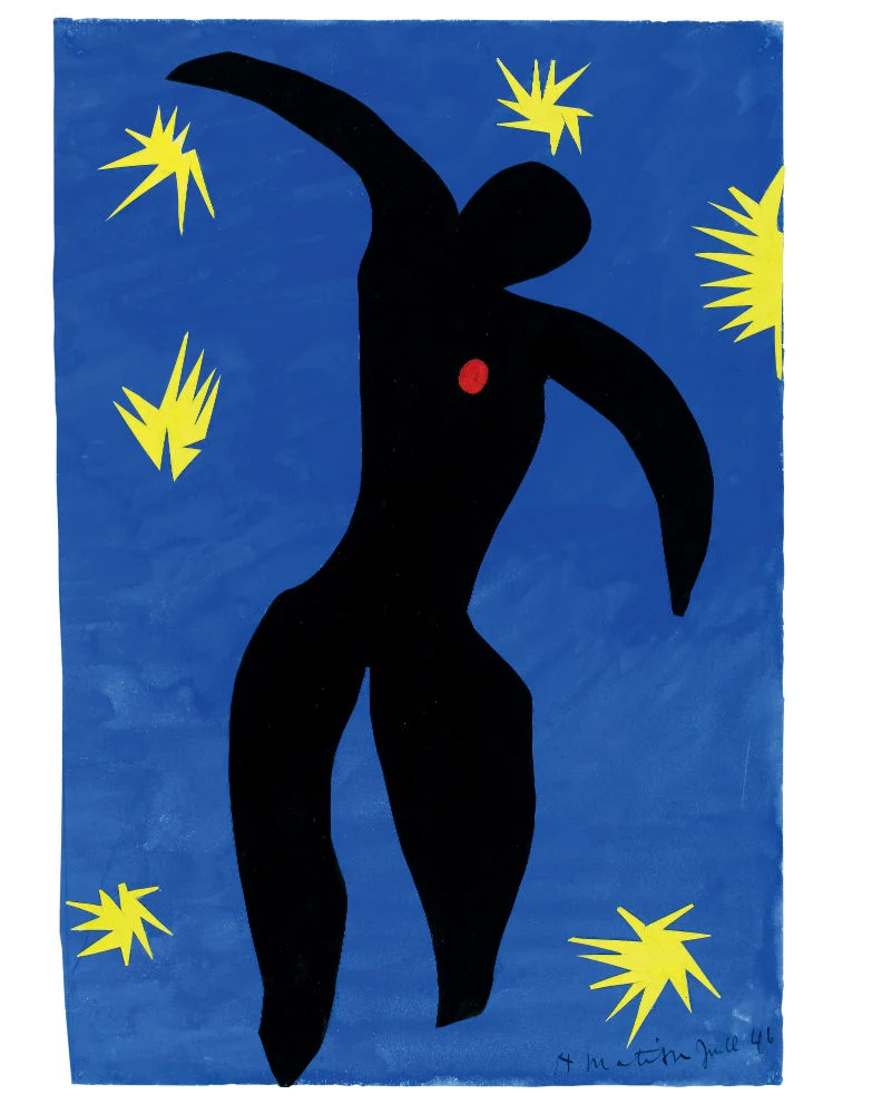
At first, Matisse’s cut-outs were seen as a radical departure from his past work. Some critics viewed them as mere "decorative" pieces, too childlike or too simple. But over time, they were recognized as groundbreaking—not just in their beauty, but in their profound ability to communicate through color and shape alone.
Today, Matisse’s cut-outs are considered some of the most joyful, expressive, and influential works of modern art, proving that even in his final years, he was still innovating.
Both Picasso’s one-line drawings and Matisse’s cut-outs share a common lesson:
- Mastery is knowing what to leave out.
- Simplicity does not mean lack of depth—it means clarity.
- True creativity is about finding new ways to express, no matter the limitations.
These two artists, in the twilight of their careers, did not complicate their work—they refined it. They let go of excess, trusting that the most essential marks were the ones that mattered.
In a world that often tells us more is better, Picasso and Matisse remind us that sometimes, the most powerful thing we can do is let go.
Choose a subject—your own face, a plant, a hand, or an object in your space. Using only a single, continuous line, draw the entire form without lifting your pen or pencil.
Challenge Yourself To:
Reflection: What did you learn about trusting the line? Did the limitation free you or frustrate you? How does this method change the way you see form?
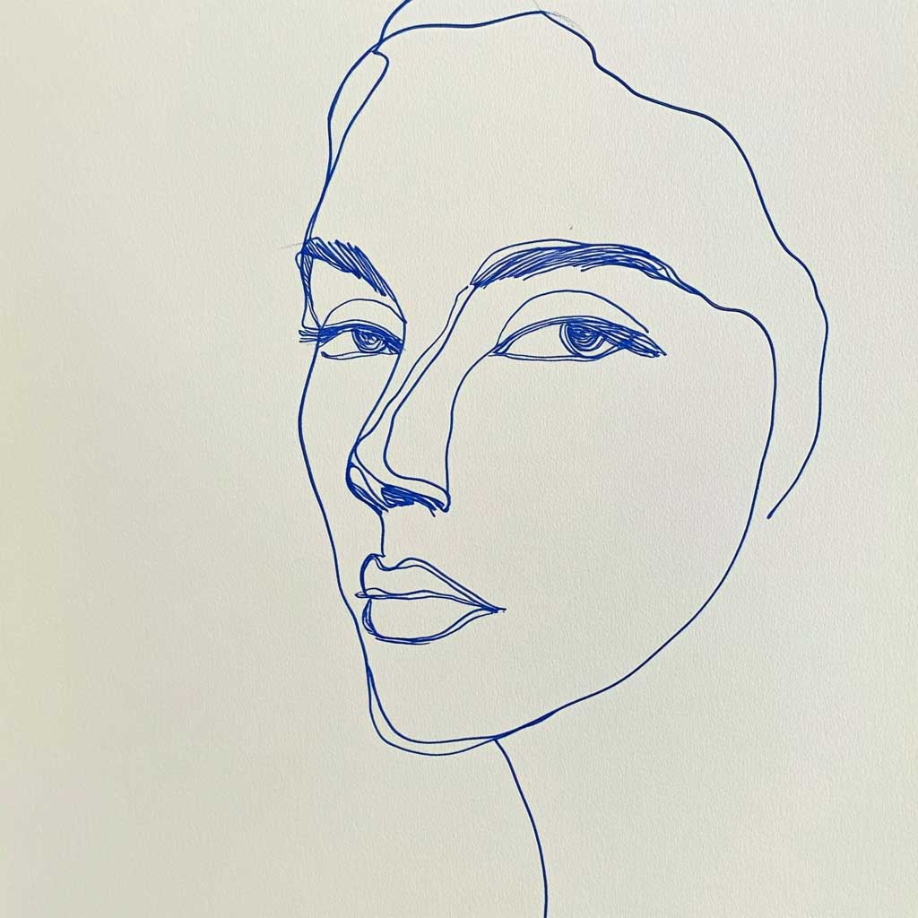
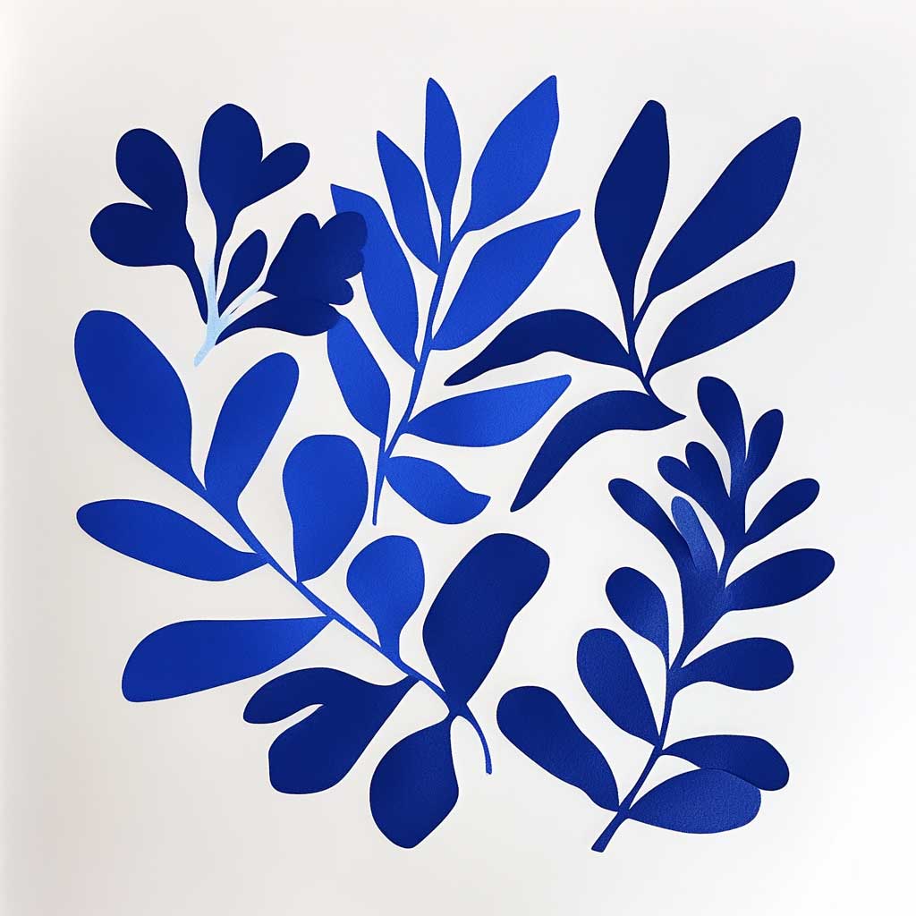
Instead of drawing, cut out abstract shapes from painted blue paper and arrange them into a composition. Think about movement, balance, and simplicity.
Challenge Yourself To:
Reflection: How does working with scissors instead of a brush or pen change your process? Did simplifying to pure shape and color reveal anything about your artistic instincts?
Choose a subject (a landscape, a figure, a face, a still life) and create a monochromatic sketch using only blue and white. Explore value, contrast, and mood with a limited palette. Personally, I was inspired to do a portrait with a hint of the blue and white azulejo tiles I see all over Portugal. If you want to do something similar to this, see the reference image below.
Challenge Yourself To:
Reflection: How did limiting your color choices shift your approach? Did you notice how value and composition became more important without multiple colors to rely on?
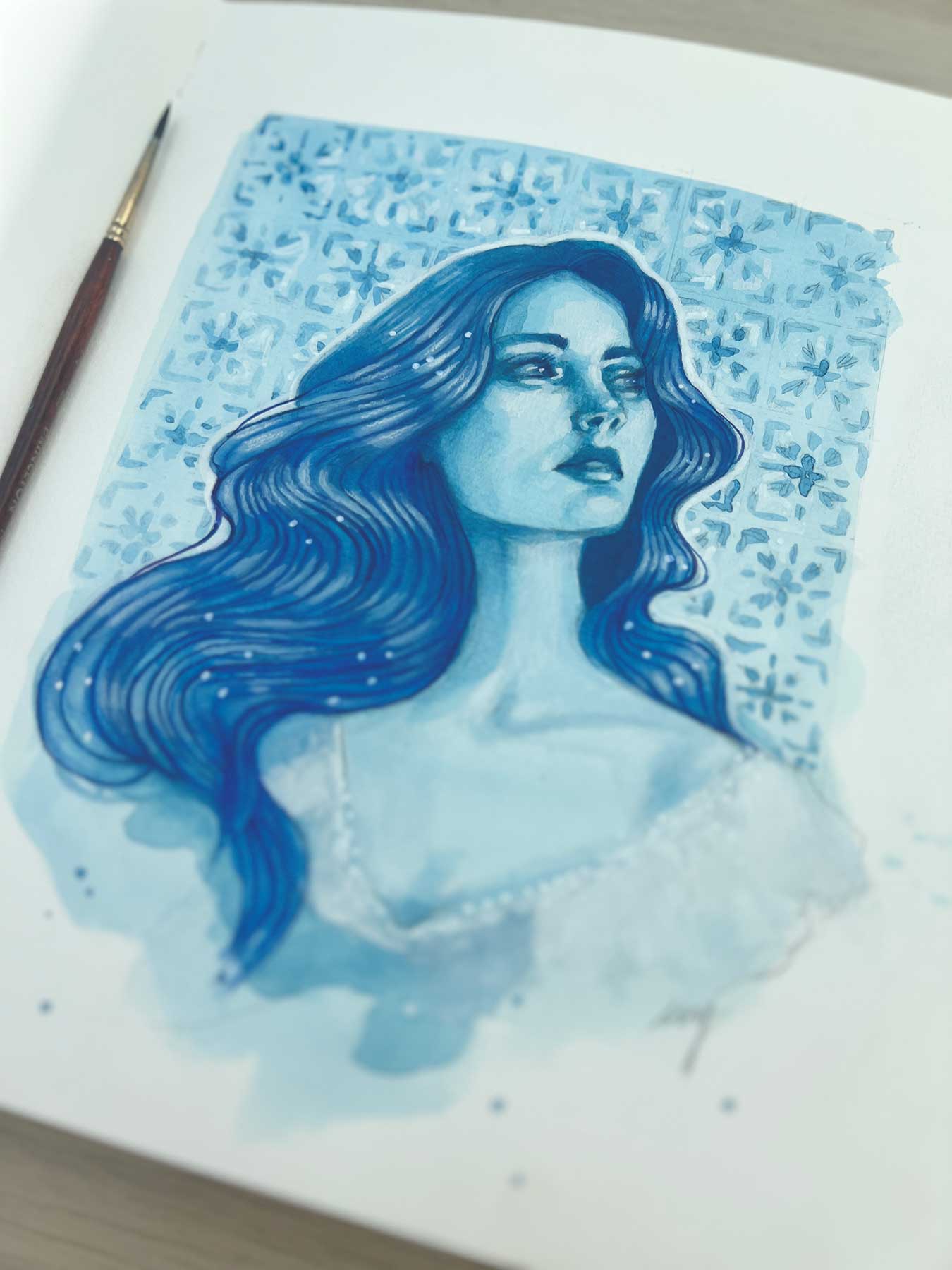
In this fun lesson, Ivy invites you to create a whimsical, abstracted face inspired by the bold shapes and playful spirit of Picasso—with her own unique twist.
You’ll focus on simplifying shapes, playing with values of blue, and building rhythm through lines and forms. It’s a great exercise in letting go of perfection and embracing creative freedom.
Have fun and see where your imagination takes you!
You can also listen to this month’s issue of the Studioworks journal. I find I love listening to books, podcasts and music while I draw, paint or go on a long walk. Enjoy.
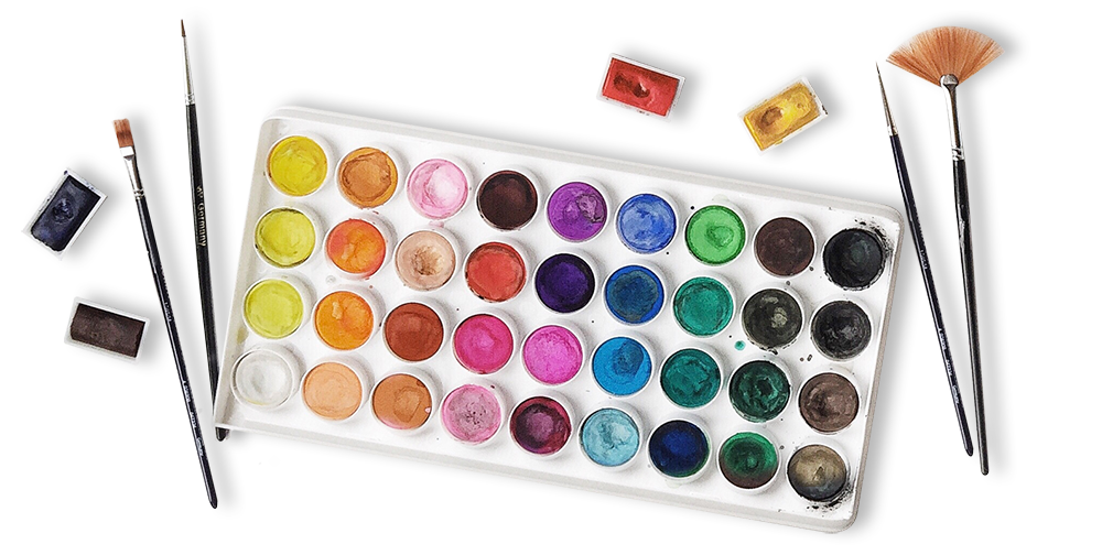
One of my favorite things to do is to curate inspiration. From Pinterest boards to books, resources, playlists and more - I love to share anything that might facilitate learning, expansion, and sparks of curiosity! Being an artist, we naturally crave these things so here are some of this month’s picks from me to you.
I had so much fun curating this list. I hope you enjoy!!
Here are just a few of our fantastic classes! I highly recommend checking them out if you haven’t already. Enjoy!