Dear creative friends,
Welcome to Issue No. 69 of the StudioWorks Journal! As always, I’m super grateful you are here with me, and I’m excited to share this month’s theme with you. This month, we are diving into the vibrant and dynamic world of complementary colors.
Complementary colors, when placed next to each other, create visual excitement and energy, making them a powerful tool in any artist’s palette. But what can we learn and be inspired by when we play with these striking color combinations?
By exploring complementary colors, we can discover new ways to enhance the depth, contrast, and vibrancy of our artwork. These color pairs – red and green, blue and orange, yellow and purple – offer endless possibilities for creating eye-catching compositions and dramatic effects.
How can we use these color combos to express our emotions, tell our stories, and bring our visions to life? How can we push the boundaries of our creativity by experimenting with the interplay of these dynamic hues?
Let’s look at this together. Let’s embrace the boldness of complementary colors and see where they take us on our creative journeys. I can’t wait to see the incredible art you’ll create this month!
xo,

So you may be wondering, where do I start? To that, I say, wherever feels right to you. Each month we will have a theme, a creative affirmation, a power word, a color palette, sketchbook exercises, art projects, articles, recommended reading, and access to wonderful inspiration and resources. I want you to think of this as a delicious new magazine, you know the ones you occasionally splurge on, with soft, velvety pages, beautiful images, and inspiring content!
Each issue will invite you to explore your creative practice in whichever way works for you. Experience each issue at your own pace. Take what resonates with you and put the rest aside for another time.
Grab a cup of something lovely and dive in.
Color adds so much to the lived experience, from the sultry richness of a red rose to the crystalline turquoise of a tropical sea. Our language reflects how, as humans, we commonly hold vision as our highest sense and color as the purveyor of brightness and diversity in our world. Take blue, for example. There are at least 32 words to describe its shades, from Aquamarine to Wedgewood, demonstrating how important the nuances of color are to us.
As artists, unless we favor monochrome, color is the font from which our creations spring. We want our work to exude brilliance like that moment in The Wizard of Oz when Dorothy steps from black and white into color, and the magic of the place is decidedly not Kansas anymore. To achieve this departure from the ordinary, it helps to understand how color behaves, especially those colors on opposite sides of the wheel. Join me in exploring the evolution of complementary colors, unearthing how artists have harnessed their power to achieve excellence.
Theories of color aren’t exactly new. Ancient Egypt and Greece both developed ideas on the topic derived from their belief in a connection between colors and physical elements. Aristotle is credited with describing colors as celestial rays from the gods, which convey a spectrum from light to dark based on the elements of earth, water, air, and fire. His views prevailed for about 2,000 years until Isaac Newton began playing around with crystals in the 1660s.
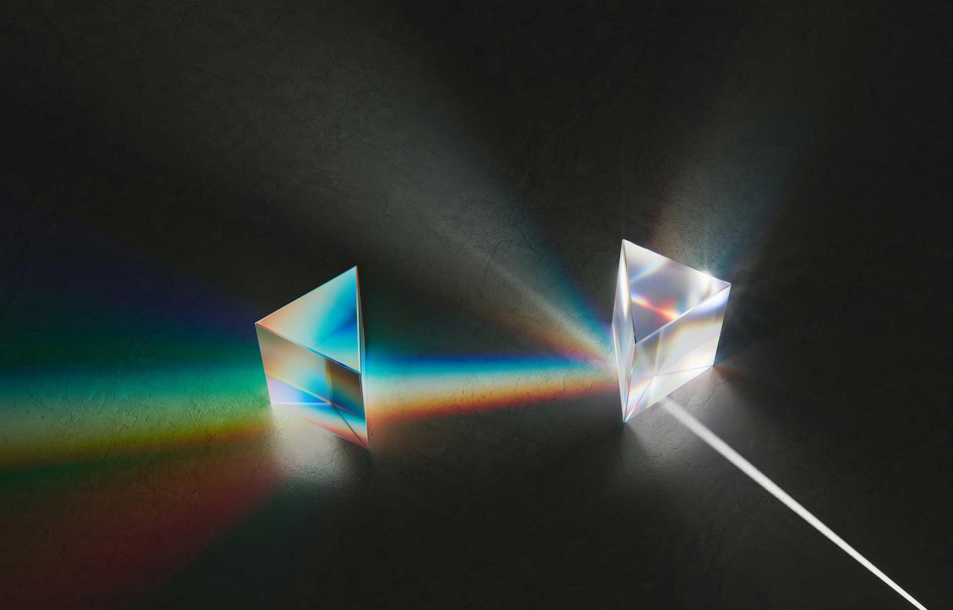
Using sunlight and prisms, Newton demonstrated the visible spectrum of seven colors, which, when combined, generate white light. He created the first color wheel by wrapping this spectrum around itself, forming a circle. His discoveries unleashed breakthroughs across the sciences, from optics to chemistry, and encouraged the study of color in nature.
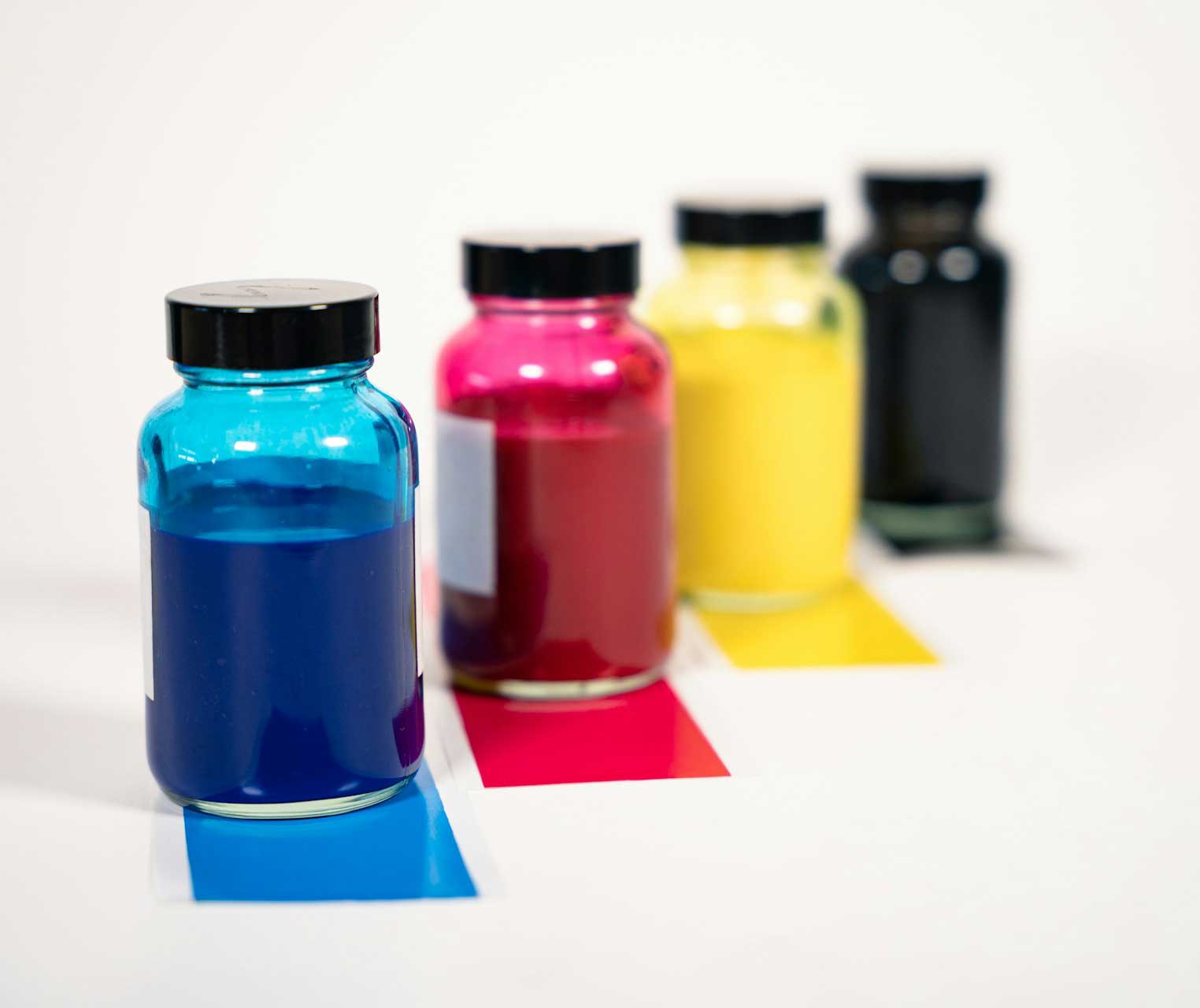
One such breakthrough came via the efforts of J. C. Le Blon. His book, Coloritto; or The Harmony of Colouring in Painting, is both the foundation for modern color printing and the first documented source that distinguishes between material colors and those generated by light or what came to be known as additive and subtractive color systems. Things that create color by overlapping different wavelengths of light, like rainbows and computer screens, are additive and have their primary colors red, blue, and green, and when combined, make white. In contrast, things made of solid materials with specific chemical compositions, like paints, dyes, and pigments, when combined, will reflect fewer wavelengths and hence are subtractive; their primary colors are blue, red, and yellow, and when combined, they make black.
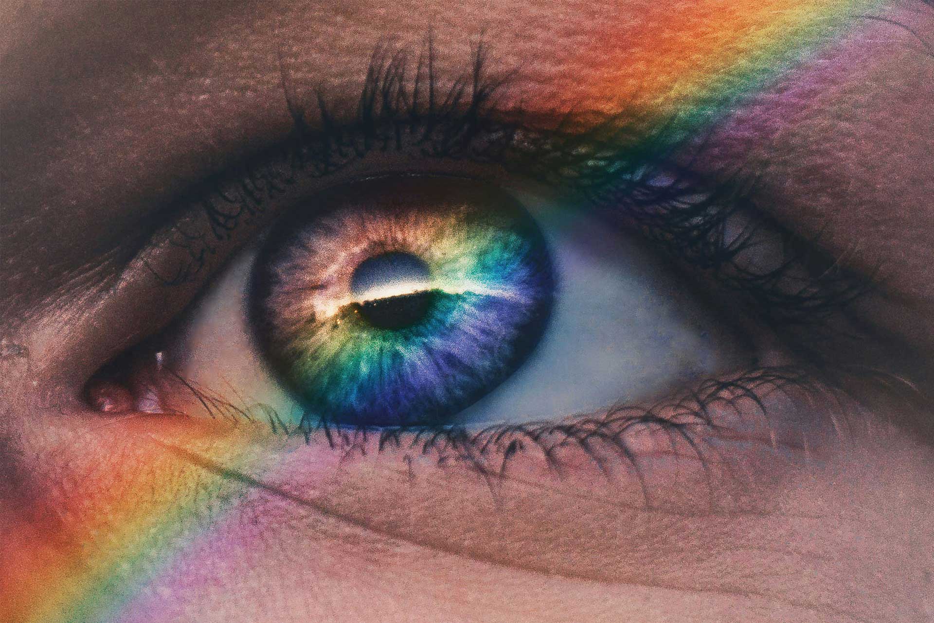
Despite these leaps in progress, it wasn’t until 1801 that the physiological basis for how we see color was understood via the trichromatic theory proposed by the physician Thomas Young. This theory describes how we see the primary colors of red, blue, and green as the result of three distinct cones in the retina of the human eye. Thus, all visible colors are a combination of these three. Secondary colors are combinations of the primary colors. Finally, tertiary colors are those near each other on the color wheel, such as yellow-orange and green-blue.
In 1810, Johann Wolfgang von Goethe, taking umbrage with the purely physical interpretation of color that Newtonian optics presented, took it upon himself to demonstrate how the subjective experience of each viewer altered their perception of color. He delivered the first systematic study of the physiological effects of color in his seminal work Theory of Colors. For him, the primary colors were yellow and blue, and out of their opposition, red was born. He found the most impactful colors to be those opposite each other on the wheel: the complementary colors.
A color’s complement can be obtained by taking a primary color, red, for example, and then combining the other two primary colors to find its opposite, in this case, green. For Goethe, these diametrically opposed colors ‘demanded’ each other, enhancing the qualities of each. Though his ideas were highly personal and often ran counter to science, Goethe’s work was popular, influencing many famous artists, including J. M. W. Turner.
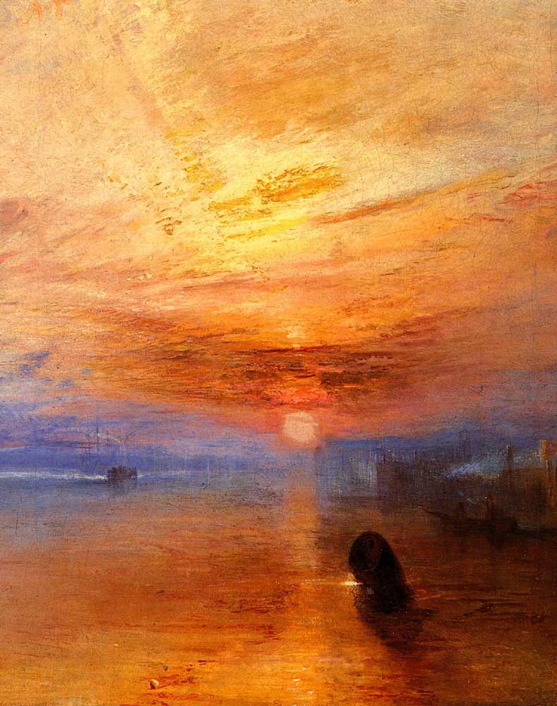
Fighting Temeraire Tugged to Last Berth to be Broken Up
By JMW Turner, 1838
Artists have always appreciated the power of complementary colors, and their use spans the centuries. From Egyptian and Byzantium mosaics with their symbolic divergences to Leonardo Da Vinci’s use of color studies to enhance realism with a little Caravaggio and Rubens's dramatic and emotional contrasts thrown in for good measure. However, the advancement of scientific color theory in the 19th century opened new avenues of exploration and allowed for greater precision in achieving the intended effects of combining opposites.
Among those influenced by the newly available knowledge were the Impressionists, the Post-Impressionists, and the Fauvists. For example, the Impressionists were the first to play with the fact that the shadow of a color will contain its complementary color. A beautiful example is Claude Monet’s Woman Seated on a Bench in which the sunlight (yellow) casts a violet shadow below her.
Another iconic example is Vincent Van Gogh's liberal use of blue and orange to convey energy and emotion in his enduringly beloved piece, Starry Night. Or, in pieces such as Blue Mountain by the king of the Abstract, Wassily Kandinsky, the emphasis on the “spiritual vibrations” of color, recognizing the universality of warm/light and cool/dark.
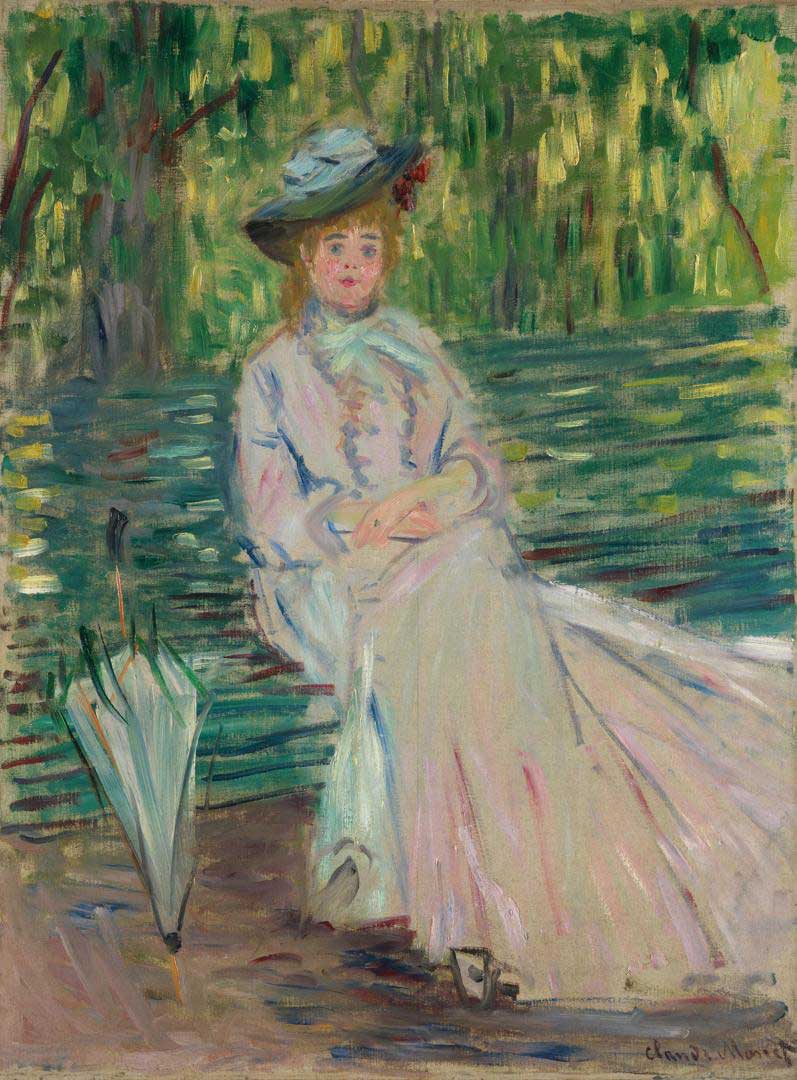
Woman Seated on a Bench
By Claude Monet, 1874
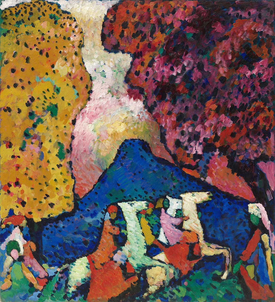
Blue Mountain
By Wassily Kandinsky, 1908-09
Color is a rich and essential part of our lives; art is an excellent place to express this relationship. As our scientific understanding of how the world works expands over time, so too does our relationship with color and the nature of how we express it.
History shows a long-standing and deep appreciation for the particular power of complementary colors. In the current era, we only have to look to advertising to see how ubiquitous complementary colors are in digital art, strategically used to draw us in visually and emotionally. Point being, whether technically understood or not, opposites have been attracting across millennia, and the trend shows no sign of waning any time soon.
In many areas of life, two things acting alone are exponentially less impactful than when working together. In art, complementary colors are amongst the strongest examples of this truth. Provided, of course, you know how to employ them to their best effect.
With complementary colors, as with any good friends, the wrong interactions can lead to volcanic disruptions that are just as discordant as they were once harmonic. It's essential to maintain good boundaries in order to have the kind of relationships we desire on our canvas and in life.
Join me in mapping out a way to approach complementary colors that will instill our work with vibrant harmony, creating balance and unity that brings out the best in each color.
A tool is only helpful if its user knows how it works. You don’t reach for a hammer when digging a garden bed or a shovel when building a birdhouse. Likewise, working effectively with complementary colors means understanding how they function. This knowledge empowers you, the artist, to take control of your artistic process.
First of all, get comfortable with identifying them. They’re most simply derived via traditional color theory. Still, no matter if you’re looking at Munsell’s color wheel or the CYM system, complementary colors will be in positions opposite of one another on the wheel. For example, using traditional color theory (RBY), you’ll have the pairs red and green, blue and orange, and yellow and purple. Each primary color finds its complement by combining the other two primaries (hence, yellow’s complementary color is blue + red = purple).
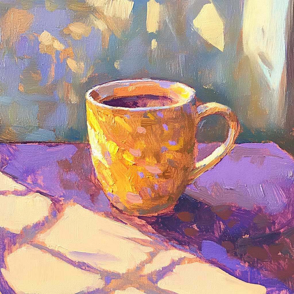
Once you’re comfortable finding our alluring opposites, you’ll want to be clear on their behavior. Remember those boundaries? If you set up your friend’s best joke, both of your charisma points go up. However, if you talk over them, neither of you looks good.
Something similar is true of complementary colors. When they are supportively placed side by side, they make each other appear much brighter, enhancing the good looks of both. However, when blended, they make something on the grey scale. If you do this intentionally, the results can be a muted version of the color you’re using, but done haphazardly, the effect can be unappealingly muddy.
Another valuable thing to remember about complementary colors is that the light of one has its opposite as its shadow. Using this knowledge can help you be more deliberate about who takes center stage, who is in the background, and how the proper alignment makes them both shine.
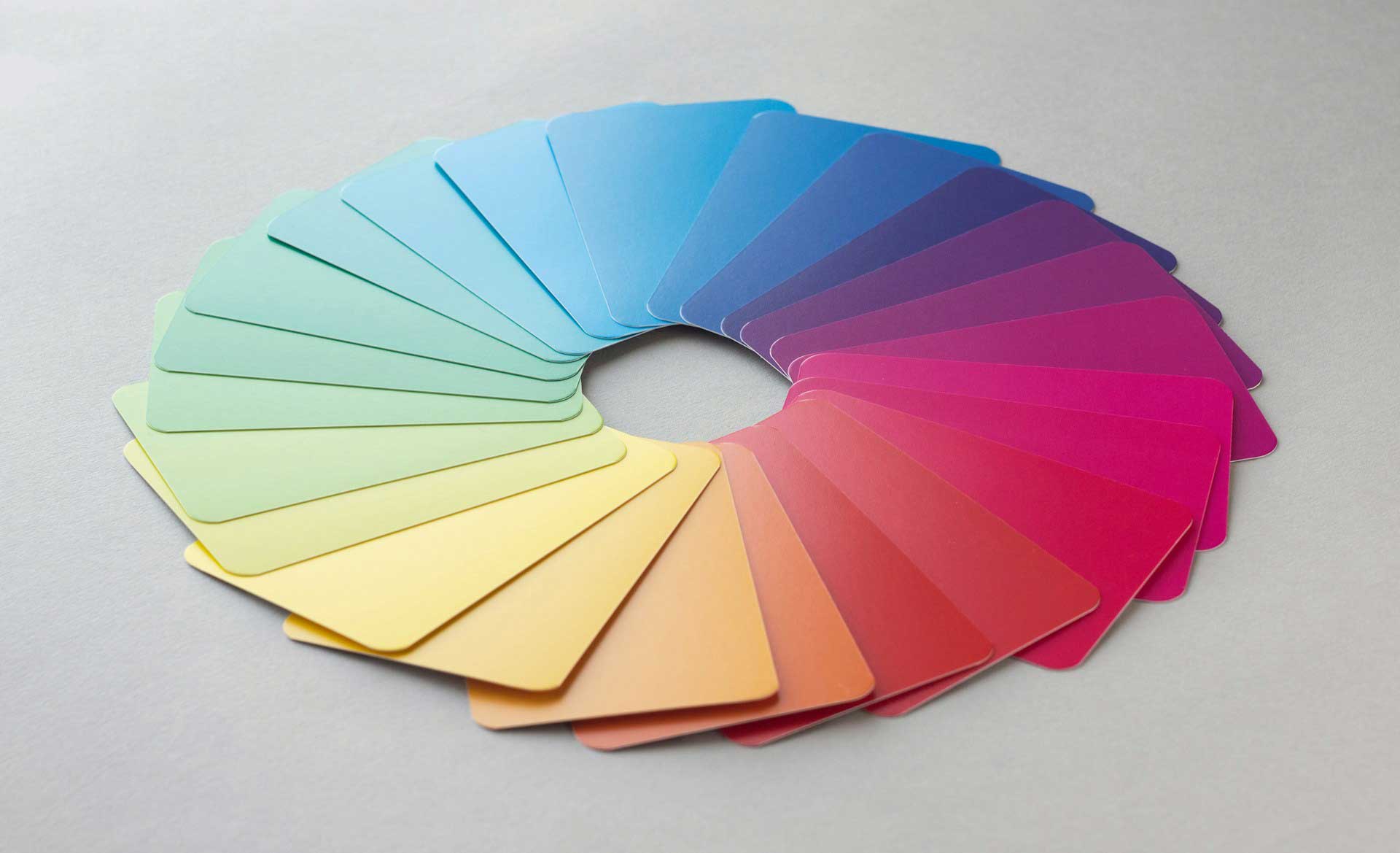
A fun place to start playing with complementary colors is to look at different color wheels and identify the opposites, noticing the many variations and possibilities. Reflect on what colors you’re most drawn to and consider why. What associations come up for you?
For some, it might be a color combination that reminds them of their favorite cartoon character as a child. Another might be reminded of the sign in front of the Italian restaurant where they met their match. Yet another might recall the first painting they ever fell in love with.
The point is that colors carry meanings, and what those meanings are will be highly personal. However, at the same time, particular color combinations carry universal appeal. By combining these two things, the personally alluring and the widely appreciated, in your choice of palette, you can make art that resonates deeply with others, adding depth and value to your creations. In addition, leaning into the symbolism inherent in color while playing with the physical effects on our perception of combining complementary colors will make your piece more impactful aesthetically and emotionally.
As always, there are no wrong choices here. Embrace the adventure of art. Get out there in nature or hunker down in your cozy, happy place. Play with hot reds or cool greens; do what feels right. It doesn’t matter where you choose to begin; it’s bound to be a colorful journey
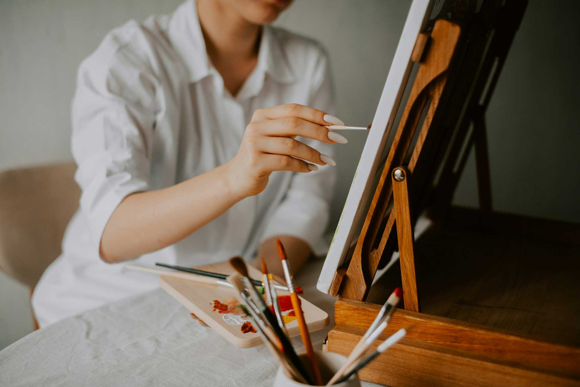
Complementary colors have always been favored by artists from Da Vinci to Rousseau, with some show-stopping tapestries and virtually every sports logo ever thrown in for good measure. Think of the iconic red and green of Christmas, the striking blue and orange of a sunset, or the classic red and green of a stoplight. Combining opposites makes images pop, taps emotions, and satisfies some profound yet mysterious aspects of what humans find alluring.
By consciously incorporating complementary colors into our work, we embark on a journey both universal and deeply personal. In so doing, we create a vibrant harmony that elevates what we make, transforming our art and ourselves in the process.
The dictionary definition of Duality is:
Duality (noun):
1. The quality or condition of being dual; having two parts, often with opposite meanings or effects.
2. An instance of opposition or contrast between two concepts or two aspects of something; a dualism.
How does this word relate to our theme?
When we work with complementary colors, we find ourselves deeply engaged with the concept of duality in our art. Here’s how this duality inspires our creative process:
Oppositional Pairs: Complementary colors, sitting opposite each other on the color wheel, embody the essence of duality. These pairs, like red and green or blue and orange, are strikingly different yet perfectly balanced. This contrast inspires us to explore the harmony that arises from opposition.
Balance and Contrast: The magic of complementary colors lies in their ability to create a visual balance through contrast. The stark difference between the colors enhances their intensity, bringing a dynamic equilibrium to our compositions. This balance through opposition fuels our creativity, pushing us to find harmony in contrast.
Dynamic Interaction: The interaction between complementary colors is where duality truly comes alive. When we place these colors side by side, they enhance each other’s vibrancy, creating a dynamic interplay that adds depth and energy to our work. This dynamic duality captivates us, drawing our eyes and engaging our imagination.
Emotional and Psychological Impact: Complementary colors evoke contrasting emotions, reflecting the psychological duality within us all. Pairing a warm color like red with a cool color like green can evoke feelings of excitement and calmness simultaneously. This rich emotional experience inspires us to explore the full spectrum of human emotion in our art.
Light and Shadow: Using complementary colors to depict light and shadow adds a dramatic dimension to our work. This duality of light and dark, captured through color, brings our paintings to life, enhancing their realism and impact. It’s a reminder that light and shadow, like complementary colors, coexist and enhance each other.
Symbolic Representation: Complementary colors symbolize the dualities of life: joy and sorrow, love and envy, life and death. By using these pairs, we can convey complex symbolic meanings and explore the profound dual nature of our experiences. This symbolic duality enriches our art, allowing us to delve deeper into the human condition.
As we paint, we are continually inspired by the duality of complementary colors. They remind us that opposites can coexist harmoniously, that contrast can create balance, and that through exploring these dualities, we can capture the depth and beauty of the world around us. Embracing this duality in our work not only enhances our artistic expression but also deepens our connection to the universal truths that these colors represent.
Let’s tap into our creative intuition and do some self-reflective journaling inspired by our theme word - Duality.
Set Up a Comfortable Space:
Create a Relaxing Atmosphere:
Write Freely and Honestly:
Spend Time Reflecting:
1. Balancing Structure and Spontaneity:
2 .Navigating Success and Failure:
3. Expressing Joy and Sorrow in Art:
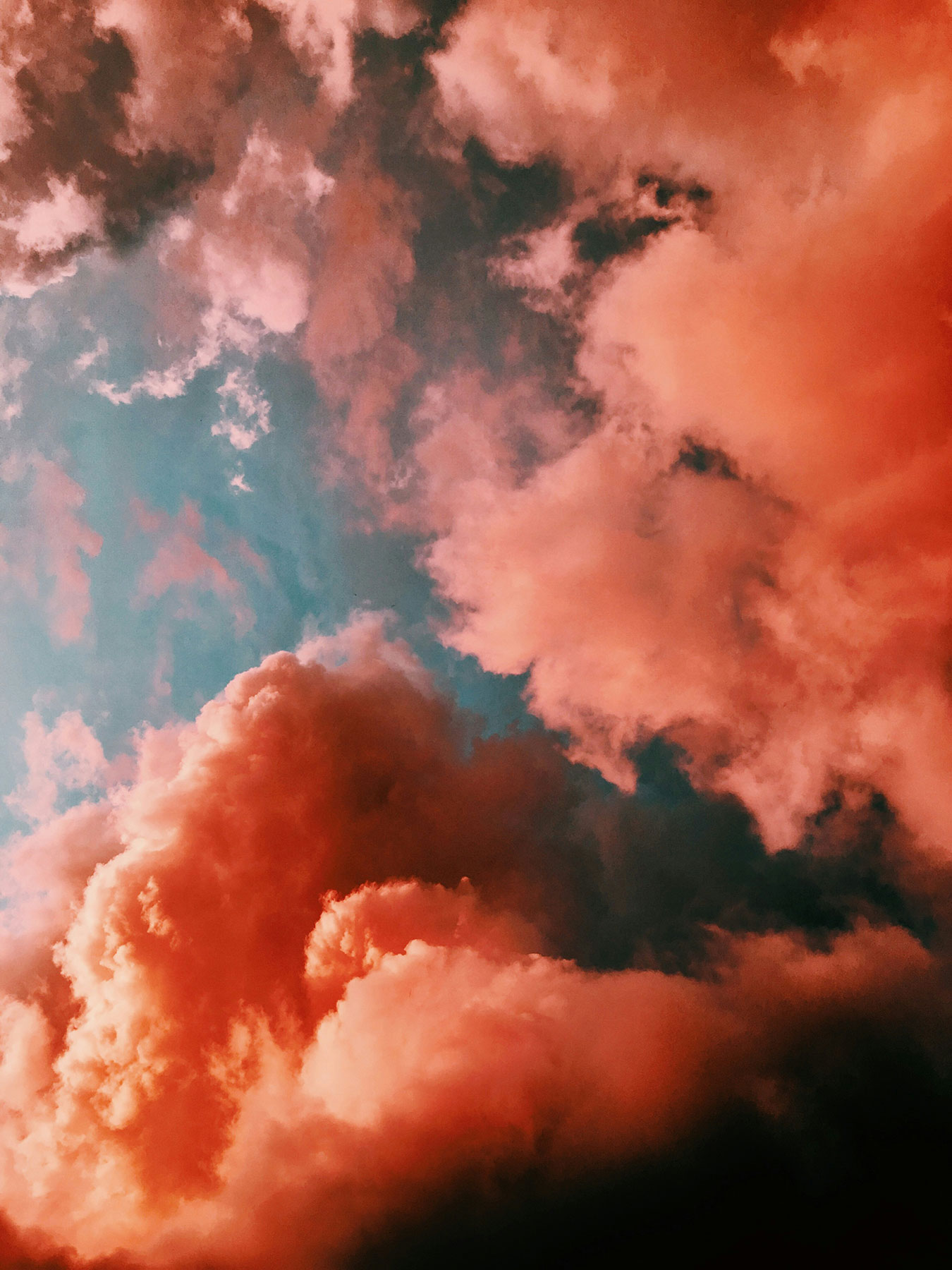
This is a short but effective guided practice that leads you on a gentle visualisation to clear and enhance the radiance of your auric field, lighten your energy field and create a healing and comforting space. Together, we call upon healing and clearing bright light from our crown, and then upon pink and purple clouds of love in from our hearts, before ending by choosing our image of auric protection moving forward. The music used in this track includes a deep droning 'om' vibration. Allow this to wash over you, connecting you to universal intelligence and love. It also contains the frequency of 432, said to align us more with our hearts, and to universal intelligence and divine guidance. Get back in touch with yourself, your spirit, your love.
I hope you enjoy.
lots of love,
Rachel
Each month we will have a positive affirmation. I recommend you print out this affirmation and put it in your sketchbook or somewhere in your studio. Recite the affirmation out loud each time you show up to create. Saying words aloud is powerful and can begin to re-write some of our own limiting beliefs or calm our fears. Try it now…
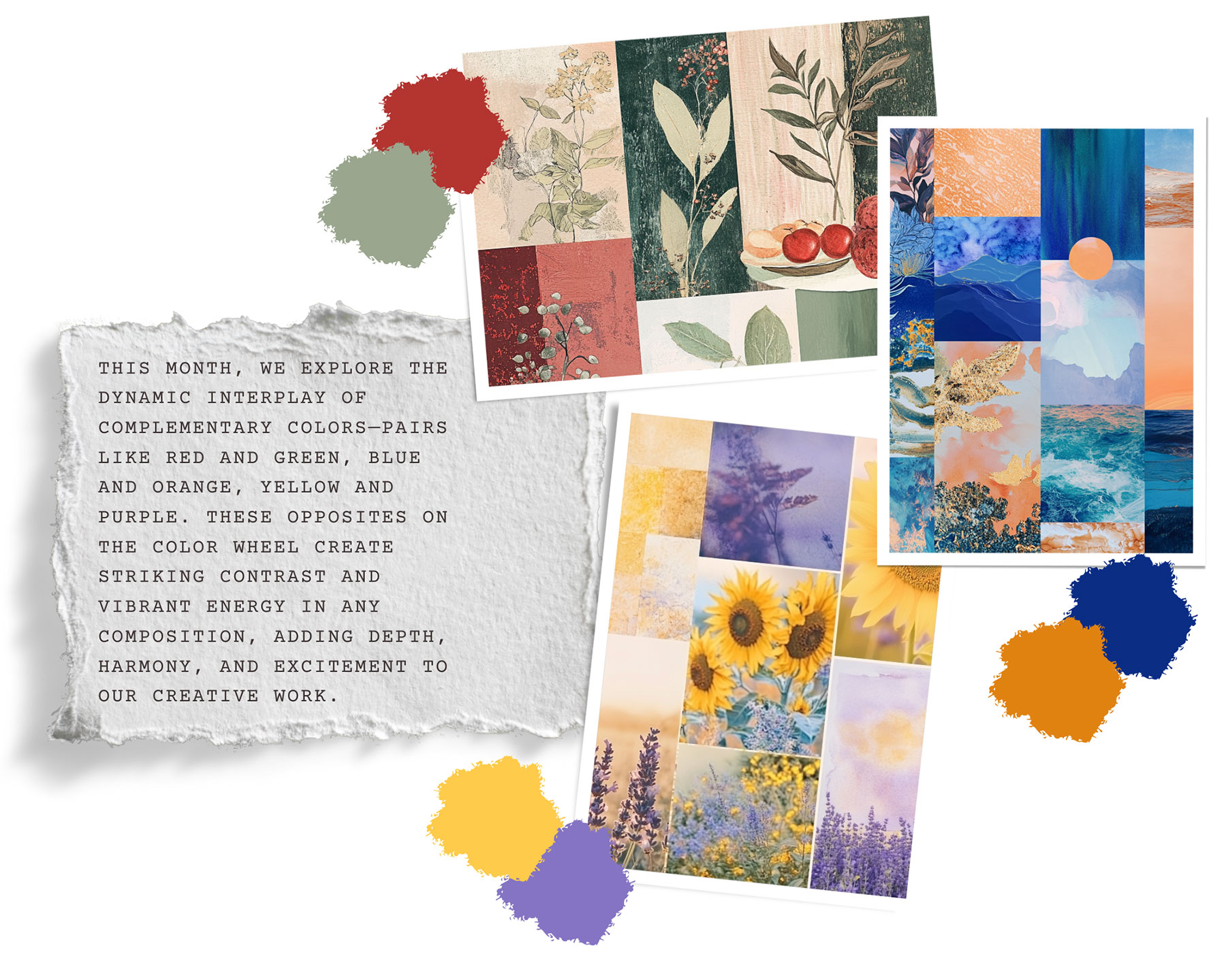
This month, we dive into the vibrant and captivating world of complementary colors. Using complementary colors can add depth, balance, and energy to our artwork. The interplay of these contrasting colors will inspire us to explore new dimensions in our creativity, pushing the boundaries of our artistic expression. As we experiment with these pairs, we’ll discover how the harmony of opposites can lead to striking and impactful compositions.
This month, instead of focusing on just one master artist, we will be diving into impactful works from art history that brilliantly illustrate the power of complementary colors.
We will explore how renowned artists throughout history have harnessed the magic of complementary colors to create some of their most iconic works.
Get ready to be inspired by the creative genius of artists like Claude Monet, Henri Matisse, Edvard Munch, and many more. As we delve into their masterpieces, we’ll uncover the secrets behind their use of complementary colors and discover how we can apply these techniques to our own artistic endeavors.
Sarah Affonso, born Sara Sancha Afonso on May 13, 1899, in Lisbon, is one of Portugal's most cherished artists, known for her vibrant works that capture the essence of Portuguese rural life and folk traditions. Affonso's artistic journey began at a young age, showing an early talent that would eventually lead her to the Escola de Belas-Artes in Lisbon. There, she honed her skills under the tutelage of prominent artists, immersing herself in the study of drawing and painting.
In 1924, Affonso's life and career took a significant turn when she moved to Paris. The vibrant art scene of Montparnasse exposed her to the avant-garde movements of the time, profoundly influencing her style. However, despite the allure of Parisian modernism, Affonso remained deeply connected to her Portuguese roots, which continued to inspire her work.
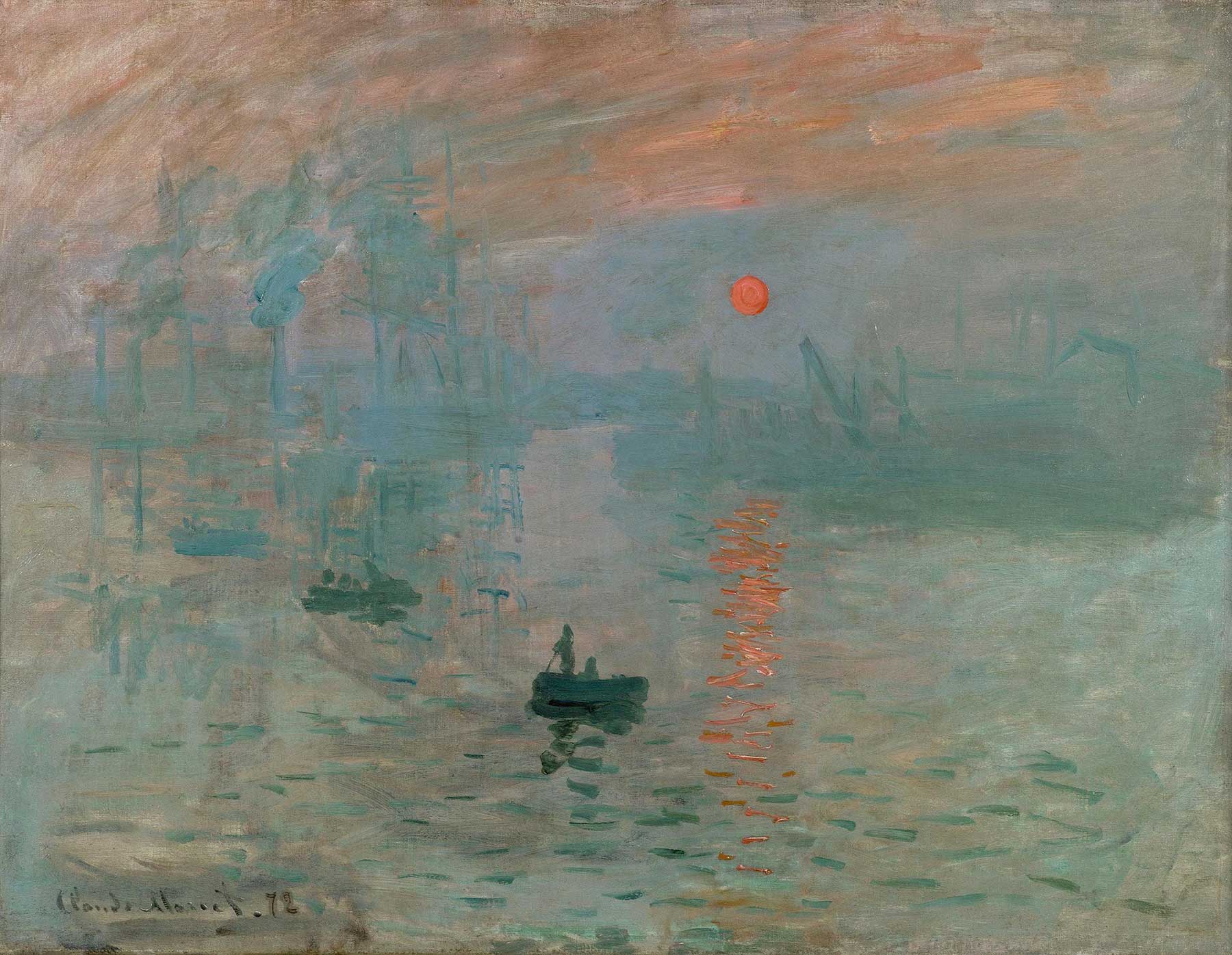
Impression, Sunrise
By Claude Monet, 1872
In this piece by Claude Monet, the artist masterfully uses the complementary colors of blue and orange to create a striking and atmospheric scene. The cool blue tones dominate the canvas, depicting the early morning mist over the harbor, while the vibrant orange of the rising sun and its reflection on the water provides a focal point. This use of complementary colors not only highlights the tranquility of the blue-hued surroundings but also emphasizes the warmth and energy of the sunrise. The contrast between the calm blues and the intense orange enhances the painting's visual impact, capturing the ephemeral beauty of the moment and showcasing Monet's innovative approach to color and light
Here, the artist masterfully uses the complementary colors of blue and orange to create a dynamic composition. The ballerina's vibrant orange tutu contrasts with the cool blue tones in the background and the lady's fan, drawing the viewer's eye to the central figure. The surrounding ballerinas in blue tutus with touches of orange further amplify this complementary color scheme, adding cohesion and vibrancy to the scene. Degas' use of these colors brings lively energy and emotional intensity to the artwork.
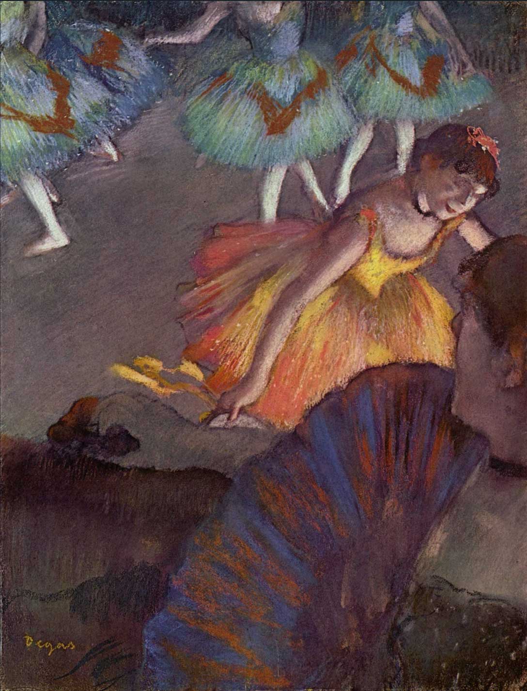
Ballerina and Lady with Fan
By Edgar Degas, 1885
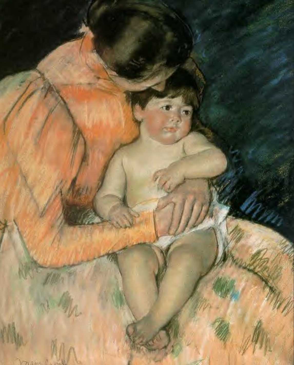
By Mary Cassatt, 1890
In Mary Cassatt's "Mother and Child," the artist effectively uses the complementary colors of blue and orange to create a harmonious and emotionally resonant composition. The mother's orange dress contrasts beautifully with the blue background, drawing the viewer's eye to the central figures. This use of complementary colors not only highlights the intimate bond between mother and child but also adds depth and warmth to the scene. The orange tones in the mother's dress suggest warmth and affection, while the cool blue background provides a serene and calming contrast. This balance of colors enhances the tender, loving atmosphere of the artwork, showcasing Cassatt's mastery in using color to evoke emotion and connection.
In Vincent van Gogh's "Irises" (1889), the artist effectively uses the complementary colors of yellow and purple to create a vibrant and striking composition. The deep purple irises stand out dramatically against the bright yellow background, creating a strong visual contrast that draws the viewer's attention. This use of complementary colors not only enhances the vibrancy of the flowers but also adds depth and intensity to the painting. The yellow background and tabletop provide a warm, luminous backdrop that highlights the cool, rich tones of the irises, making them appear more vivid and dynamic. Van Gogh's masterful use of yellow and purple showcases his ability to create harmony and balance through contrasting colors, resulting in a composition that is both visually captivating and emotionally resonant.
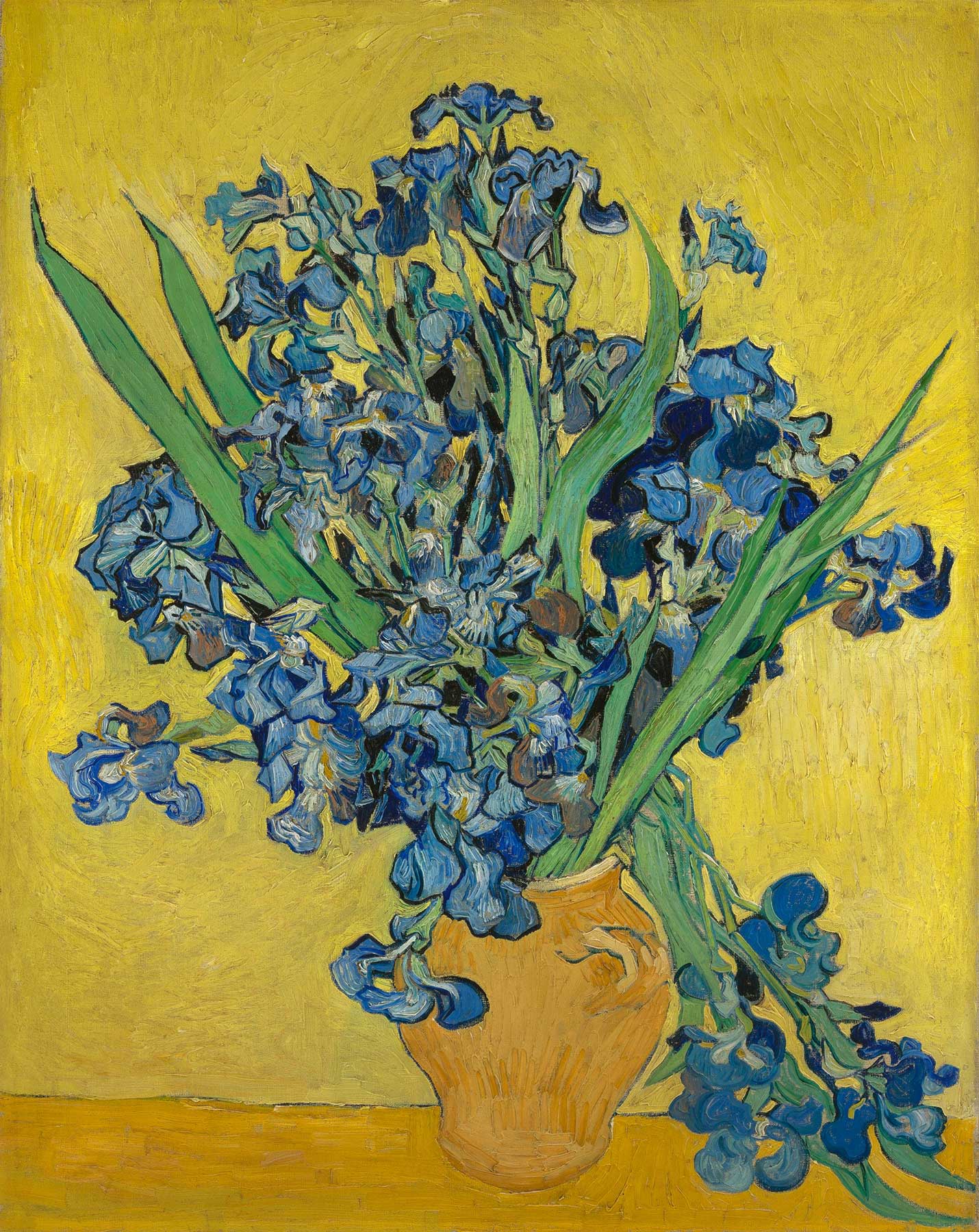
Irises
By Vincent van Gogh, 1889
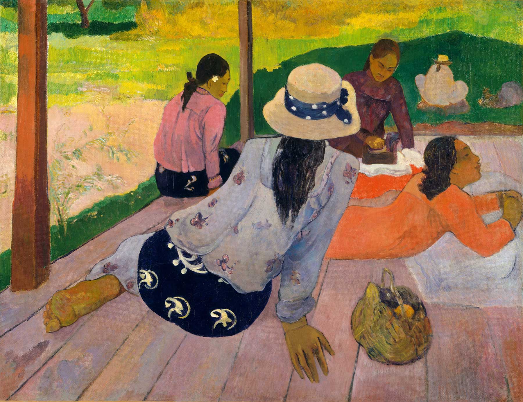
The Siesta
By Paul Gauguin, 1892-1894
In Paul Gauguin's "The Siesta," the artist skillfully employs the complementary colors of yellow and purple to create a vibrant and balanced composition. The yellow tones in the background and foreground, depicting the lush landscape and wooden floor, provide a warm and lively contrast to the cooler purple hues seen in the clothing and shadows. This effective use of complementary colors draws the viewer's eye across the painting, highlighting the relaxed posture of the figures and the tranquil atmosphere of the scene. The purple garments worn by the figures stand out against the sunlit yellow surroundings, emphasizing their presence and adding depth to the composition. Gauguin's use of yellow and purple not only enhances the visual interest of the painting but also conveys a sense of harmony and serenity, capturing the essence of a peaceful afternoon siesta.
In Georges Seurat's "A Sunday Afternoon on the Island of La Grande Jatte," the artist utilizes the complementary colors of yellow and purple to create a balanced and harmonious composition. Seurat's technique of pointillism, applying small dots of pure color, allows the yellow and purple hues to interact and blend visually, enhancing the vibrancy and luminosity of the scene. The purple shadows in the trees, clothing, and shaded areas contrast effectively with the sunlit yellow highlights on the grass, figures, and water. This use of complementary colors not only brings a dynamic contrast to the painting but also adds depth and dimension. Seurat’s meticulous placement of yellow and purple dots achieves a sense of light and shadow, enriching the overall atmosphere of a leisurely afternoon. The interplay of these colors helps to convey the serene yet lively ambiance of the park, demonstrating Seurat's masterful understanding of color theory and optical effects.
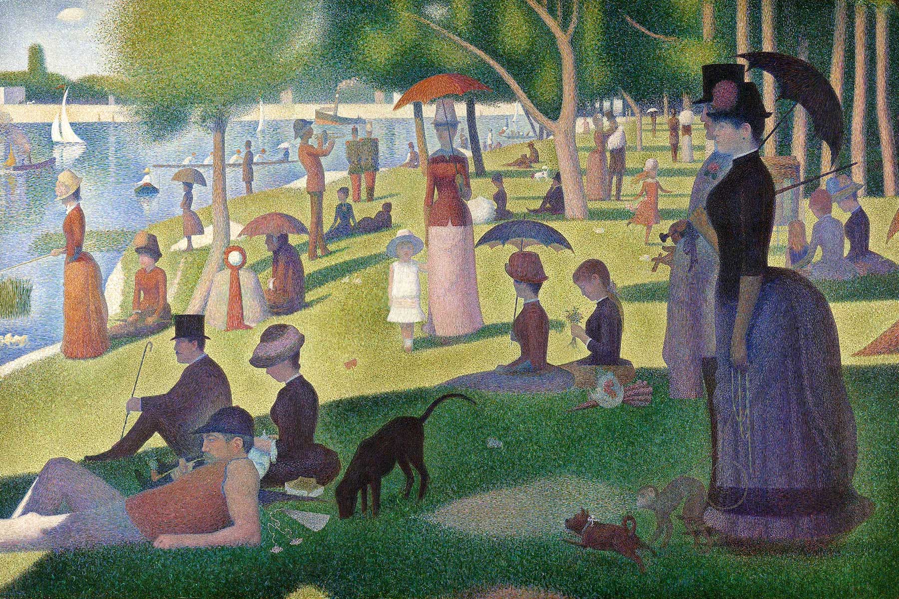
A Sunday Afternoon on the Island of La Grande Jatte
By Georges Seurat, 1884-1886
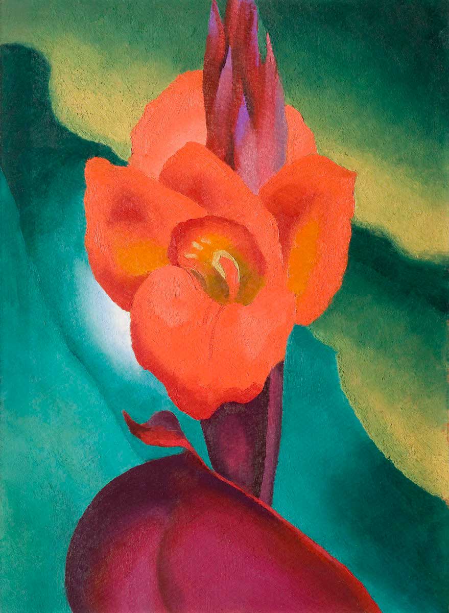
Red Canna
By Georgia O'Keeffe, 1919
In Georgia O'Keeffe's "Red Canna," she effectively uses the complementary colors of red and green to create a striking and vibrant composition. The intense red petals of the canna flower stand out dramatically against the rich green background, enhancing the flower's vividness and drawing the viewer's attention immediately to the central subject. This use of complementary colors not only highlights the natural beauty of the flower but also adds depth and intensity to the painting. The green hues in the background provide a cool, calming contrast to the warm, energetic reds, creating a harmonious balance that enhances the overall impact of the artwork.
In this piece we see how Jawlensky effectively uses the complementary colors of red and green to create a striking and vibrant portrait. The intense red of the hat and the flowers contrasts sharply with the various shades of green in the background and the subject's face. This use of complementary colors not only draws the viewer's attention to the hat, making it the focal point of the portrait, but also creates a dynamic visual tension that enhances the overall composition. The green tones in the skin and background provide a cool, contrasting backdrop that amplifies the warmth and intensity of the red elements. Jawlensky's bold application of red and green demonstrates his mastery of color theory, resulting in a portrait that is both visually arresting and emotionally engaging.
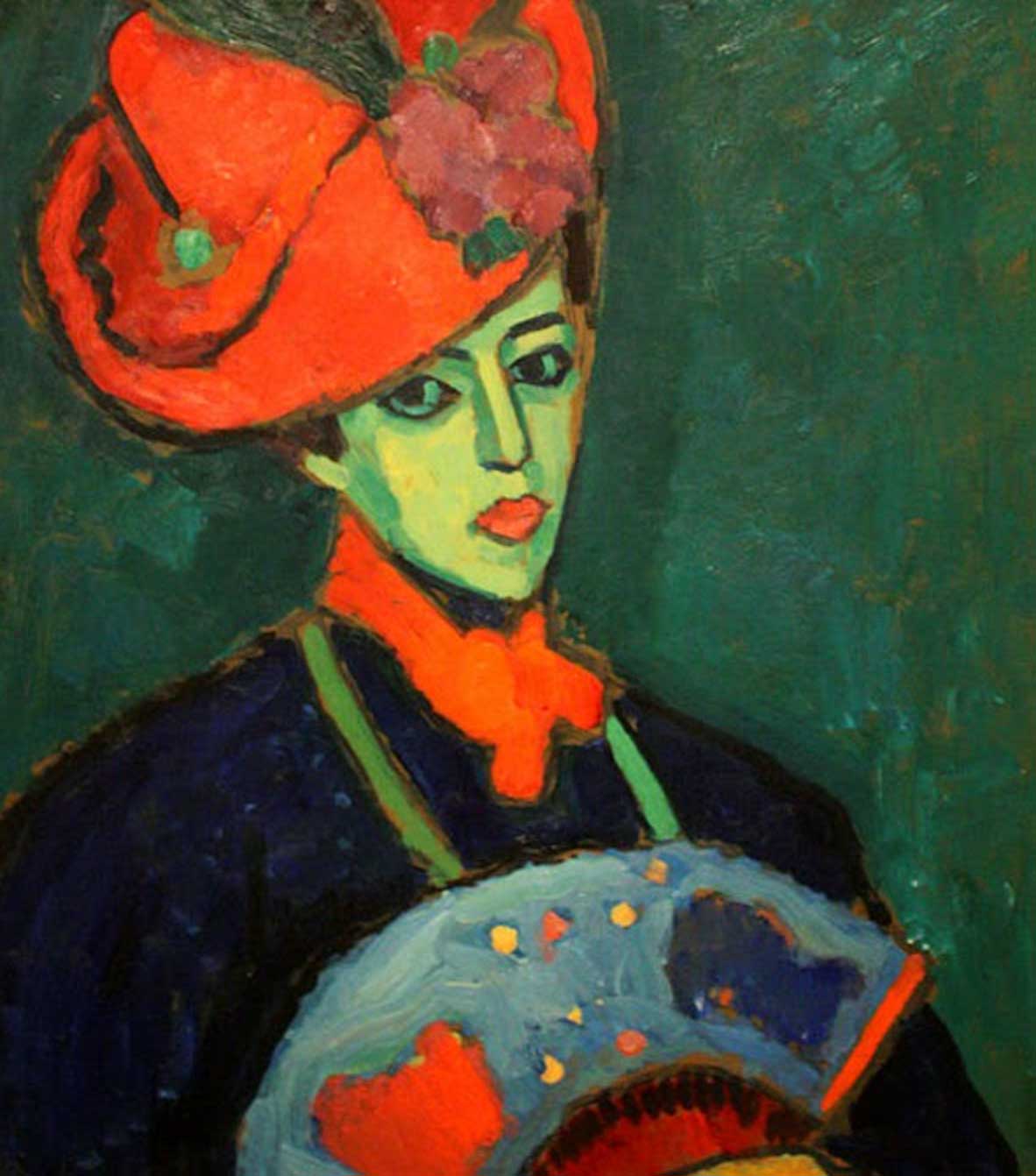
Schokko with Red Hat
By Alexey Georgievich Jawlensky 1909
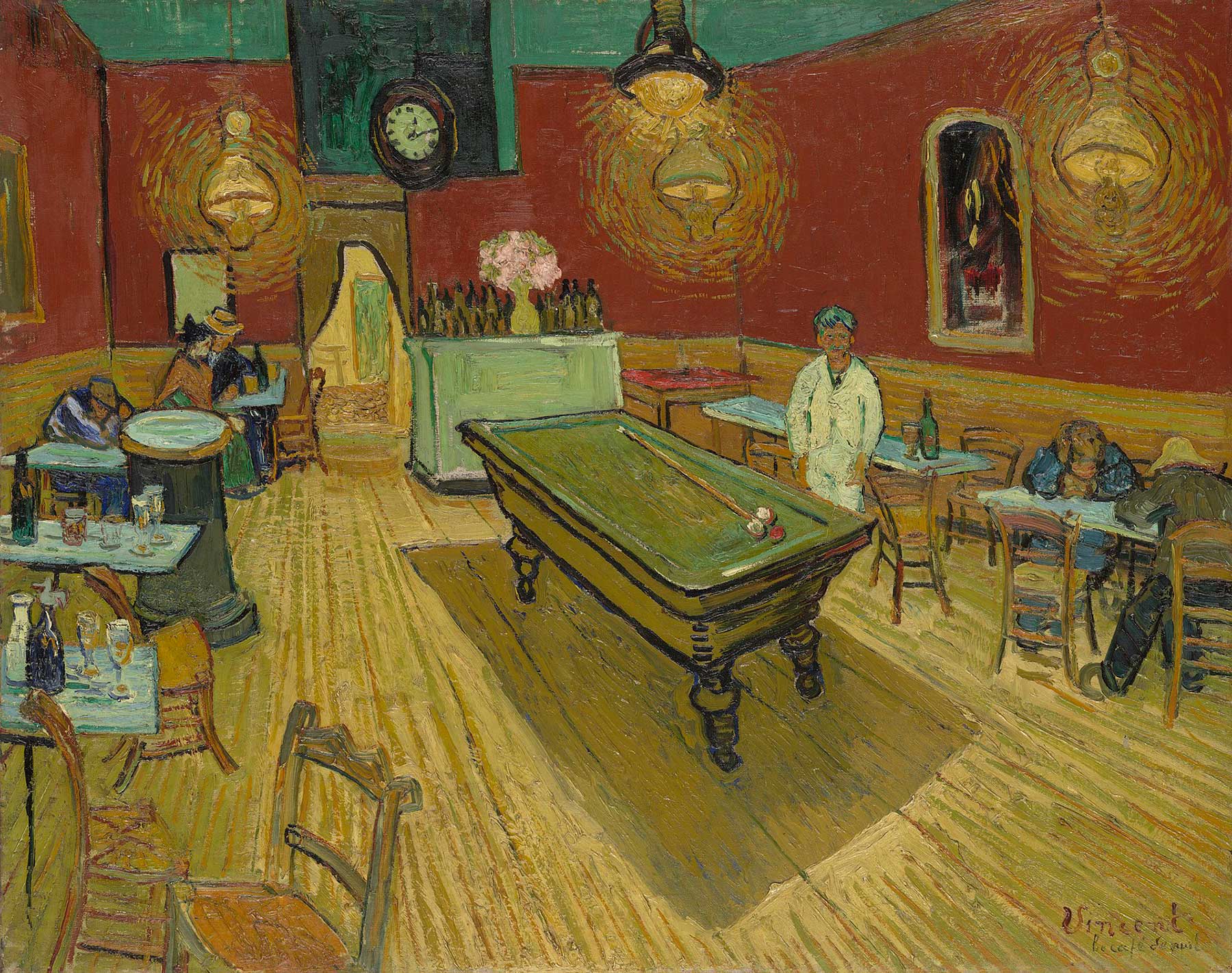
The Night Café
By Vincent van Gogh, 1888
In Vincent van Gogh's "The Night Café" (1888), he beautifully uses the complementary colors of red and green to create a striking and intense atmosphere. The dominant red walls of the café contrast sharply with the green ceiling and details, creating a visual tension that reflects the unsettling and oppressive mood of the scene. This use of complementary colors heightens the emotional impact of the painting, making the interior space feel both vibrant and claustrophobic. The green billiard table in the center of the composition anchors the room and draws the viewer's eye, while the surrounding red hues amplify the sense of unease. Van Gogh's strategic use of red and green not only enhances the visual dynamism of the artwork but also conveys the psychological tension and discomfort he associated with the café's environment.
Complementary colors—pairs like red and green, blue and orange, and yellow and purple—are foundational elements in the world of art. When used effectively, these colors can create stunning contrasts and bring a vibrant energy to your work. However, harnessing the power of complementary colors doesn't mean you must use them at their full strength. By exploring different values, saturation levels, and color temperatures within these pairs, you can add depth, harmony, and subtlety to your compositions.
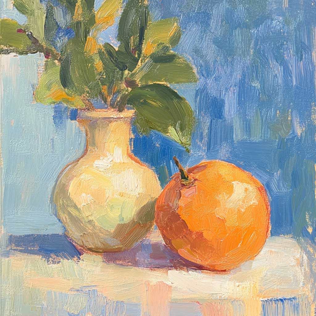
Exploring Saturation
Saturation describes the intensity or purity of a color. High saturation means the color is vivid and strong, while low saturation results in more subdued and greyed-out tones. When working with complementary colors, varying the saturation can help you achieve a more nuanced and layered composition. For example, using a highly saturated orange next to a muted blue can create a focal point that pops without being too jarring. This technique is particularly useful for creating areas of interest and balance within your artwork.
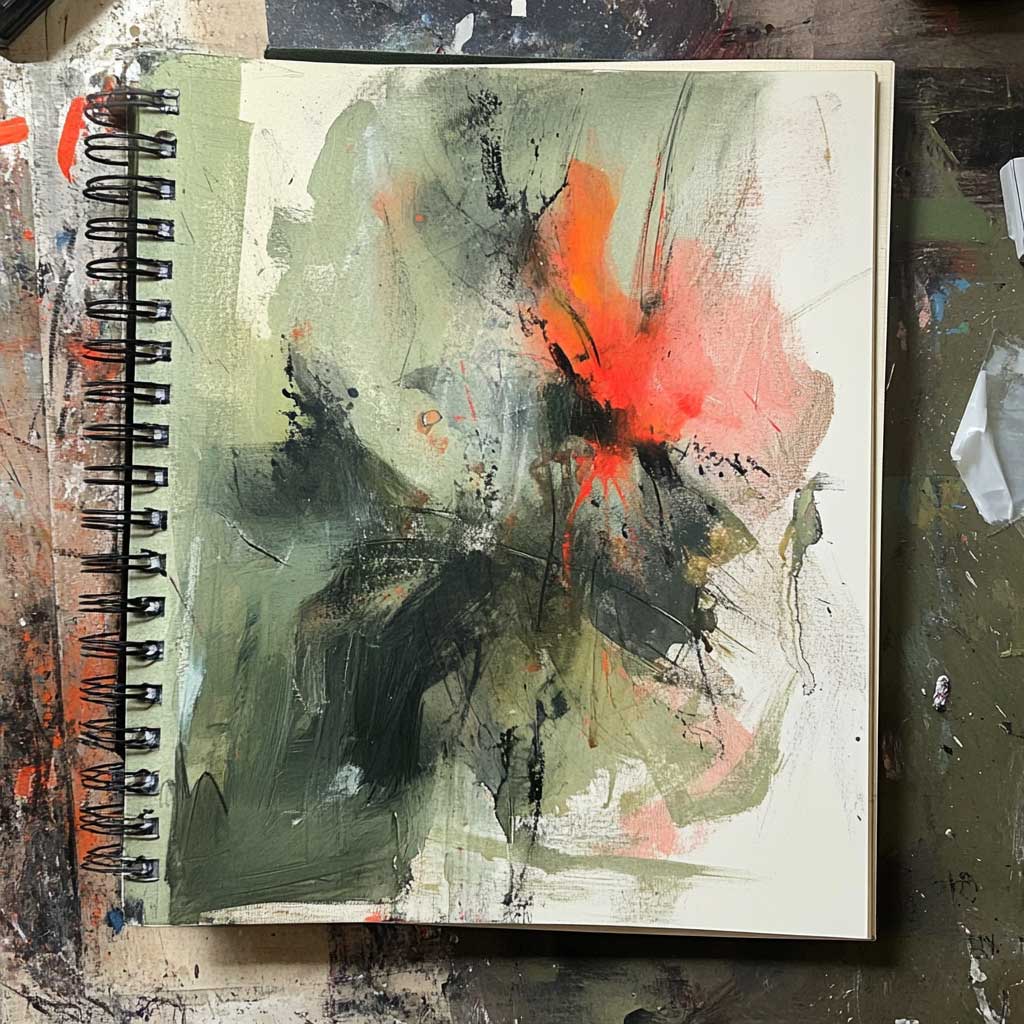
Understanding Values
Values refer to the lightness or darkness of a color. By adjusting the values of complementary colors, you can create a range of effects in your artwork. For instance, pairing a dark, muted green with a light, vibrant red can create a sophisticated and balanced contrast without overwhelming the viewer. Experimenting with values allows you to emphasize different aspects of your composition and guide the viewer's eye to key elements.
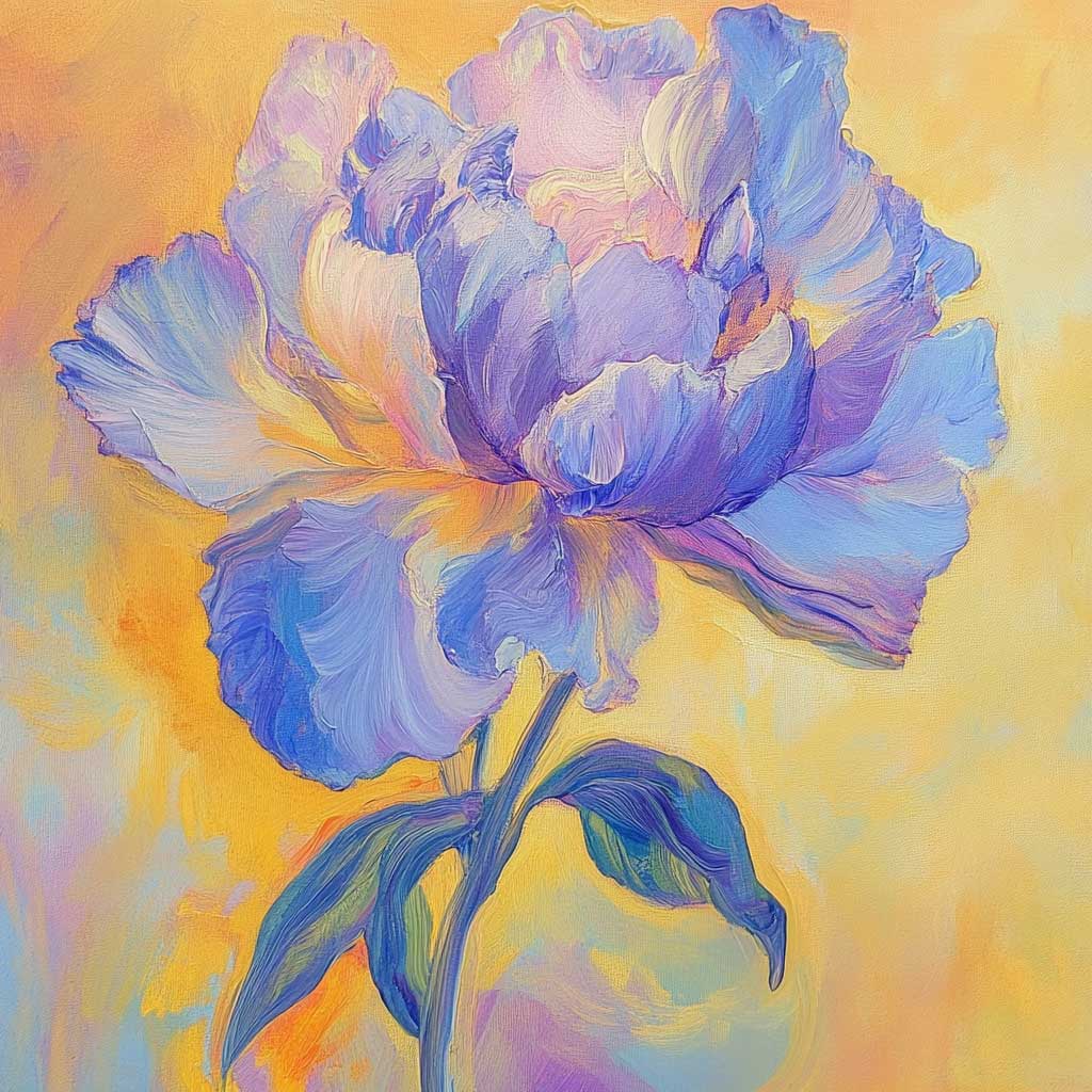
Playing with Color Temperature
Color temperature refers to the perceived warmth or coolness of a color. Warm colors, such as reds and oranges, evoke a sense of warmth and energy, while cool colors, like blues and greens, convey calmness and tranquility. Within each complementary color pair, you can find variations in temperature. A warm yellow paired with a cool purple can create a dynamic interplay that adds complexity and emotional depth to your work. By balancing warm and cool tones, you can create a more engaging and harmonious composition.
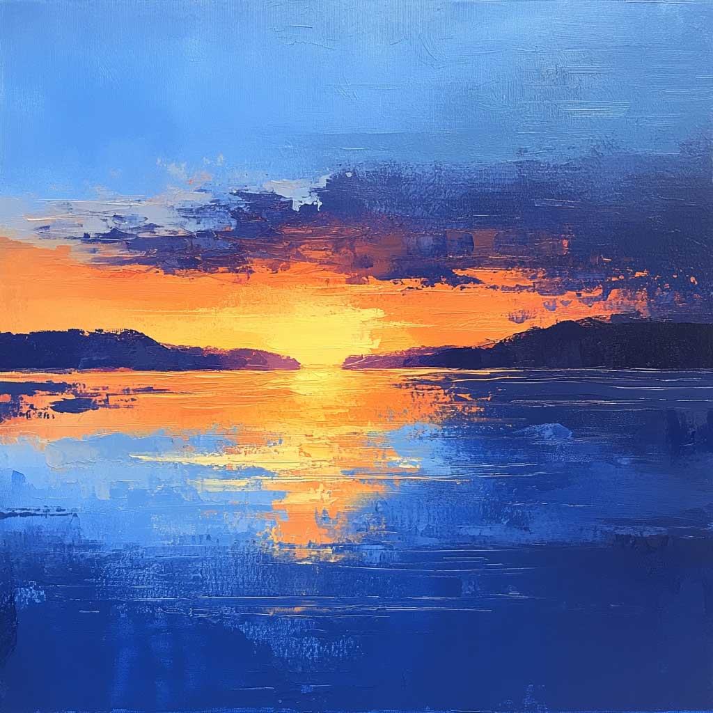
Gradients and Blending
Creating smooth gradients between complementary colors can add depth and movement to your work. Blend a warm orange into a cool blue, varying the saturation and value as you transition between the colors. This technique can be used to depict natural scenes, like sunsets or water reflections, or to add a sense of flow and continuity to abstract compositions.
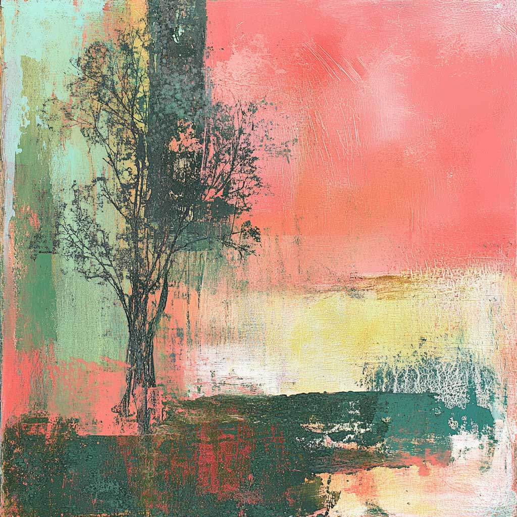
Layering and Textures
Experiment with layering different values and saturations of complementary colors to build texture and richness in your work. For instance, layer a muted green over a vibrant red background to create depth and complexity. Use different brushstrokes or tools to vary the texture and enhance the visual interest.
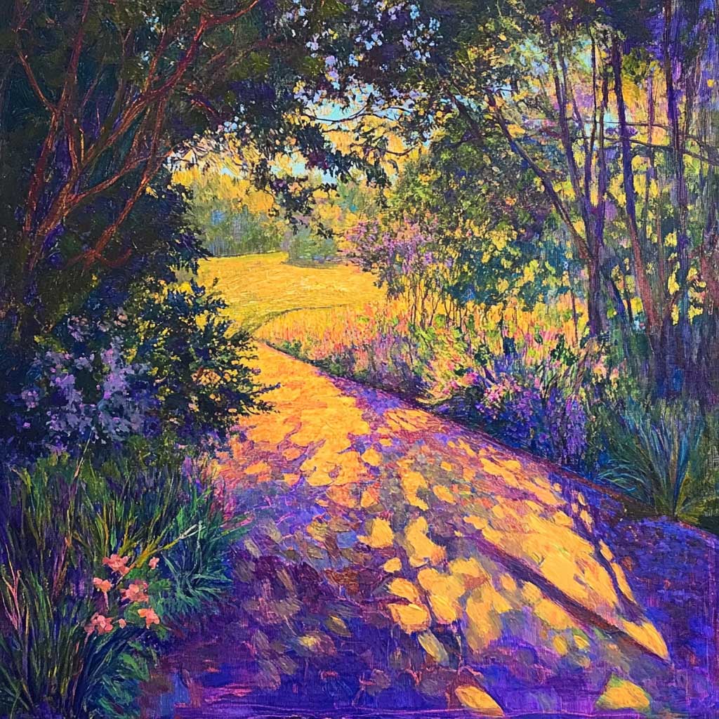
Highlights and Shadows
Using complementary colors for highlights and shadows can create a striking effect. For example, use a soft light blue to highlight areas of an orange object, or add cool, deep purple shadows to a warn yellow scene. This approach not only adds dimension but also creates a harmonious color balance that enhances the overall composition.
As you explore the world of complementary colors, remember that effective use goes beyond their purest forms. By playing with values, saturation, and temperature, you can unlock endless possibilities for creating depth, harmony, and emotional resonance in your art. Embrace the versatility of complementary colors, and let your creativity guide you in discovering new ways to bring your compositions to life.
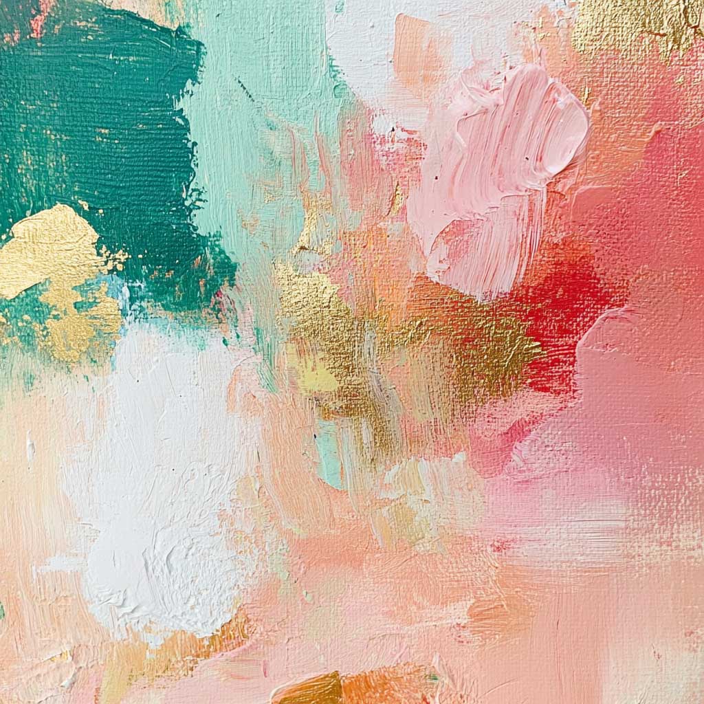
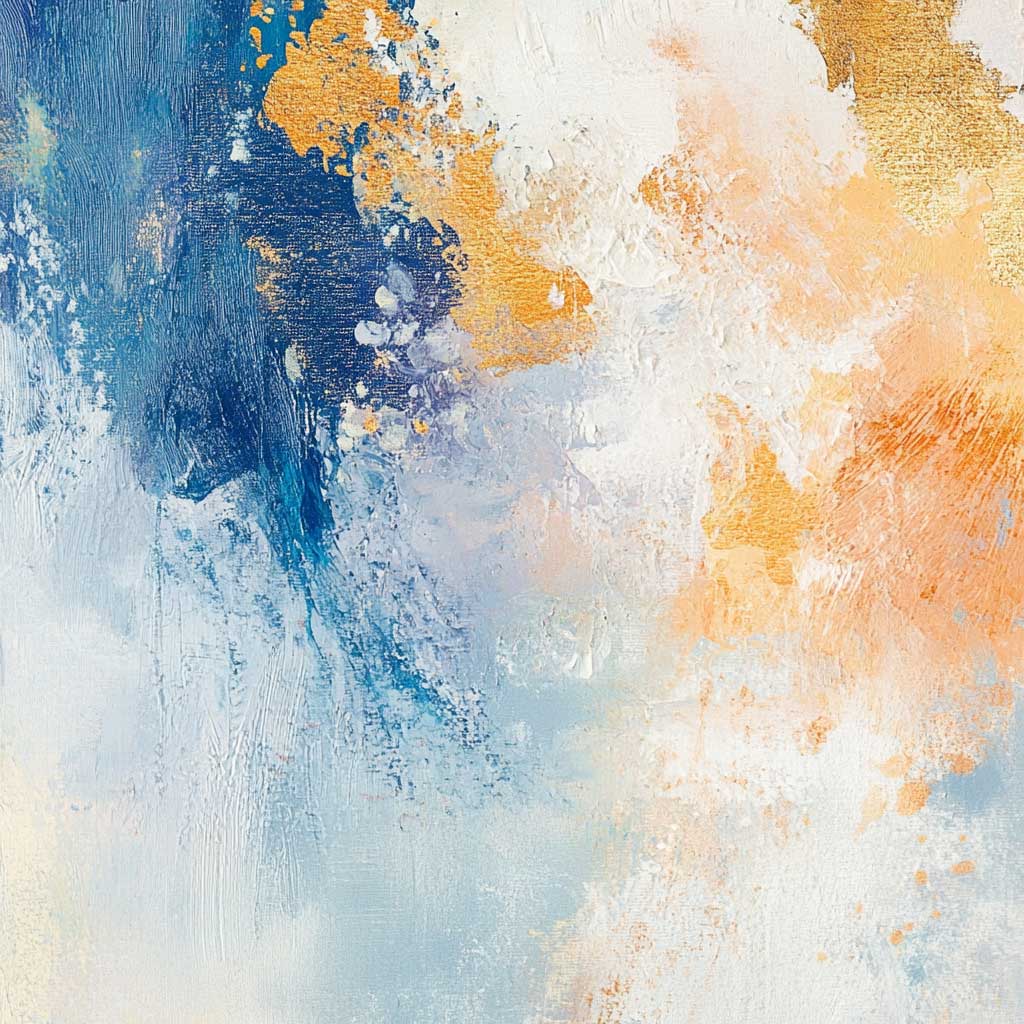
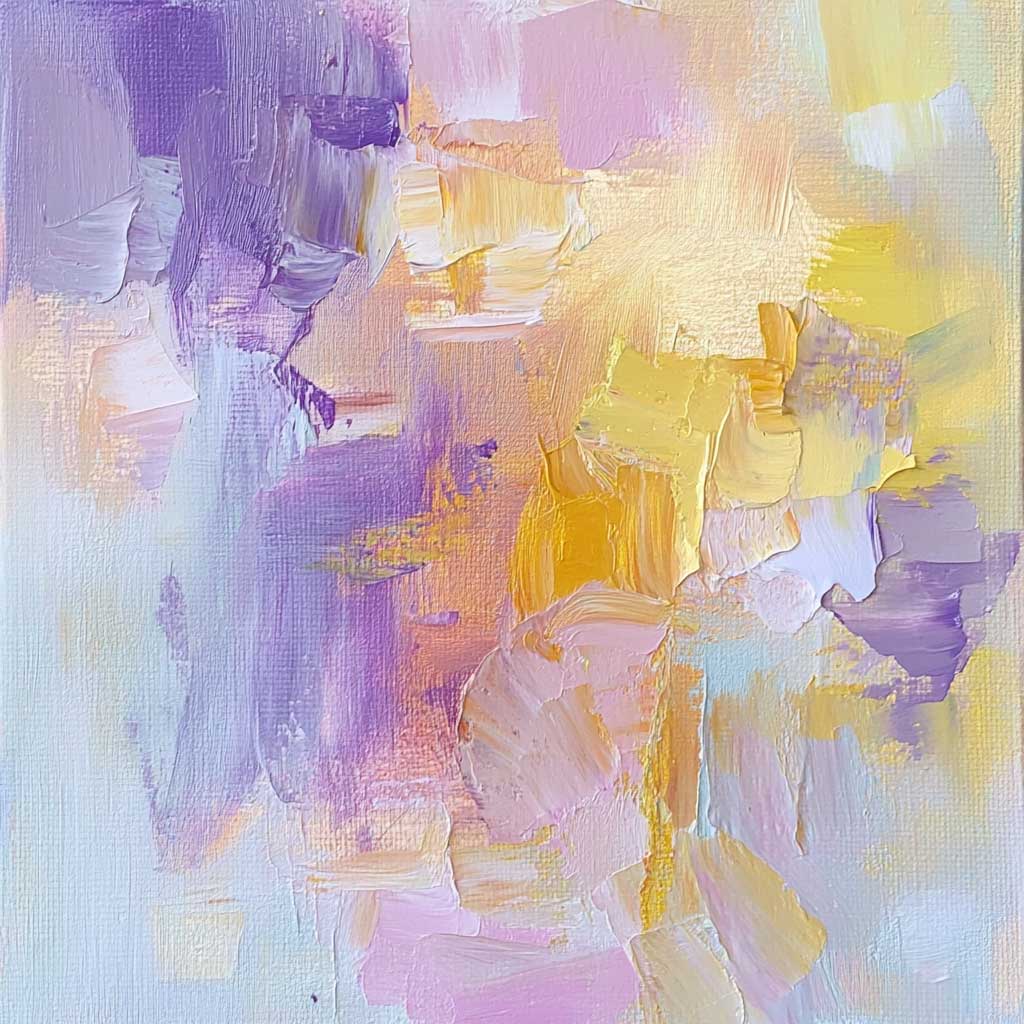
Objective: Experiment with shapes, lines, and textures using complementary colors to create dynamic abstract compositions.
Steps:
Reflection: Write about the process and how the use of complementary colors influenced the visual dynamics and emotional impact of your abstract piece.
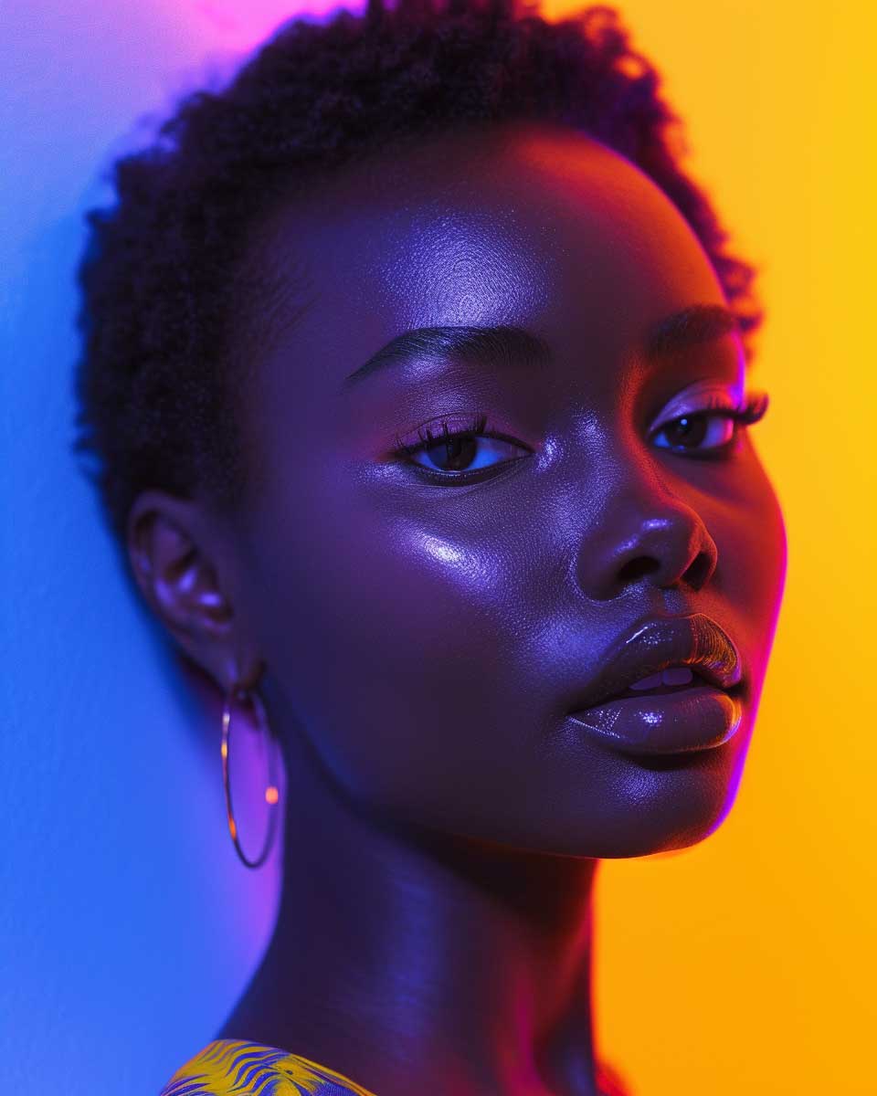
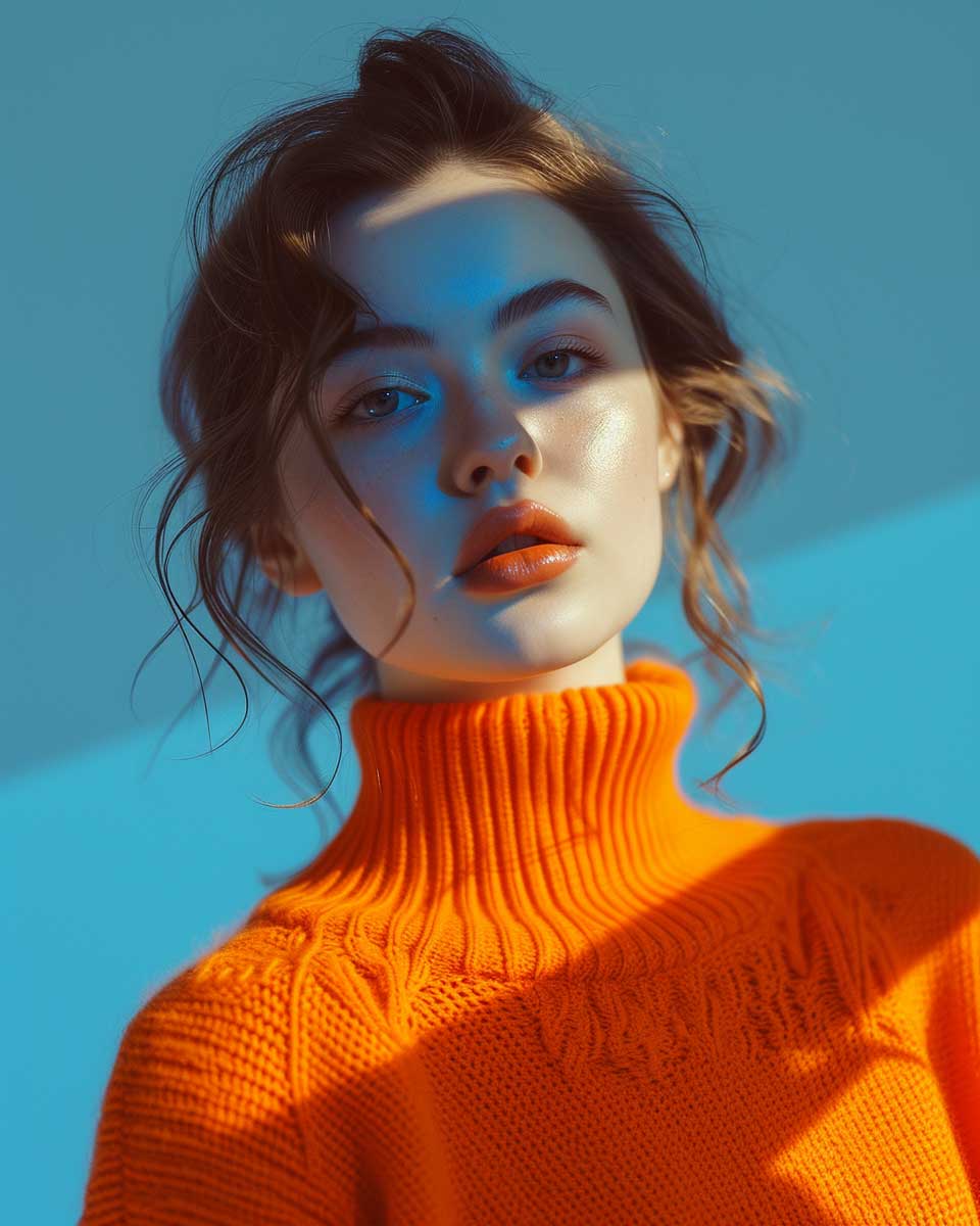
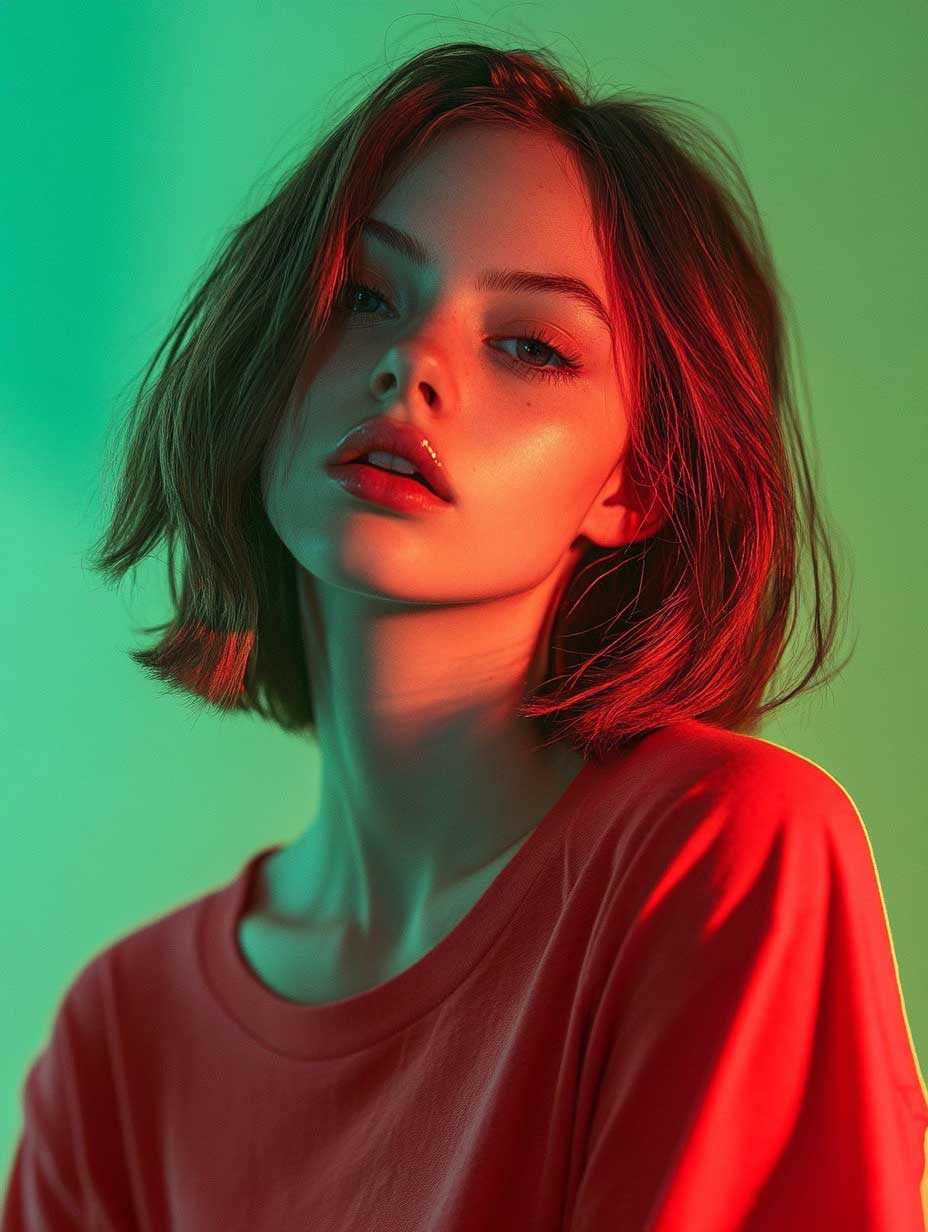
Objective: Explore the emotional impact of complementary colors through portraiture.
Steps:
I’ve included some fun reference images to work from if you choose-
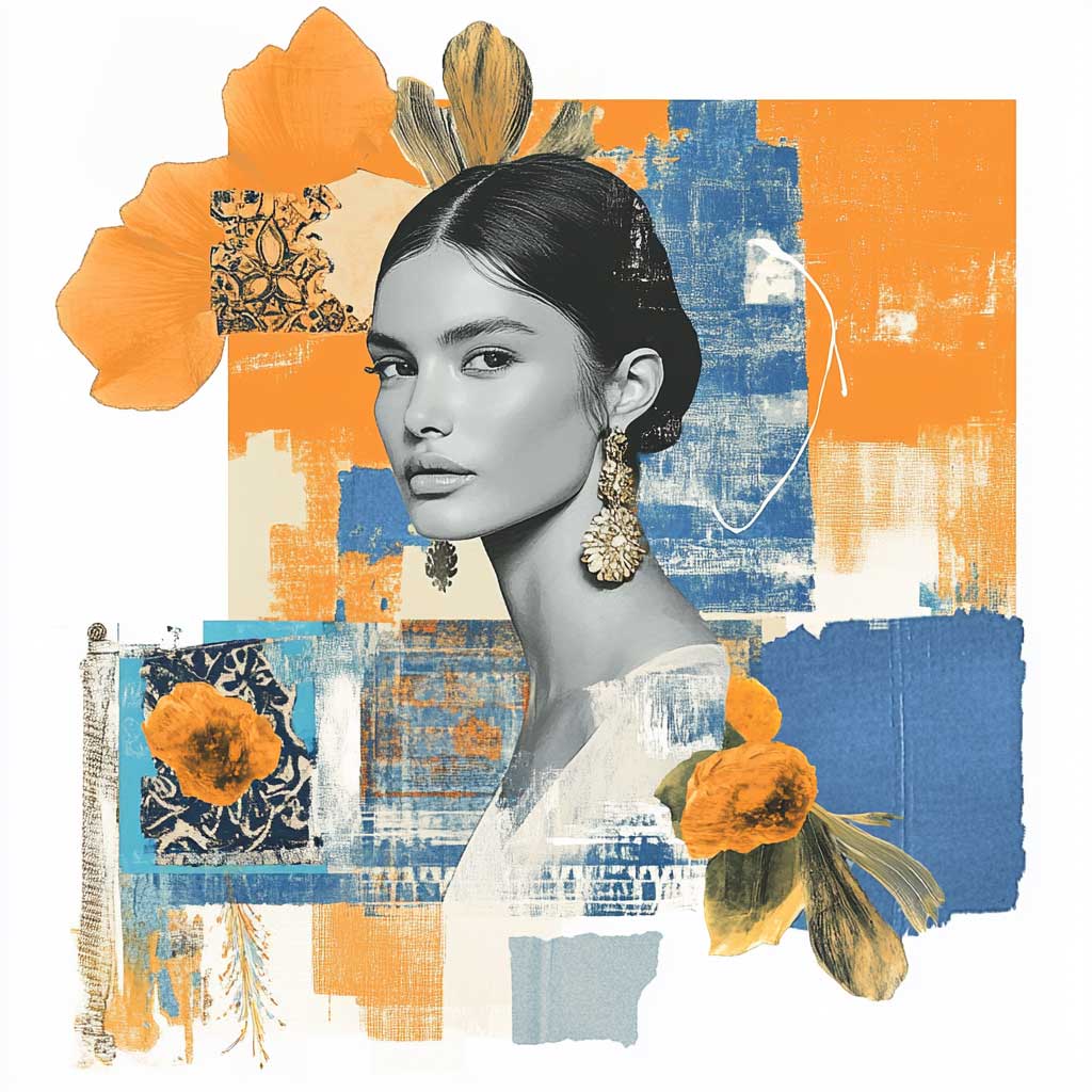
Objective: Experiment with shapes, lines, and textures using complementary colors from magazines and other ephemera to create dynamic collages. (You can create these digitally too on your iPad! I love doing this!)
Steps:
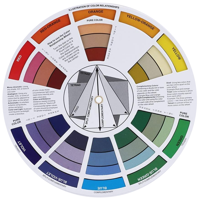
If you don’t already own a color wheel! I highly recommend getting one. So often we own these but rarely read all the wonderful information on them or put them to good use! So grab one and really check it out!
Check out this color wheel and color mixing lesson from my class Le Visage. It’s so valuable to understand your color wheel and how to work with not only complimentary colors but other combinations as well! Pull out that paper color wheel that so many of us have and give it a good look! So often we own one but don’t use it to its full potential. If you don’t have one yet, I highly recommend you grab one.
You can also listen to this month’s issue of the Studioworks journal. I find I love listening to books, podcasts and music while I draw, paint or go on a long walk. Enjoy.
One of my favorite things to do is to curate inspiration. From Pinterest boards to books, resources, playlists and more - I love to share anything that might facilitate learning, expansion, and sparks of curiosity! Being an artist, we naturally crave these things so here are some of this month’s picks from me to you.
I had so much fun curating this list. I hope you enjoy!!
Here are just a few of our fantastic classes! I highly recommend checking them out if you haven’t already. Enjoy!