Oh color theory... love it or hate it...it’s an integral part of painting and it’s best to just get on with it, practice like crazy and become accustomed to mixing color and understanding the components.
For some of you this might be old news, but it never hurts to revisit learned knowledge. Or you can skip ahead to our first lesson, Portrait In Black and White! Yah... makes sense right?
So let’s get some definitions out of the way first. Like what IS Color Theory anyway?
Well... here’s how it is stated: In the visual arts, color theory is a body of practical guidance to color mixing and the visual effects of a specific color combination. - Wikipedia
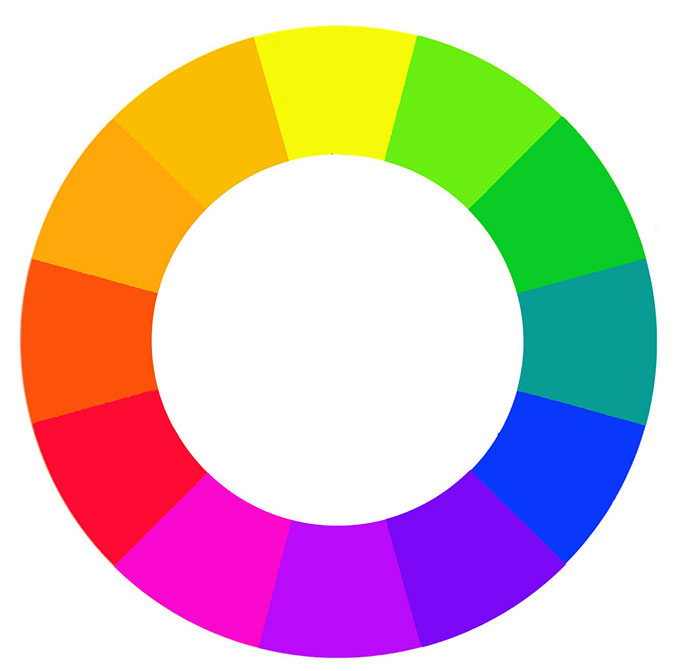
Hue: The purest or brightest form of a color. Colors that have not been mixed with white or black.
Chroma: Another word for color or hue; the amount of saturation of a color.
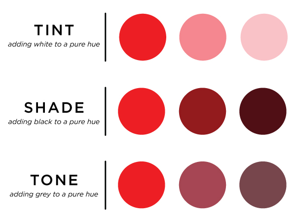
Tint: Lighter value of a pure hue, made by adding white.
Shade: Darker value of a pure hue, made by adding black.
Tone: A gray version of a hue, made by adding gray; gray quiets the color

Saturation: the intensity of a color, expressed as the degree to which it differs from white.
Value: how dark or light a color is
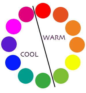
Temperature: how cool or warm a color is
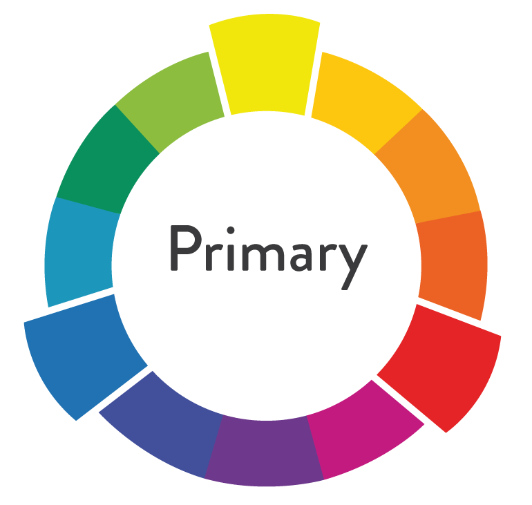
Primary Hues or Colors: Yellow, red and blue: the three colors from which, in theory, all other colors are derived.

Secondary Colors: Orange, green, purple; the second set of colors made by combining two primary colors except the color’s complement. For example red-blue and red-yellow but not red-green.
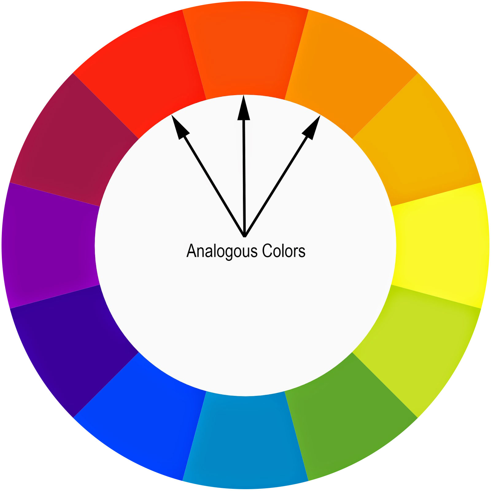
Analogous Colors: Three to six adjacent colors on the color wheel.

Tertiary Hues: The third set of colors on the color wheel, formed by combining adjacent primary and secondary hues. Sometimes called intermediate hues or colors.
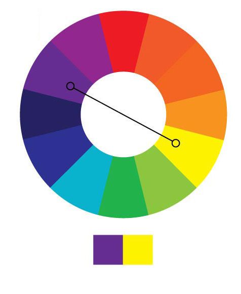
Complement Color: The color positioned directly across the wheel from any given color on the color wheel. Each color on the wheel has only one complement, also called Direct Complement.
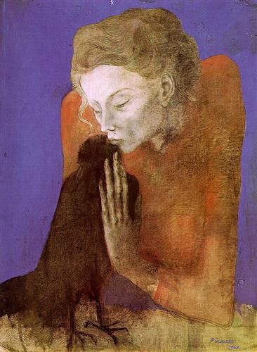
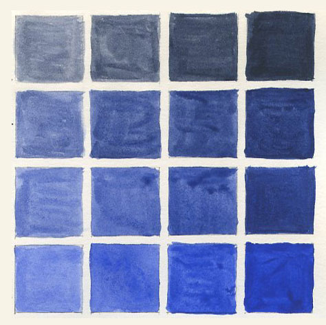
Monochromatic colors: Relies on only one color family to create a design; uses a combination of tints, tones, and shades from the same family to achieve desired effect.
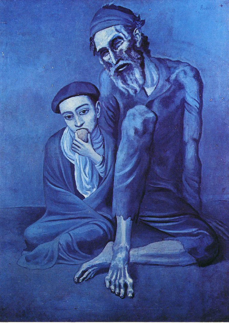
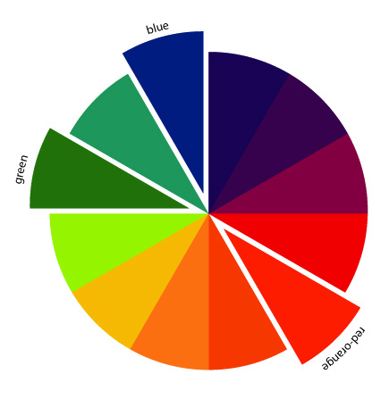
Split Complement: One color paired with the two colors on either side of the original color’s direct complement, also known as Divided Complement.
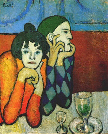
So those are some of the most commonly used terms used when discussing color theory. I hope that helps clear some things up. You can clearly see how Picasso used some of these color systems in his paintings and we will be doing our own very soon!
But first, let me show you some simple color mixing!
If you want to really geek out, check out this awesome video from the creator of Gamblin paints, Robert Gamblin.
Try and mix as many colors as you can from these Picasso pieces. Try and use only your primary colors and black and white! Notice how Picasso’s colors are slightly toned down...so try adding gray to your hues or mix the compliments to achieve a more dull color. i.e. mix red in green to tone it down or mix orange into blue. Experiment with your paints and have fun!! As with everything, practice is the KEY!
CLICK TO ENLARGE