Dear creative friends,
Welcome to Issue No. 78 of the Studioworks Journal! I’m so happy you’re here.
This month, we’re leaning into something a little braver—an invitation to drop the pencil, pick up the pen, and sketch without erasing. Ink, with all its boldness and unpredictability, is taking center stage as our featured medium.
We’ve explored pastels, watercolor, and collage in previous issues—and now it’s time to honor ink for what it truly is: expressive, immediate, and wonderfully imperfect.
During a recent retreat in the UK, I challenged myself to begin each sketch in pen—and something shifted. Without the safety net of the pencil, I had to trust my hand, trust the moment. Each mark felt alive. That experience reminded me how often we block ourselves from simply playing.
So this issue is about fearless marks and fresh starts. It’s about sketching messy, showing up honestly, and letting your creativity lead—no erasing, no overthinking.
I hope it inspires you to make your own bold marks this month.
xo,

Many circumstances in life cause us to ask ourselves where we should draw the line, figuratively and literally, and experience frequently reveals that where the line goes depends on context. Different situations necessitate various responses. As artists, we can unduly belabor our process by fixating on getting our vision onto the page or canvas in a practiced and precise fashion.
Sometimes, however, we must let go and let something emerge boldly, irreversibly, and without hesitation. Enter ink sketching.
Some of the most avant-garde, brilliant, and enduring artists of all time used ink in their art journals. Join me in exploring why this might be and what the process of working with indelible materials can reveal about our personal truths and how they can best bear witness to the urgings of our creative souls.
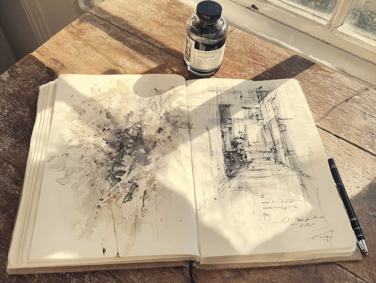
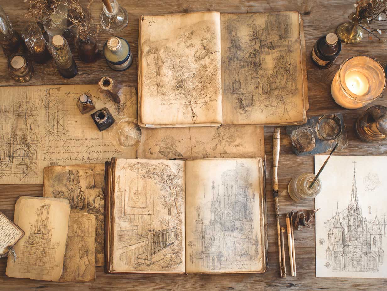
The practice of using ink in art dates back to humanity’s earliest creative renderings. From cave paintings to stunning Japanese Sumi-e paintings to the contemporary gems of Liana Moran, a treasure trove of work is built upon this seemingly simple medium. The form of ink, somewhat resembling what we use today (essentially ground pigments derived from plants, animals, and minerals combined with water), is thought to have originated simultaneously in China and Egypt upwards of 4,500 years ago. Suffice it to say that ink has been around a while and is artistically essential.
Even the word itself is cloaked in significance. Ink derives from the old French encre, meaning “dark writing fluid.” Interestingly, this is a shortening of the Latin word encaustum, which translates to “burned in,” referring to how acids in inks of the day would eat into surfaces. In addition, across myriad cultures, the word for ink is synonymous with black, and as such, it doubles down on an association with permanence.
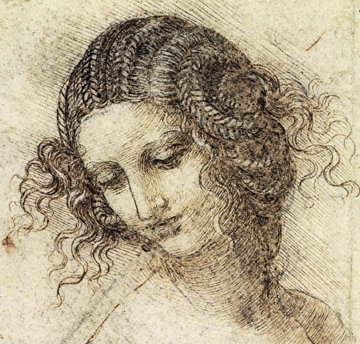
Study of Leda Head
Leonardo Da Vinci, 1504
For some artists, the enduring nature of pen and ink can feel excessively weighty. If each line applied to the page remains forever, the fear of making mistakes can stop a person in their tracks. However, others lean into this quality, utilizing it in their sketchbooks and journals and even making it a primary tool.
One such artist is the quintessential Renaissance man, Leonardo da Vinci. The codices formed by his over 7,000 pages of personal notes and illustrations are a major component of his immense legacy. Many of these pages contain architectural, astrological, and anatomical drawings beautifully rendered in ink, including his famous proportional drawing, the Vitruvian Man.
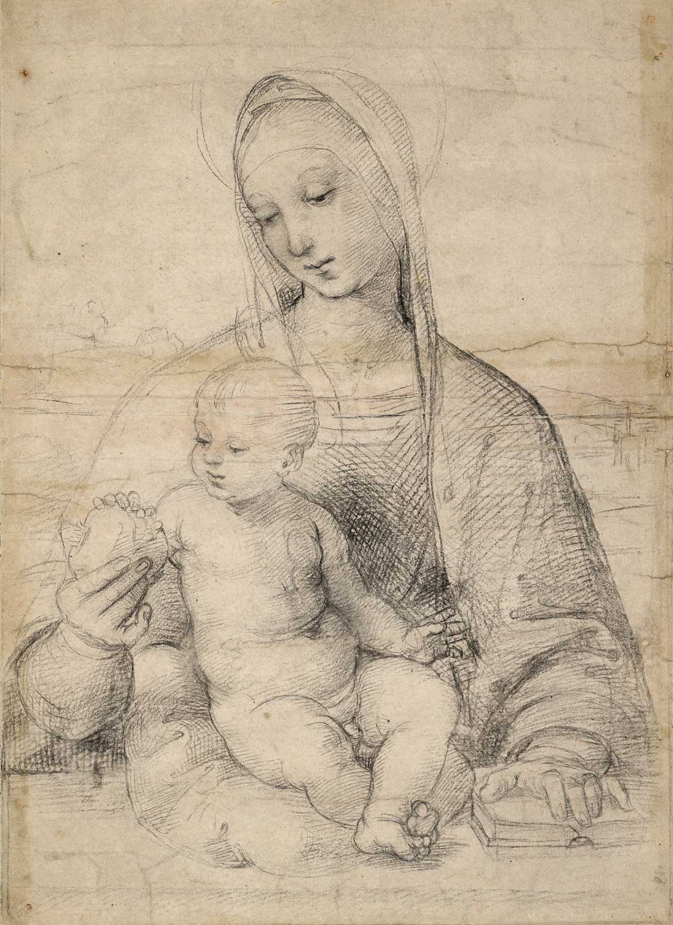
Study of Madonna & Child
Raphael, 1500
Another Renaissance master, Raphael, also leaned heavily on ink sketches. Some of his most prized pieces were completed in ink or derived from his extensive drawings in the medium, such as his studies of the Madonna and Child. Famously emotional and romantic, the abundance of Raphael’s drawings offers a window into his inner self and his dedicated creative process.
Moving forward in time, we have Pablo Picasso, who, in his typical innovative and fearless fashion, also boldly included sketching in ink in his creative practice. From his feverish flurry of output across 16 sketchbooks, leading to the completion of his phenomenon, Les Demoiselles d’Avignon, to his dynamic and dauntless studies culminating in his War and Peace murals, Picasso let ink fly across the page in any direction, orientation, or order he chose.
Another artist deserving of mention, a contemporary of Picasso who famously included a pair of earrings he hand-sculpted for her in a self-portrait, is the inimitable Frida Kahlo. Her diaries ought to be awarded a cum laude in so far as they reveal not only the artist's passion, suffering, and triumph but also the potency of using media such as pen and ink to bring vividness and immediacy to the lived experience as well as one’s art. In the ten years from 1944 to 1954, she created a profoundly personal archive of sketches, artwork, contemplations, poems, and emotive musings on a foundation of ink that continues to inspire.
A final and more modern nod in this sketchy overview goes to Janice Lowry. Though on the surface her life work is primarily comprised of assemblages, collages, and paintings, her creative journals serve as the backbone of it all. She began journaling at the age of 11 and kept up the practice throughout her life. The 119 large-format art journals she kept from 1973 to 2007 are a treasury of inked sketches, multi-media collages, personal commentaries, and timely events that became some of her most important works.
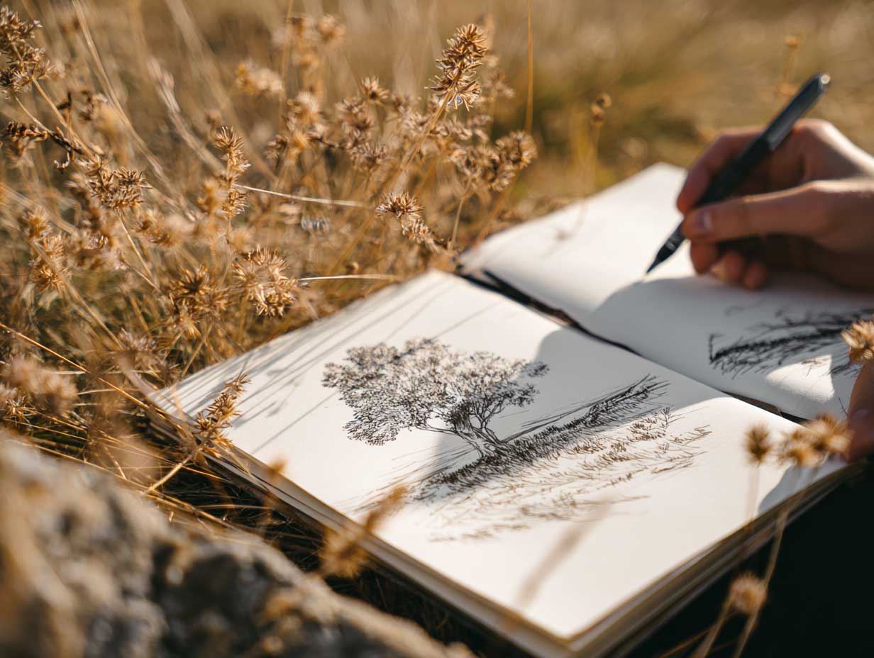
Ink is an artist's foundational tool. Whether mixing pigments to scrawl on the walls of a cave, tirelessly sketching the anatomy of the eye to create the enigmatic look of the Mona Lisa, or spilling ink like lifeblood as we reveal our innermost pain and passion in a soulful self-portrait, ink has a place in our practice.
It matters little if pen and ink are our primary tools or occasional sketchbook buddies; either way, they are capable of bringing something impactful and lasting to our artistic practice. As evinced by some of art’s most enduring characters, the permanence of ink can help to wash away hesitancy and allow us to boldly go where we’ve never creatively gone before.
It’s quite common for children to be handed a pencil in lieu of a pen. This can be considered good sense; after all, who wants permanent marks making their way off the page and onto the table or walls or mucking up the homework sheet? In addition, those freshly inhabited youthful bodies have yet to learn mastery over creating a line, and erasing can be helpful.
However, it might be worthwhile to consider what this process instills in us. How much of our creative hesitancy contains roots in this early training that we’re not quite up to the measure of a pen? It’s time to set all that aside and learn to trust the line and our innate competence by nurturing our inky intuition.
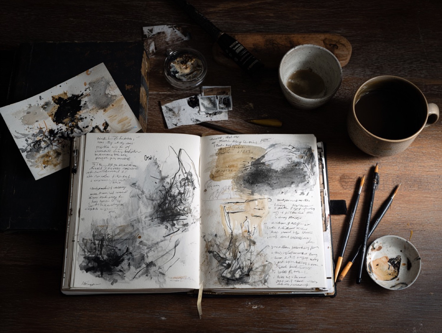
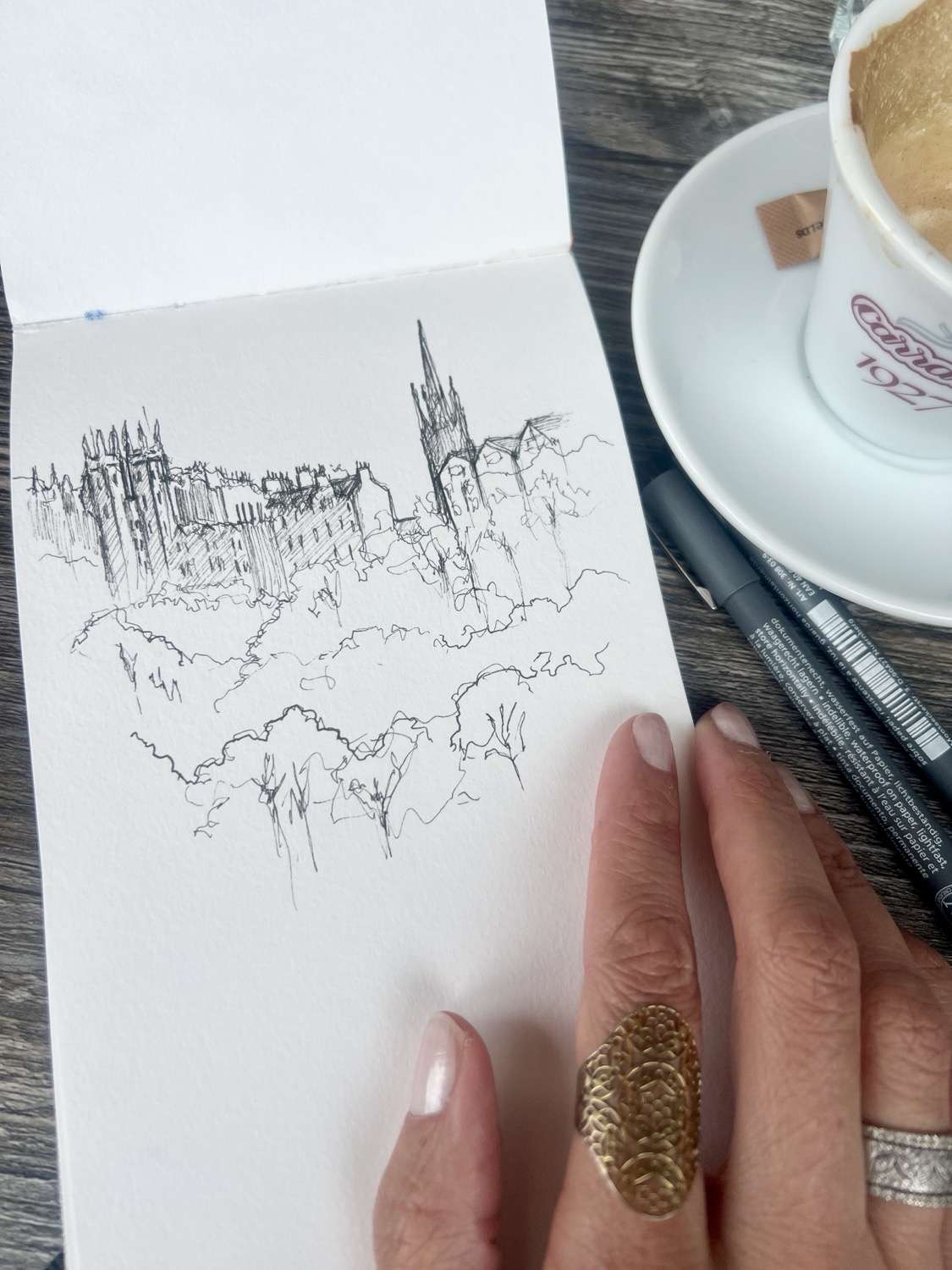
Proper care is required to raise anything from a plant to a pet to a person. Enhancing our intuition is no different. To foster intuition means cultivating the ability to create in an immediate way without getting mired in reasoning or studied effort. To a certain extent, this ability is a product of our lived experience, which enhances our instincts and informs our seemingly instantaneous knowing, but there’s more to it than that. Humans are meaning makers, and our uncalculated responses often hold creative keys that are personally valuable and worthy of our notice.
As artists, part of our job is to hone our ability to see as only we can. Out of cultivating personal vision springs our ability to create something special. When it comes to working in ink, we’ll want to develop trust in where our hand decides to go and free ourselves from fixating on making “mistakes.” The following are some ways to accomplish this goal:
One way to nurture intuition is through fostering immediacy. We can do this by implementing a bit of urgency and excitement in our work. By investing entirely in the moment and sketching what we directly perceive, not what we think we should be seeing or what we’ve seen before, we can draw something that isn’t simply a dry re-creation of a scene.
In practice, this looks like drawing swiftly without waiting for our brains to catch up. It means getting wild and not worrying if our lines look “right.” It means having a good time and seeing what emerges as a result. It entails heading out into the world with only a pen, eschewing pencils and erasers, and enthusiastically sketching like we mean it.
Another facet of intuition is immediate apprehension or a rapid understanding that typically emerges from the subconscious level. When applied to drawing in ink, this is an invitation to daydream a little. Let your meditations, affirmations, and yearnings guide you in executing your line work.
Putting this into practice could mean slowing your breath and opening your eyes wide with an intention to wonder rather than know. Try not to label and catalogue but to see things as new and fresh, as they are here and now. Respond with awareness, not with rationality. Let what you draw reflect more than meets the eye as you tap deeper aspects of your creative well.
Another facet of intuition is honing our ability to swiftly grasp overarching patterns. This benefits our predictive abilities and reaction time. When it comes to ink sketching, this skill is foundational.
To foster pattern recognition, focus on what is essential in your composition. Let the shapes, lines, and tonal qualities be directed by the energy of what is necessary. Once the general impression is there, the rest can fall naturally into place.
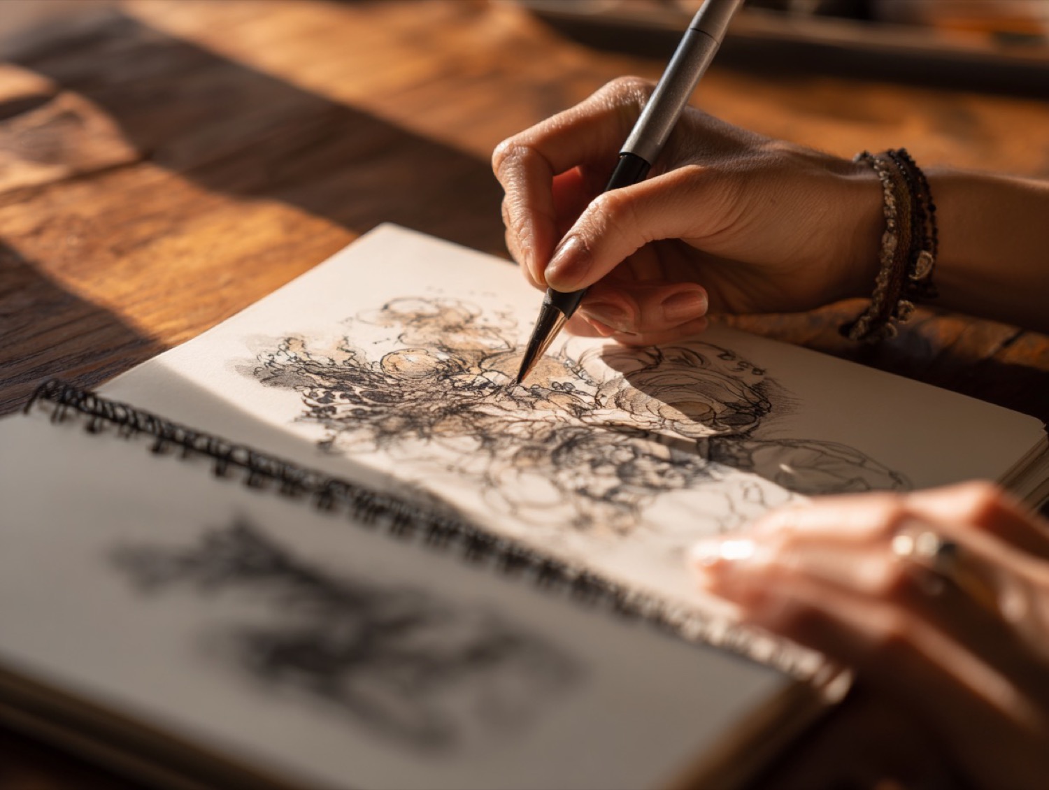
Intuition is an intimate bedfellow to our emotions. The more we cozy up to ourselves and understand our inner workings, the better equipped we are to create from an honest and more powerful place. The solidity, strength, and permanence of ink favor this process.
In practice, this might look like letting your joy dance across the page in barely there gossamer lines or your frustration slash, hatch, or otherwise darken the scene with dramatic effect. Perhaps the lines you sketch will be heavy and ponderous as you traverse your sorrow, or wavy and erratic as confusion grabs and tosses you about. The idea here is to move with what you feel, let it guide your pen, and embrace what reveals itself.
Sometimes, the way to master something is to surrender to it. Ink drawing inherently requires this of us because what we put on the page is there to stay, which is a beautiful thing, especially when we have cultivated our innate talents of perception.
Through the act of nurturing our intuition, we learn to rely on the wisdom of our hands and allow the lines that emerge to draw us closer to our creative truth. As a result, whether we’re working in ink or any other media, what we make will be more authentic, powerful, and uniquely our own.

According to the Oxford English Dictionary, the word brave is defined as:
1. Ready to face and endure danger or pain; showing courage.
2. To endure or face something unpleasant or difficult.
June has a kind of bold energy to it. The world feels more alive, more awake, more exposed. Trees are fully leafed out, flowers stretch tall toward the sun, and suddenly... there’s nowhere to hide. And maybe that’s the invitation—to stop hiding in our creative lives, too.
This month’s theme is all about making fearless marks. Picking up the pen instead of the pencil. Starting without a plan. Letting the line wander, even when your hand shakes a little. Being brave in this context isn’t about loud declarations or perfect outcomes. It’s about choosing to show up, again and again, even when the page feels intimidating or you’re afraid you’ll mess it up.
(Let’s stay with this one for a bit—it’s tender but mighty.)
Brave doesn’t mean you’re not scared. It means you’re scared and you keep moving anyway. In art, that might look like sketching without erasing. Or sharing a piece that feels a little too personal. Or painting with a color you usually avoid. It’s every time you choose your own voice over someone else’s opinion. Every time you say, “This matters to me.”
And here’s the thing—being brave doesn’t have to be dramatic. It can be quiet. A whisper instead of a shout. A single ink line instead of a perfect composition.
So this month, let’s practice small acts of courage in the sketchbook. Let’s risk the wonky perspective, the awkward hands, the imperfect pages. Let’s get a little messy. Let’s show up even when we’re unsure. Because that, dear friend, is the real magic of bravery.
• Where am I being called to be brave in my art?
• What am I afraid to draw or express—and why?
• What would I create if I let go of the need to get it right?
You don’t have to be fearless. You just have to begin. This month, let your courage take the shape of a line—and let that be enough.
Let’s tap into our creative intuition and do some self-reflective work inspired by our theme. Below you will see our month’s Oracle/Tarot card spread. But fear not, if you are not one drawn to using oracle or tarot cards, no worries, just use the accompanying reflective questions as writing prompts for your journals!
Here’s a four-card oracle card spread designed to tap into your creative intuition and our themes. This spread and its journaling prompts encourage reflection on the artist’s inner wisdom, the magic of inspiration, and the journey of trusting intuition in the creative process.
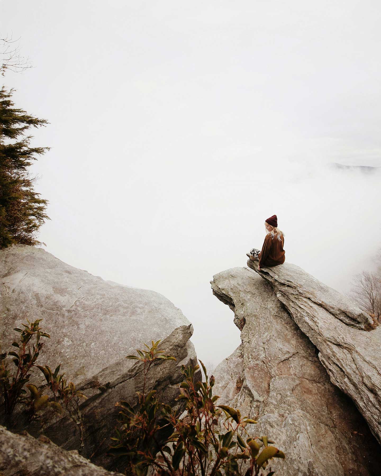
Treat yourself to this wonderful and powerful meditation from one of my favorite meditation creators - Rachel Hillary
Here’s a little more information from Rachel…
This meditation journey is a little different from my other creations in that it is more energy-based than usual. This meditation will pluck a specific chord within you, whatever you most need right now. We connect our third eye energy with our heart energy and begin a journey into expansion and unfolding, allowing ourselves to flow beyond the limits we may usually put upon ourselves. Music by Chris Collins, Indie Music Box.
I hope you enjoy, sending you love.
lots of love,
Rachel
Each month we will have a positive affirmation. I recommend you print out this affirmation and put it in your sketchbook or somewhere in your studio. Recite the affirmation out loud each time you show up to create. Saying words aloud is powerful and can begin to re-write some of our own limiting beliefs or calm our fears. Try it now…
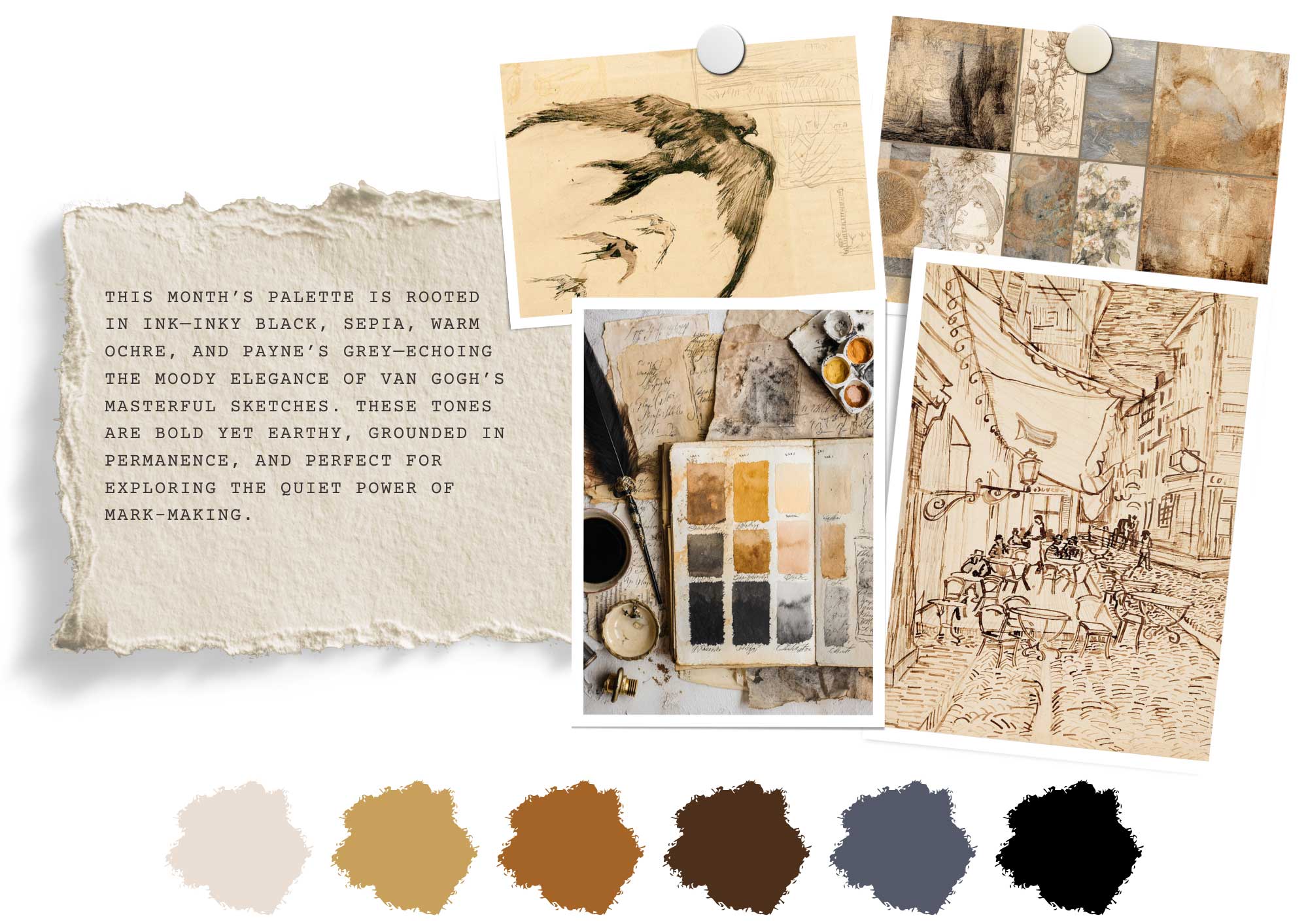
This month’s palette is grounded in ink—both literally and emotionally. Inspired by our Master Artist, Vincent van Gogh, and his deeply expressive ink drawings, we’re leaning into the moody elegance of inky black, earthy sepia, warm ochre, and atmospheric Payne’s grey.
These aren’t polished or decorative colors. They’re elemental. Honest. The kind of tones that live in old journals, timeworn sketchbooks, and twilight fields. Van Gogh often used just brown ink or graphite to capture the rhythm of wind in trees or the quiet solidity of a cottage roof. There was nothing tentative in his mark-making—it was immediate, intuitive, and full of feeling.
As we explore themes of bravery, presence, and beginning without erasing, this palette reflects that creative state of surrender. Inky black gives us contrast and clarity. Sepia brings warmth and history. Warm ochre adds the golden hum of sunlit moments. And Payne’s grey wraps it all in quiet introspection—perfect for slow observation and emotional depth.
This isn’t a palette for flashy work. It’s for thoughtful pages, moody sketches, and expressive lines. It invites you to make your mark boldly—to trust the colors of earth and ink as you move through your sketchbook this month.
It’s not about getting it right. It’s about showing up—and letting the marks speak for themselves.
When we think of Vincent van Gogh, it’s often his swirling brushwork and vivid oil paintings that come to mind—sunflowers blazing, skies tumbling in blue. But before the color, before the fame, and long before the tragedy of his final years, there was drawing. And not just drawing—but drawing in ink.
Van Gogh’s ink sketches, especially those created between 1888 and 1890, form a body of work that is as emotionally charged and technically masterful as any painting in his oeuvre. For Van Gogh, the act of drawing was not just preliminary or preparatory—it was fundamental. It was his anchor, his vocabulary, and often, his clearest form of expression.
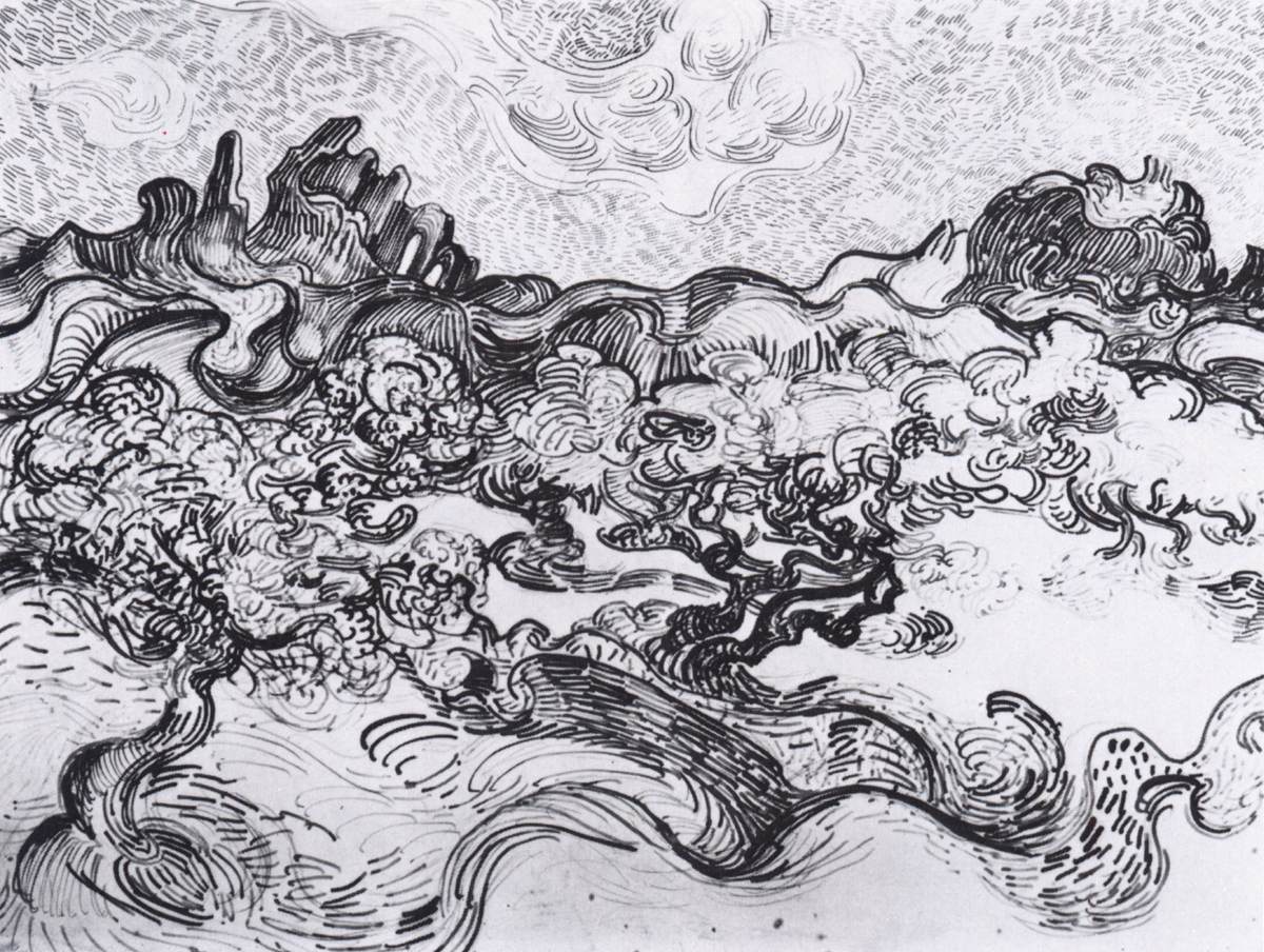
Born in the Netherlands in 1853, Van Gogh did not come to art early. He attempted various professions—art dealer, teacher, preacher—before deciding, in his late twenties, to become an artist. Largely self-taught, he began with drawing. His early years were devoted to studying form and anatomy, copying from manuals and plaster casts, and producing hundreds of charcoal and pencil studies. By the mid-1880s, Van Gogh had turned to ink—not just as an outlining tool, but as a medium in its own right.
His mastery with ink blossomed during his time in Arles and Saint-Rémy in the final two years of his life. It was during this period that Van Gogh produced some of his most compelling and lyrical pen and ink drawings.
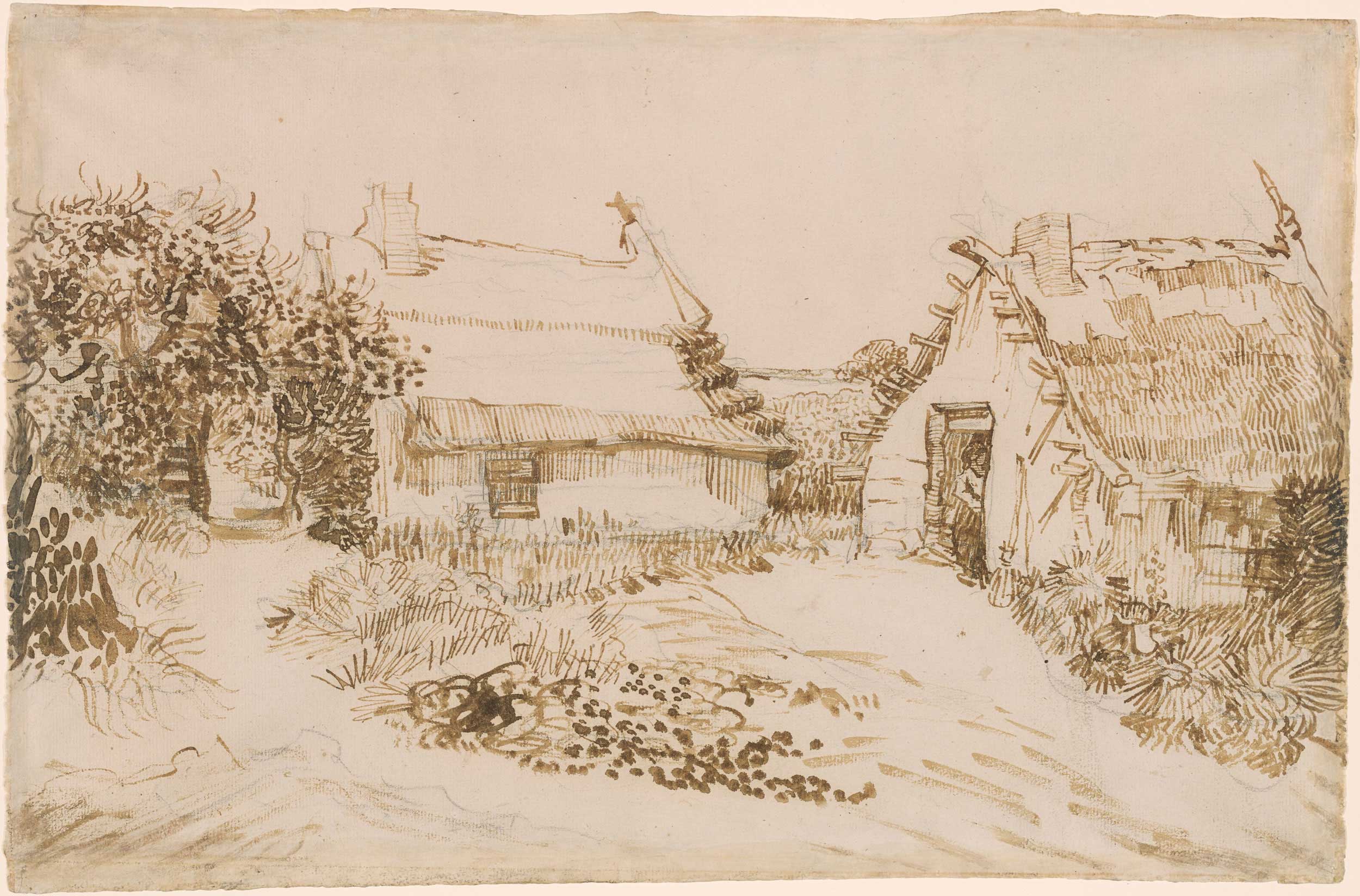
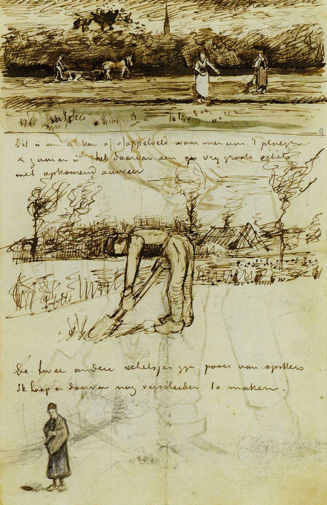
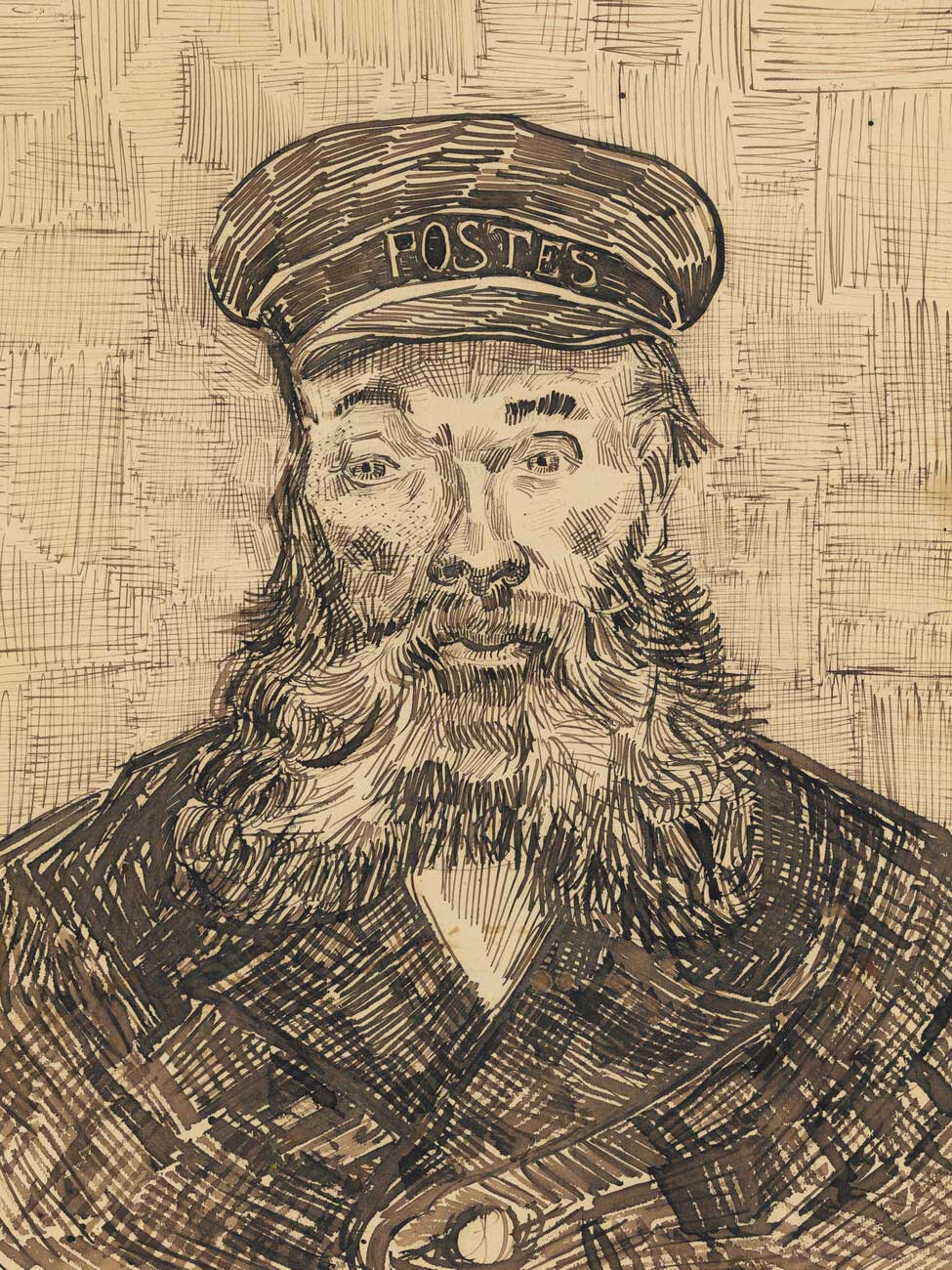
Van Gogh’s ink drawings are not quiet studies. They are alive with rhythm, repetition, and motion. Using a reed pen—cut from local bamboo or elder branches—he would dip into black or brown ink and build his drawings with layers of expressive marks. His lines often followed the energy of the scene: tight, short strokes to convey density or tension; long, swirling marks to suggest movement or calm.
Unlike the soft, shaded modeling of academic draftsmanship, Van Gogh's drawings relied on texture and repetition to convey volume and light. His hatch marks pulsed with directionality, giving form not just weight, but mood. Trees seem to tremble. Fields ripple. Architecture sits with a kind of stubborn gravity.
Many of these drawings were not sketches in the traditional sense, but finished works, intended as gifts or included in letters to his brother Theo. In them, Van Gogh translated the world around him into a visual shorthand—immediate and visceral, but never careless.
What makes Van Gogh’s ink work so compelling is its conviction. With ink, there is no erasing, no undo. Each line is a commitment—and in that way, ink seems almost designed for an artist like Van Gogh, who was drawn to the raw and unfiltered.
But his drawings were not impulsive. They were thoughtful acts of observation. In letters, he wrote often about the difficulty of drawing, the discipline it required, and the satisfaction it brought. In a letter from Arles in 1888, he said:
"Drawing is the root of everything, and the time spent on that is actually all profit."
These drawings were not just exercises; they were a way for Van Gogh to slow down, to see clearly, and to connect more deeply with his surroundings—whether it was a knotted tree trunk, a farmer’s hut, or a quiet field outside the asylum in Saint-Rémy.
For today’s artists—especially those just beginning—Van Gogh’s ink work offers not only inspiration, but invitation. You don’t need expensive materials to begin. Van Gogh often worked with simple paper and homemade pens. What mattered was attention, and the willingness to make a mark, even when unsure.
His technique encourages us to:
There is bravery in this process. In trusting the hand. In resisting the urge to hesitate. In showing up for the page with full presence—even if the result is messy or incomplete.
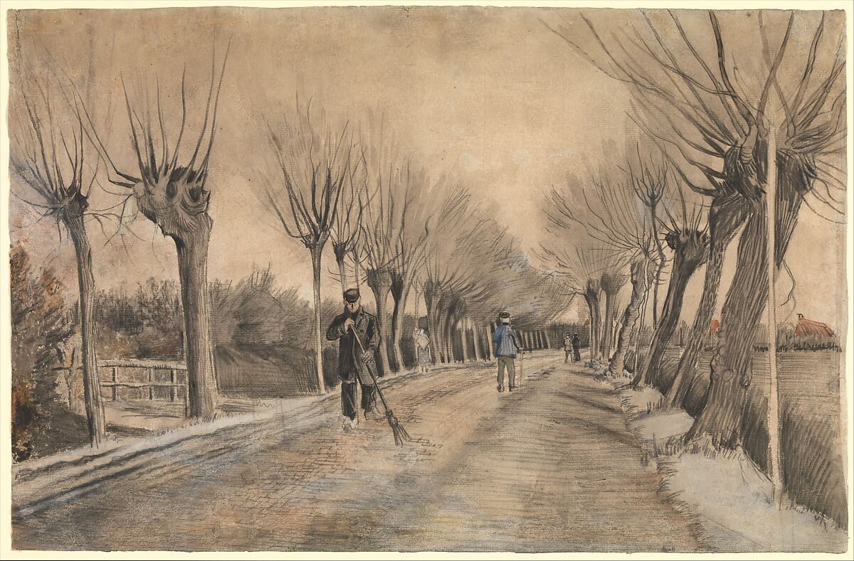
Van Gogh’s ink drawings are housed in collections around the world, from the Van Gogh Museum in Amsterdam to the Metropolitan Museum of Art in New York. And yet, they often receive less attention than his paintings. Perhaps because they are quieter. Or perhaps because they are more vulnerable—closer to the artist himself.
But for those of us who spend time with sketchbooks and pens, his drawings remind us that art often begins in simplicity. Not with spectacle, but with observation. Not with color, but with a single line—made with intention, and the courage to begin.
Pen and ink (or any permanent drawing tool)
30–60 minutes (or longer if you want to layer detail)
Choose one of Van Gogh’s pen and ink drawings to study. A few beautiful and accessible options include: Click the links below to see the images and be able to zoom in on them too.
(you can also choose one from our Pinterest board below)
1. Print the drawing or view it on a screen.
Set up your sketchbook next to it—don’t trace, but observe and redraw by hand.
2. Sketch the overall composition lightly with a few guiding lines (in ink!).
Focus on the flow and structure, not precision.
3. Begin studying Van Gogh’s marks.
4. Recreate sections of the drawing in your own sketchbook.
You can copy the whole scene or zoom in on just a detail—like the movement of tree branches or the texture of thatched roofs.
5. Take notes right on your page.
Label the marks you’re imitating: “loose loops,” “dense hatch,” “short flicks,” “directional rhythm.” This turns your study into a living reference for future work.
Doing a master study is not about perfection. It’s about slowing down to learn through another artist’s hand. In copying Van Gogh’s bold ink lines, you start to feel the pulse and pacing of his mark-making—and you begin to discover your own.
Medium: Pen or ink (no pencil)
Time: 10–15 minutes
Choose one emotion you’re feeling right now—subtle or strong, welcome or unwelcome. Write it in small letters at the top of your page. Then, without sketching or planning, use a single continuous line to draw something that expresses that emotion.
Let the line flow without lifting your pen. It can loop, tremble, surge, hesitate. It doesn’t have to look like anything—just feel like something.
Try:
Reflect:
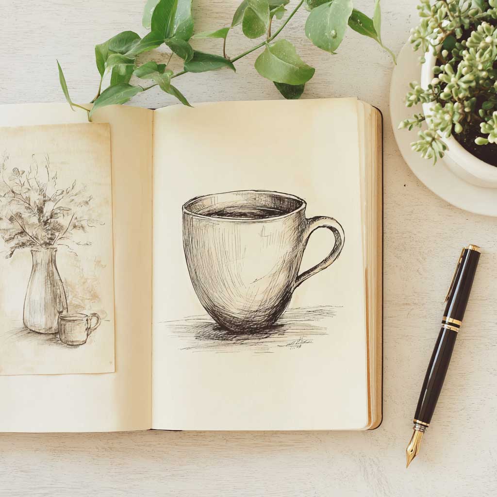
Medium: Pen and ink (fine liner, fountain pen, or dip pen), optional watercolor wash
Time: 20–30 minutes
Choose a simple object from your daily life (a mug, a plant, a worn shoe, a jar of brushes). The catch? You must draw it directly in ink—no erasing, no pencil underdrawing.
Sketch it three times on one page:
Bonus: Add a limited color swatch palette in one corner (warm ochre, payne’s grey, sepia). You’re not painting the object—just building a feeling around it.
Reflect:
Medium: Pen, dip pen, brush pen, or ink + stick, brush & ink
Time: Open-ended (10 minutes to 1 hour)
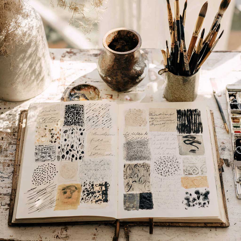
Create a full page (or two) dedicated to exploring your personal mark-making vocabulary. Think of it like a visual swatch book—not of color, but of line.
Start in the top corner and try:
Label each type of mark as you go, or give them names like “stormy,” “breathe,” “urgent,” “drift.”
Optional: Use this library to create a small abstract composition in one corner—no subject, just rhythm and emotion.
Reflect:
As we move through this month’s Studioworks Journal—soaked in ink, courage, and quiet mark-making—it feels like the perfect time to remember that sketchbooks are for us. Not for performance, but for presence. I recorded a little video to share more on this idea: a casual conversation about practice over perfection, and how hard it can be to let go of that inner critic.
While I chat, I’m simply playing in my sketchbook—letting ink flow, making honest marks, and staying curious. I hope it encourages you to do the same.
Just show up. Just begin.
You can also listen to this month’s issue of the Studioworks journal. I find I love listening to books, podcasts and music while I draw, paint or go on a long walk. Enjoy.
One of my favorite things to do is to curate inspiration. From Pinterest boards to books, resources, playlists and more - I love to share anything that might facilitate learning, expansion, and sparks of curiosity! Being an artist, we naturally crave these things so here are some of this month’s picks from me to you.
I had so much fun curating this list. I hope you enjoy!!
Classes that pair well with this month’s theme in your Studioworks Creative Library