IVY NEWPORT
Studioworks
Journal
a letter from ivy
Dear creative friends,
Welcome to Issue #10 of the StudioWorks Journal! As always, I’m super grateful you are here with me and I’m excited to share this with you.
Well, I’m home again from beautiful Italy and I truly hope you enjoyed exploring this magical place with me virtually last month! This month, I want to shift our focus from story to beauty. Beauty, not in the superficial sense but rather a deep attentiveness to beauty on a much deeper level. How attuning our hearts and eyes to the power of beauty can truly enrich our creative lives. Let’s begin…
xo,


So you may be wondering, where do I start? To that, I say, wherever feels right to you. Each month we will have a theme, a creative affirmation, a power word, a color palette, sketchbook exercises, art projects, articles, recommended reading and access to wonderful inspiration and resources. I want you to think of this as a delicious new magazine, you know the ones you occasionally splurge on, with soft, velvety pages, beautiful images
Each issue will invite you to explore your creative practice in whichever way works for you. Experience each issue at your own pace. Take what resonates with you and put the rest aside for another time.
Grab a cup of something lovely and dive in.
WORD OF THE MONTH
Beauty
a combination of qualities, such as shape, color, or form, that pleases the aesthetic senses, especially the sight.

This definition while somewhat accurate on a surface level, falls rather flat when truly looking at the essence of beauty.
“In a very real sense beauty is synonymous with consciousness. The more conscious we are that we are creatures created by an Incomprehensible Creator, the more perfect is the beauty we perceive. The more beauty we perceive, the more beauty we project. Our internal experience of consciousness is the lens by which our radiance is projected to the world around us. If we are imbued internally with the consciousness of sacred beauty, our physical, mental, emotional and spiritual bodies are congruently charged with that radiance.”
– Sewa Singh Khalsa
BEAUTIFUL MEMORIES – WRITING PROMPT :
Your life here is full of memories, full of experiences, full of pain and joy. These memories are often laced with beauty and it is important to remember that beauty can encapsulate the darker times as well as the light. It can be healing and poignant to document these moments.
Take at least 10 minutes of meditation before you begin to write. Set an intention that you are going to be open to this writing session and that you welcome all loving wisdom.
In your journal or sketchbook write about three vivid memories where beauty touched you and reflect upon these questions…
- How has your awareness to beauty heightened your creative life?
- When did beauty hold you in her embrace?
- When did she soothe you or gift you with a glimmer of hope, a whisper of comfort?
- Where has beauty touched your life?
Feel free to sketch or paint some of these memories.
BEAUTY BEHOLDER PROMPT:
- Wander around your home with a gentle gaze, where can you bring beauty in? What cluttered corner or forgotten shelf? Take the time to remove the unwanted, the old, the unused. Add a sweet plant or a pretty rock, display your favorite books or your art. Attending to beauty is living with intention.
Word of the Month : Beauty
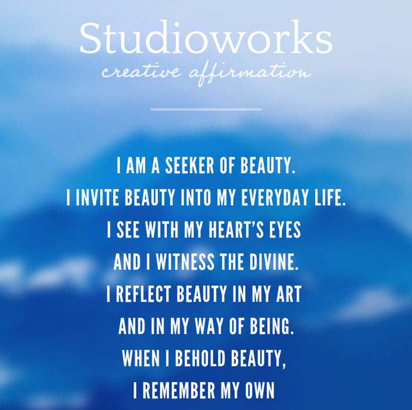
Monthly Affirmation
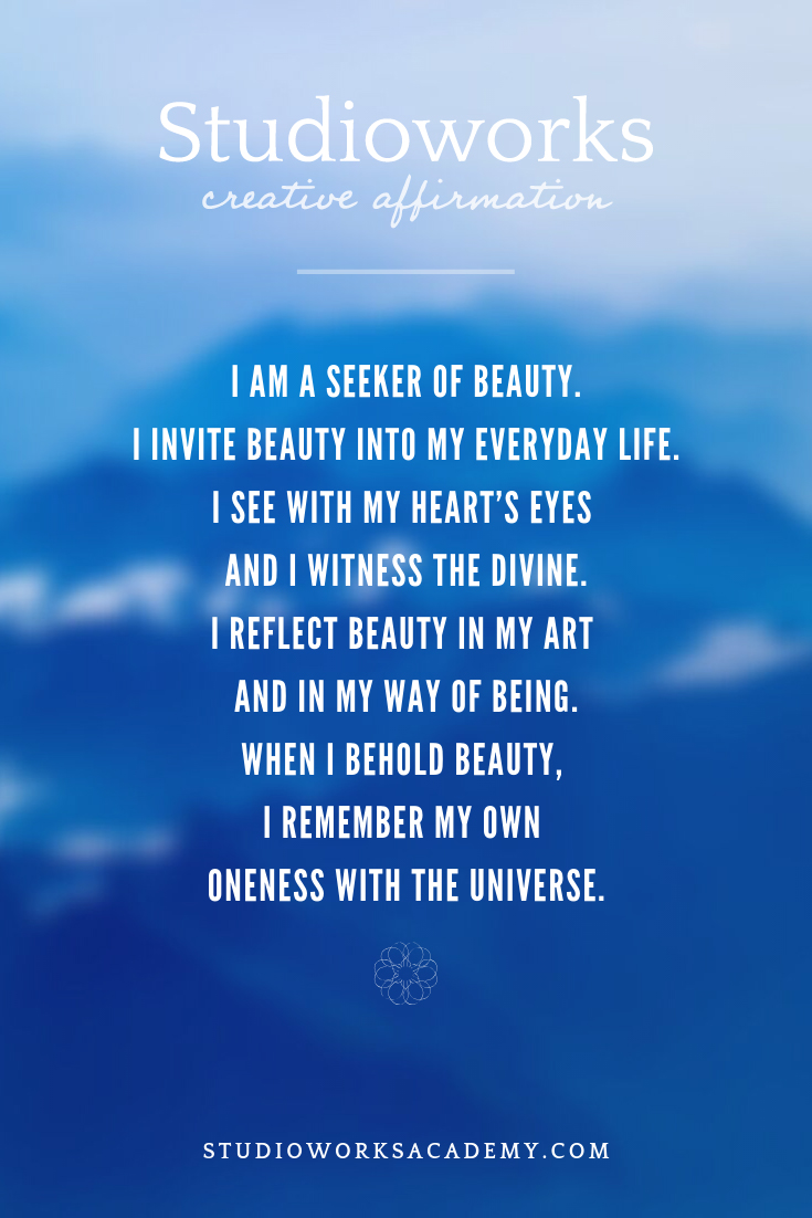
Each month we will have a positive affirmation. I recommend you print out this affirmation and put it in your sketchbook or somewhere in your studio. Recite the affirmation out loud each time you show up to create. Saying words aloud is powerful and can begin to re-write some of our own limiting beliefs or calm our fears. Try it now…
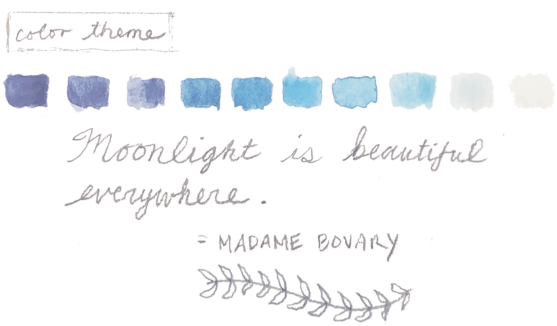
Color Palette of the Month
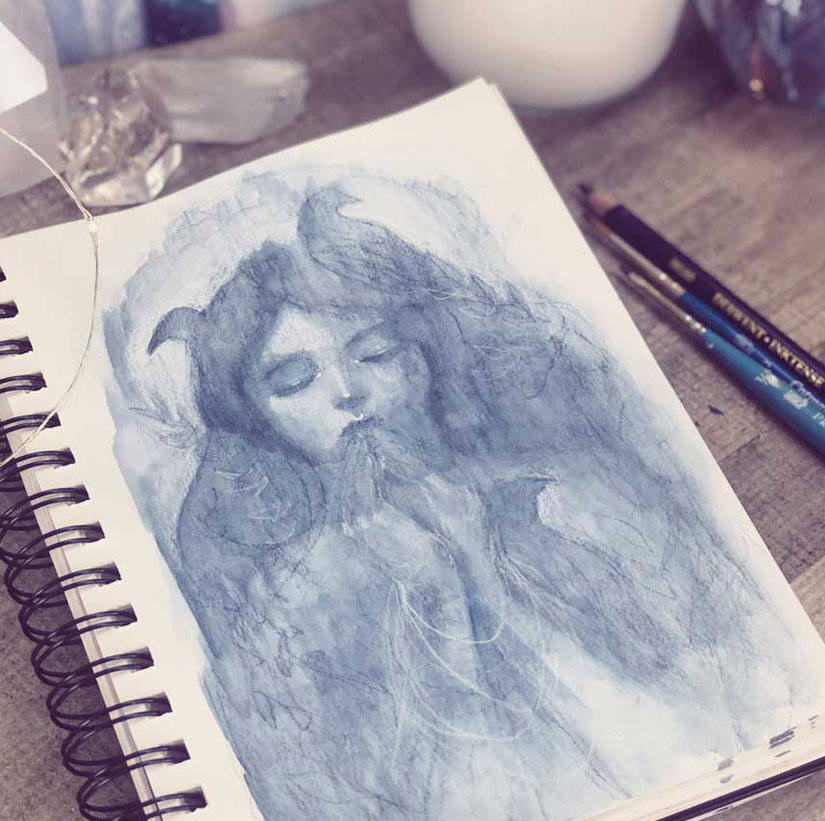
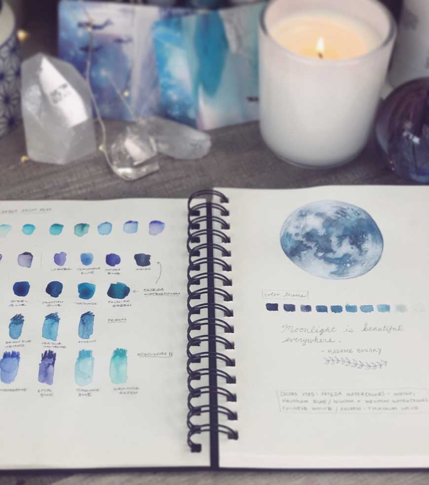
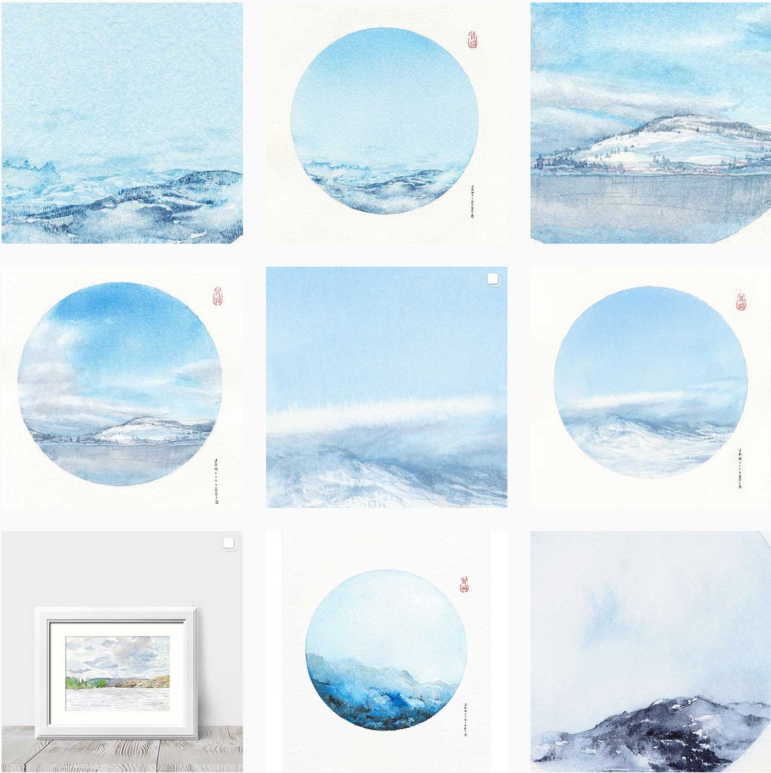
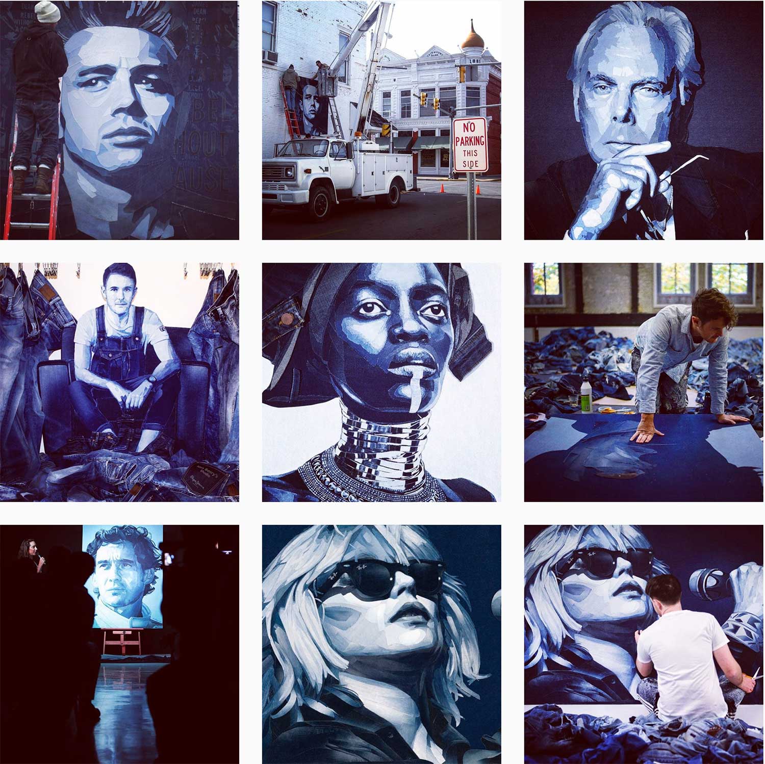
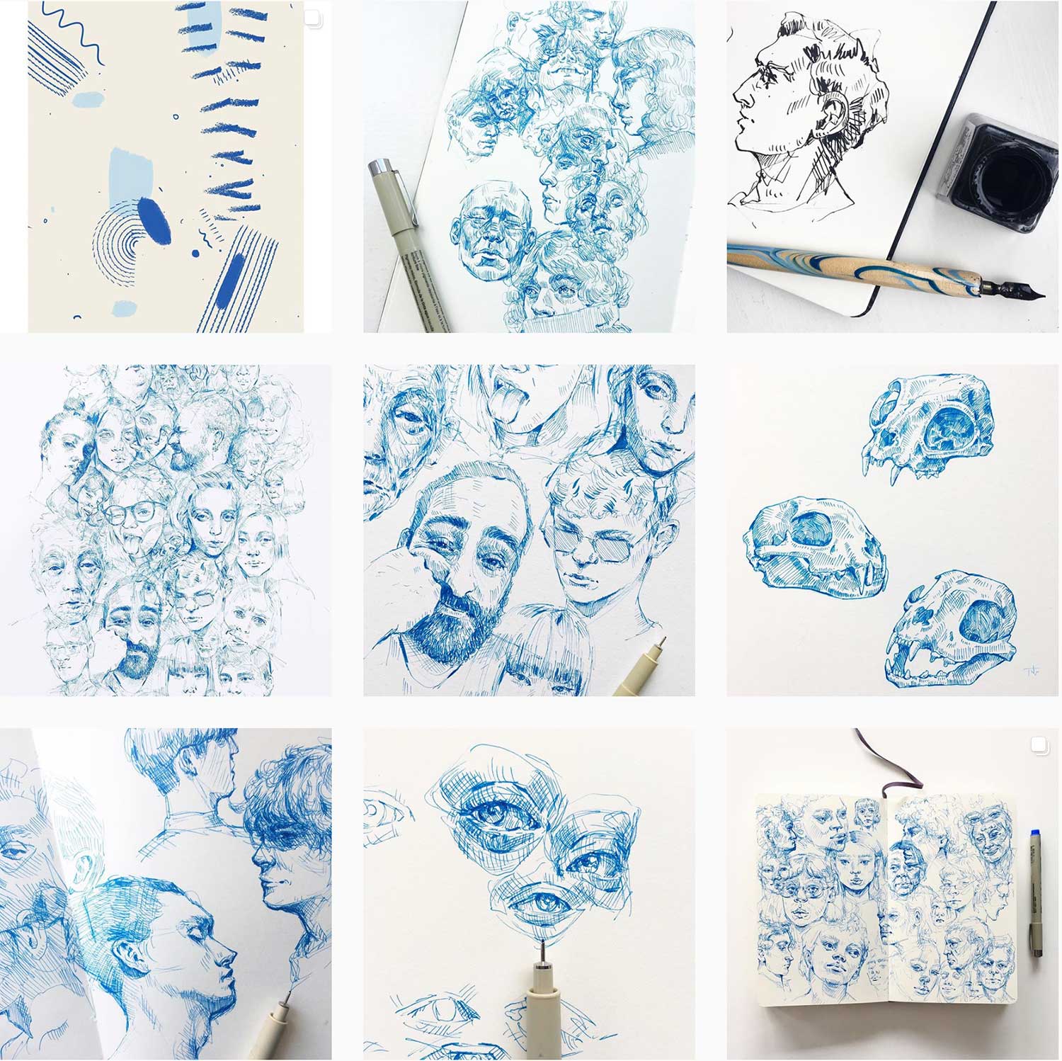
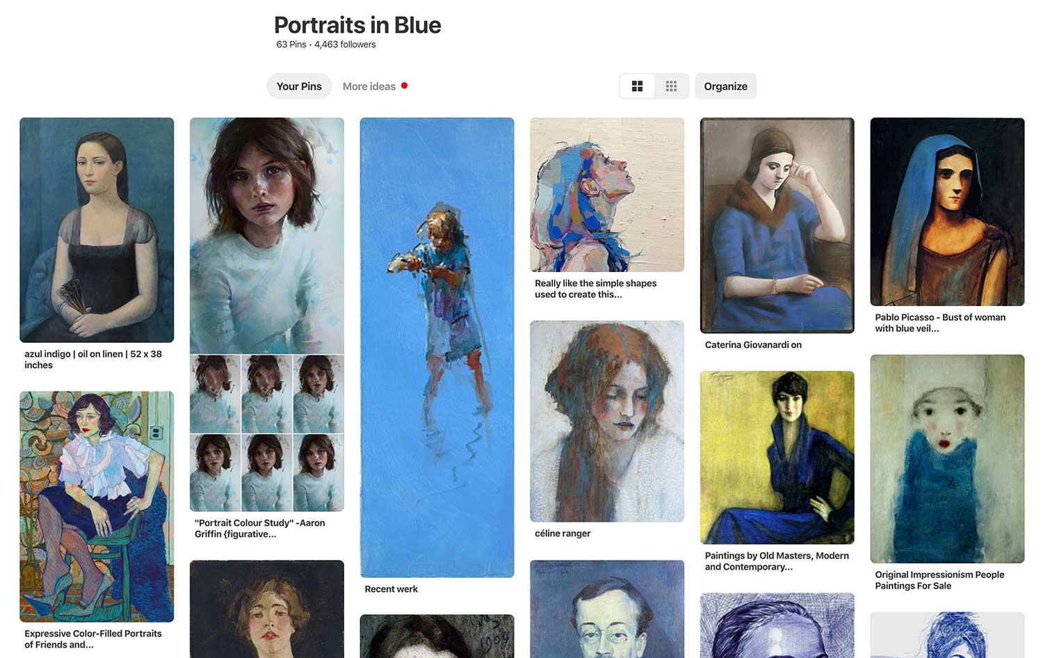
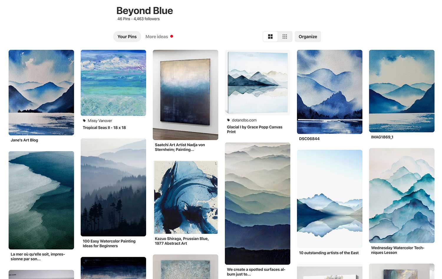
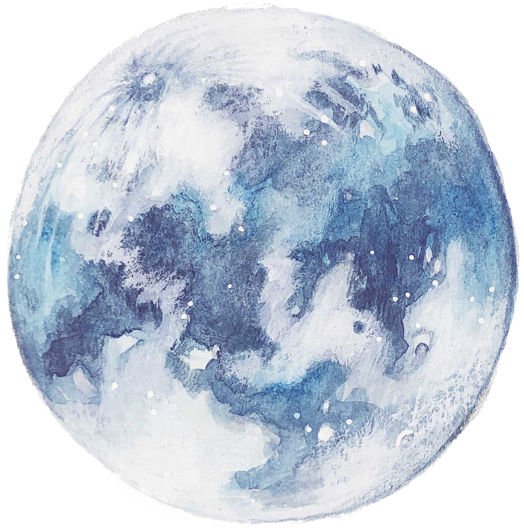
This color resonates with me in a deep way from a pale sky to deep indigo, prussian, sapphire, cobalt, cerulean, peacock, azure – these hues evoke such emotion and beauty. So let us dive deep into the endless oceans of blue.
BEAUTY BEHOLDER PROMPT:
- Treat yourself to a bouquet of flowers. Take the time to very consciously arrange them. Create balance and beauty. Focus only on the blooms and your breath. Witness the forms, colors and shapes in these beautiful gifts from nature. Take a few photos and sketch or paint from them. Notice how loving it feels to give yourself this simple pleasure.
The History of Blue
Did you know that each hue we use, each color we paint with has its own history? It’s own journey into being. It turns out that the history of color is a fascinating one and as per usual, I allowed myself to surrender to the draw of research so I could bring you some interesting insight into a few of my favorite shades of Blue. Don’t you love how EVERYTHING has a story to it?
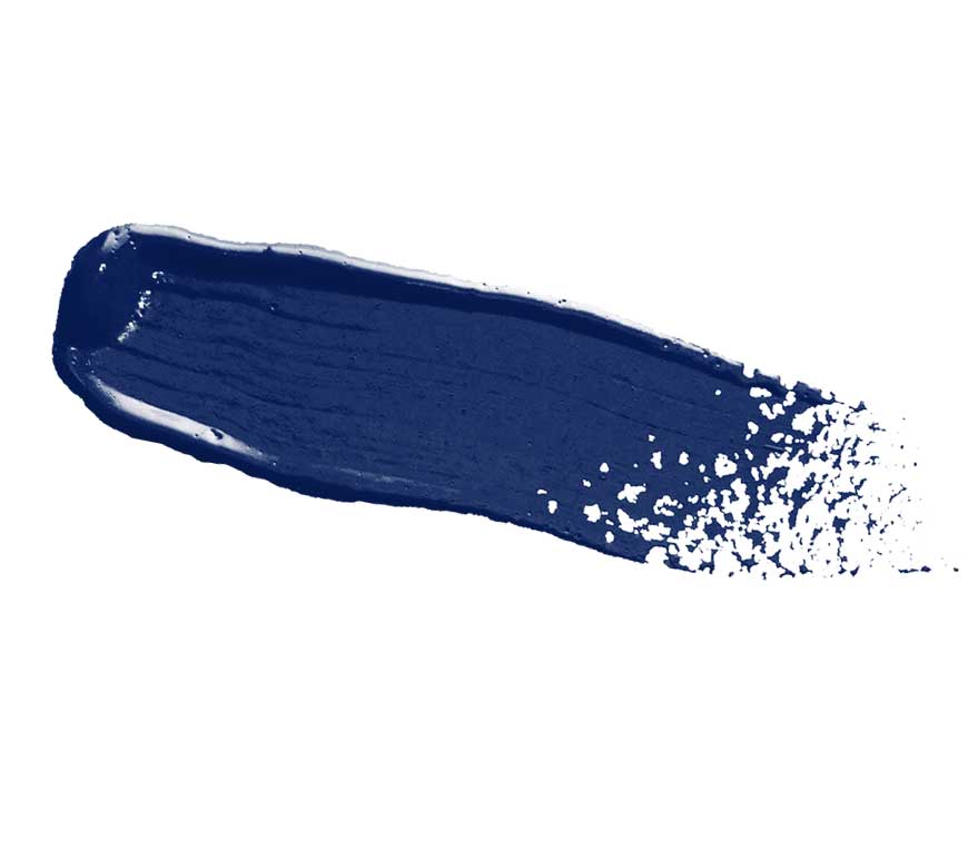
ULTRAMARINE BLUE
Ultramarine is famous for having been the most expensive pigment. It was more expensive than gold during the Renaissance. First used in 6th century Afghanistan, the pigment found its most extensive use in 14th and 15th century illuminated manuscripts and Italian panel paintings, often reserved for the cloaks of Christ and the Virgin. It’s use as a pigment among ancient mediterranean cultures is very rare. It was imported to Europe by way of Venice.
Ultramarine, genuine was made from the semi-precious gem – lapis lazuli and was so costly in the nineteenth century that artists infrequently used it. The hue is a necessary component in a balanced palette of warm and cool colors; without it a cool, deep blue is lacking.
By 1828 in France, a new way of producing ultramarine was discovered by Jean Baptiste Guimet. Guimet’s ultramarine was sold for four hundred francs per pound. While, in Paris at that time, lapis lazuli cost between three to five thousand francs per pound! This new and much more affordable color was named, French Ultramarine and is still used by artists today.
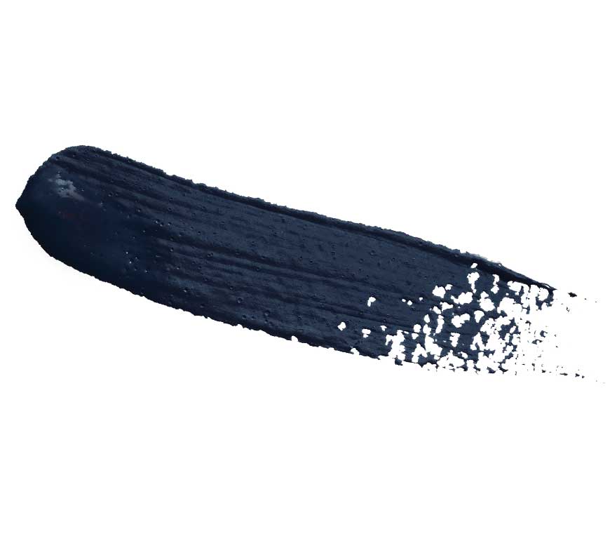
PRUSSIAN BLUE
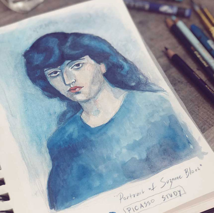
The first modern, artificially manufactured color was Prussian blue. It was made by the colormaker Diesbach of Berlin in about 1704. Diesbach accidentally formed the blue pigment when experimenting with the oxidation of iron. The pigment was available to artists by 1724 and was extremely popular throughout the three centuries since its discovery. This hue was the chosen blue featured in Picasso’s blue period.
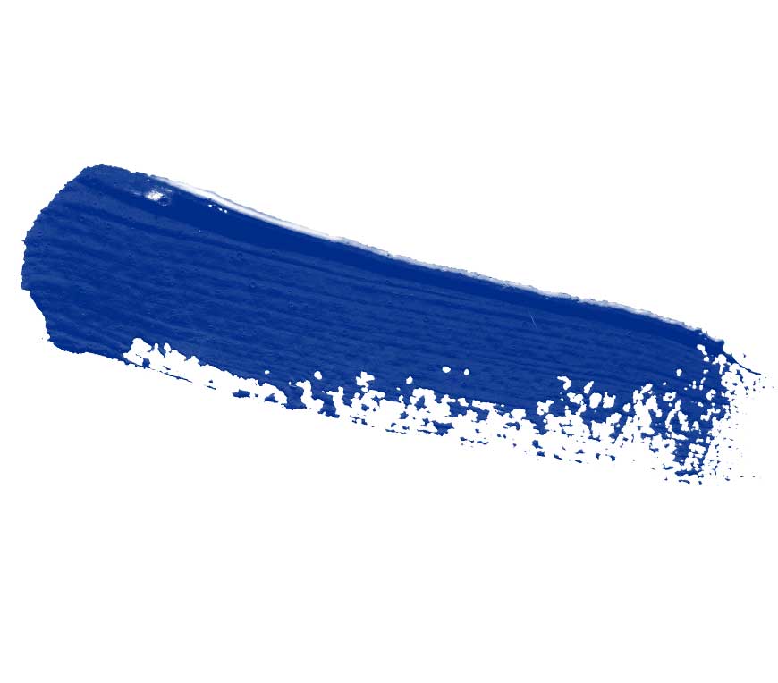
COBALT BLUE
Although smalt, a pigment made from cobalt blue glass has been known at least since the Middle Ages, the cobalt blue established in the nineteenth century was a greatly improved one.
The Minister of the French government, Chaptal, appointed Louis Jaques Thénard to look into the improvement of artists’ colors. Thenard developed this new cobalt blue by his observations at the Sevres porcelain factory. After thorough testing by Thenard, production began in France in 1807.
Cobalt blue was generally regarded as durable in the nineteenth century and was regarded as a good substitution to ultramarine when painting skies.
The History of Blue
MASTER ARTIST GUIDE
Pablo Picasso
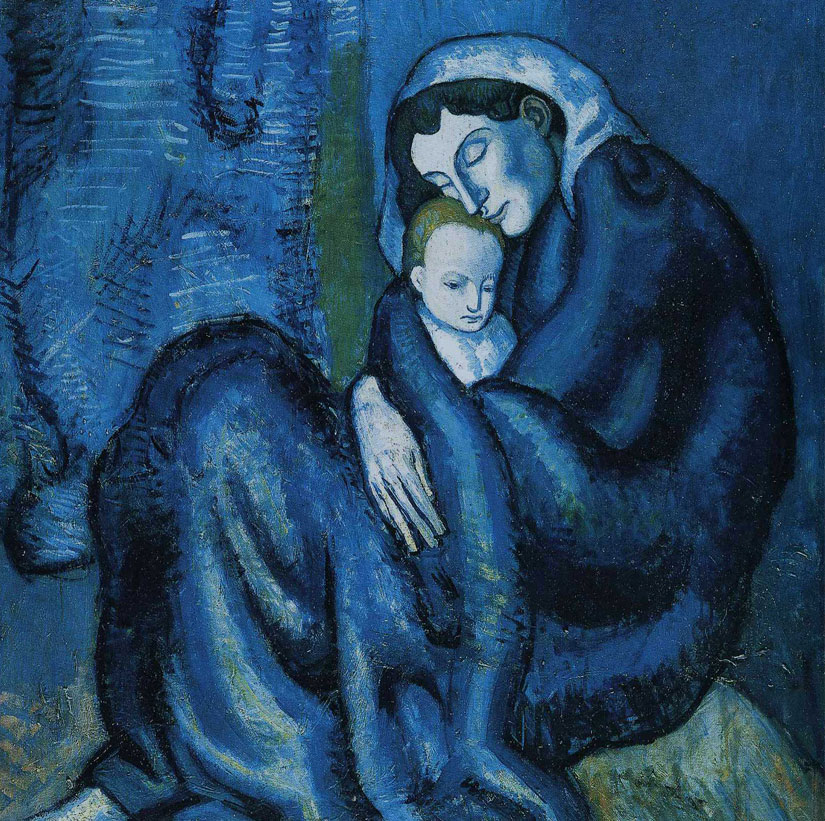
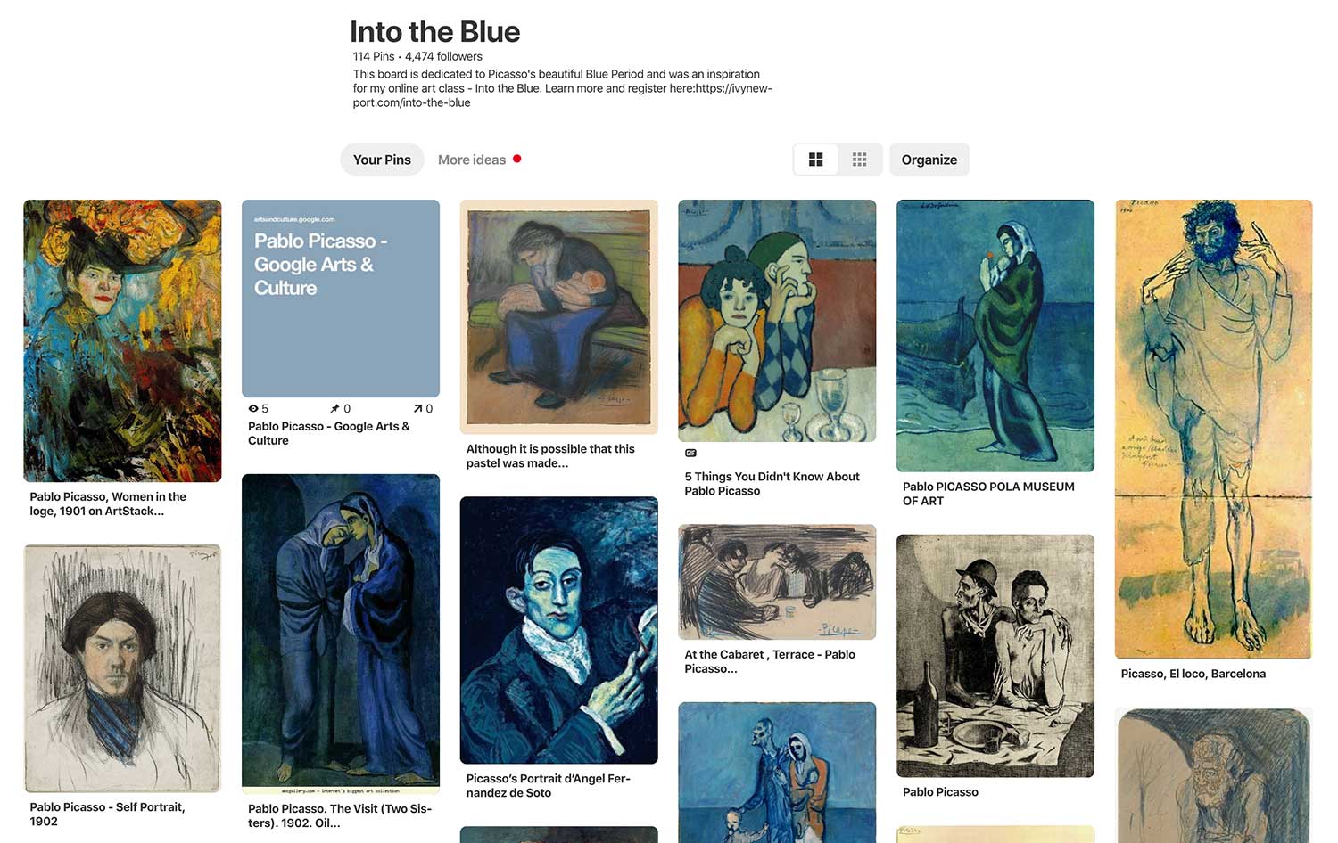
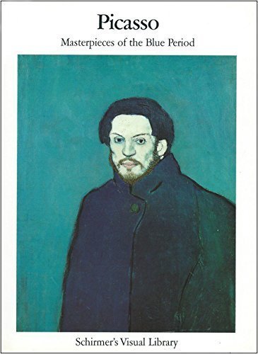
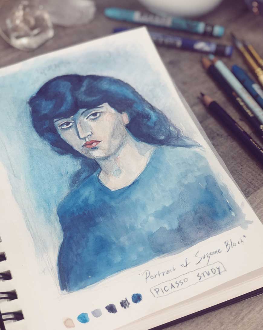
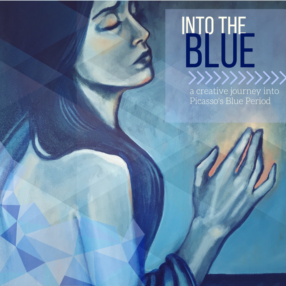
This month, I felt compelled to share with you the works of Pablo Picasso’s Blue Period. It only felt in alignment to study and explore this body of work from this master artist. For I believe, although he was controversial, he had a gift for seeing beauty in unexpected places. This is revealed in his “blue works”. Although somber, they express a grace and elegance – an elevation of beauty coupled with suffering. These works greatly inspired me. Enjoy this brief slideshow and lecture exploring Picasso’s Blue Period.
The Blue Guitarist
For a deeper look at one of Picasso’s pieces from his Blue Period, I invite you to watch along as I discuss and analyze one of his most famous works, “The Blue Guitarist.”
Master Artist Guide - Pablo Picasso
BEAUTY BEHOLDER PROMPT:
- Take a walk in your neighborhood and seek out beauty in unexpected places. Look for beauty in a rain puddle or the cracks of the sidewalk, an old discarded item or a broken window. Take pictures or notes of your findings..

